|
|
| Image |
Comment |
| 04/20/2006 08:25:54 PM | Pure Sweetnessby Jaded_HousewifeComment: Cute kid, but you're to close to the background, which causes harsh shadows and flash kickback from the wall. A 30 inch off camera umbrella would do wonders for this setup. If you don't have the off camera equipment, but you have a Bounce-Flash, bounce the light off the ceiling and light up the shadow areas with a white kicker-board placed just below the frame.
White foam-core board found at an art store is really cheap. You can even spray-paint one side silver or gold. |  Photographer found comment helpful. Photographer found comment helpful. |
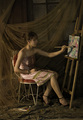
| 04/20/2006 08:15:10 PM | The Art of Artby shabbychicComment: She's pretty, but her face is lost in Shadow. However, I do like the soft lighting falling across her body. If only you could kick-up the face a bit. Also, she's not really painting, accentuated by the fact that the lighting pulls the eye to the canvas. Personally, I think the spike high heels detract from the image as well. If it weren't for the heels the image would seem timeless. I do like the drape, and the way you've placed it. The concept could work... Maybe a square image would be nice, with the focus falling on the girl and not the painting. | | Photographer found comment helpful. |
| 04/20/2006 12:50:08 AM | Ummm.... Coffee!by ewillisonComment: My photo had several issues to contend with. First, I didn't brew enough coffee to get the pour to flow properly through the nozzle. So I added water... Bad choice, I should have brewed more coffee, instead the coffee looked more like tea. Secondly, my six foot wide white paper blind looks like a postage stamp on the nozzle. Oh if I could have used "advanced" photoshop technics to blend it away. I went with a blue background because my original thought was to make a black and white image. However, the coffee wasn't dark enough to stand out in B&W. So. in the end, I rather liked the red handle, so I went with color. Yes, its slightly over sharpened... I like that effect on metal. However, notice that it doesn't effect the color channels only the luminance. Can you guess how I did that? Oh well, I'm happy with my placing. TTFN |
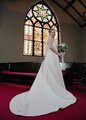
| 04/01/2006 08:35:10 PM | Wedding Dress Shotby ewillisonComment: Originally posted by Plachoochi:
I like your perspective and the stained glass window is a nice backdrop. A few things that should have been done to help this photo are cropping out the light in the upper right, smoothing the hem of the dress and watch your exposure - her dress is overexposed which has caused you to loose detail. |
Actually, the compression caused the dress to loose detail not the exposure. The printed images show dress detail perfectly. Also, the beauty of the stained glass window far outweighs the light fixture caught in the upper corner. Besides, church ceilings have lights, and I never crop wedding photos, all framing is done in the camera. Finally, yes, the dresses seam could have been flattened out. However, take into account this is a three strobe setup, achieved in less than two minutes, right before the wedding party headed to the reception. In wedding photography you work with what you got, and their ain't no time to dilly-dally. Message edited by author 2006-04-01 20:37:23. |
Home -
Challenges -
Community -
League -
Photos -
Cameras -
Lenses -
Learn -
Help -
Terms of Use -
Privacy -
Top ^
DPChallenge, and website content and design, Copyright © 2001-2025 Challenging Technologies, LLC.
All digital photo copyrights belong to the photographers and may not be used without permission.
Current Server Time: 08/04/2025 01:30:06 AM EDT.
|