| Image |
Comment |
| 10/03/2007 05:54:09 AM |
|
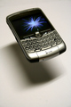
| 10/03/2007 05:52:30 AM |
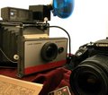
Textnologyby WallitComment: - The white is blown out along the logo pane
- I would've liked a little more sharpness to the picture overall
- I would've liked a little more highlights
+ The 'hovering' effect is cool!
+ The shadow cast looks nice
+ The picture overall looks nice |
 Photographer found comment helpful. Photographer found comment helpful. |
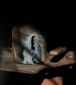
| 10/03/2007 05:49:21 AM |
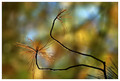
Metallurgyby pointandshootComment: Maybe too much blackspace on the top 1/3 of the picture, but everything else looks great! 7. |
| Photographer found comment helpful. |
| 10/03/2007 05:48:08 AM |
|
| Photographer found comment helpful. |
| 10/03/2007 05:46:12 AM |
|
| 10/03/2007 05:45:07 AM |
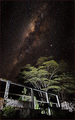
Today and Yesterdayby JLCComment: The white balance looks a little too much on the yellow side though, and the picture is a little noise, otherwise I like the setup and its a good composition. |
| Photographer found comment helpful. |
| 10/02/2007 03:05:09 AM |
|
| Photographer found comment helpful. |
| 10/02/2007 02:31:56 AM |
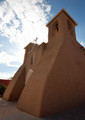
San Francisco de Asisby nowhohaComment: Beautiful composition. A little blown out in the clouds (though that may be personal preference), and I would've liked a little more brighter midtones. Good shot. |
| 10/02/2007 02:27:28 AM |
|
| 10/02/2007 02:27:04 AM |
|
| Photographer found comment helpful. |
Home -
Challenges -
Community -
League -
Photos -
Cameras -
Lenses -
Learn -
Help -
Terms of Use -
Privacy -
Top ^
DPChallenge, and website content and design, Copyright © 2001-2025 Challenging Technologies, LLC.
All digital photo copyrights belong to the photographers and may not be used without permission.
Current Server Time: 08/05/2025 03:52:51 PM EDT.