|
|
|
Showing 3521 - 3530 of ~3582 |
| Image |
Comment |
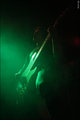
| 04/18/2006 11:02:13 AM | Police Carby reeveyComment: Greetings from the Critique Club!
First, let me say that I am not a professional or even a very good amature photographer, so you may want to take my comments with a grain of salt.
Meeting the Challenge: Definitely! It makes me feel like a kid again.
Composition: I agree that the crop seems a bit off. I don't feel like I need to see the whole toy - in fact, I think I like the feeling of energy that comes from the partial car. But I think that a looser crop on the top would bring it more into balance by showing more of the rear of the car. A solid color background may be less distracting but as there is not much background there, this is not as big of an issue as it would otherwise be.
Lighting: Pretty good. I think the right could be lit a bit more, and the left a bit less, as you lose a bit of details - especially to the left where the light merges with the car. It's not a huge problem as the merging of light and car does give a feel of movement, but that would have been enhanced by the beams of light being more consistant with each other.
Color: AWESOME. I love it. One of the best aspects to this photo, in my opinion.
Camera Work: Everything is clear and crisp. I am impressed with the attention to detail that this photo shows.
Post Processing: Details are sharp, the glow adds vibrance, highlights and shadows are very nice. You definitely accomplished what you wanted to with this.
Title: I would have prefered to see a less-obvious title, but this one is fine.
Image Dimensions and Filesize: Although not noticable, the filesize should be as close to 150kb as possible to minimize compression artifacts.
Misc / My subjective thoughts: It reminds me of something in a comic book or cartoon. I think it captures the feeling of children - colorful, vibrant, full of energy.
I hope this helps! Feel free to PM me if you have any questions. |  Photographer found comment helpful. Photographer found comment helpful. |
| 04/17/2006 02:23:17 PM | | | Photographer found comment helpful. |
| 04/13/2006 02:13:23 PM | Gas Worksby langdonComment: Only my sixth critique, and I get your image? Er, of course I'm not intimidated...! ;-)
Greetings from the Critique Club!
First, let me say that I am not a professional or even a very good amature photographer, so you may want to take my comments with a grain of salt.
I love the silhouettes (although as mentioned before, the leaning aspect is there) and think that they are quite interesting looking. There is a lot of detail there, which is very nice. The crop works very well. However I do think that what could have made this a vastly improved image is the sky. I would have loved to see more of the brighter blue and less of the grey blue, for a greater contrast. As it is, your picture is a very good one technically but it doesn't seem to have the impact that many of your other photos have.
I hope this helps! Feel free to PM me if you have any questions. | | Photographer found comment helpful. |
| 04/13/2006 01:42:58 PM | Vesperby BrinComment: Greetings from the Critique Club!
First, let me say that I am not a professional or even a very good amature photographer, so you may want to take my comments with a grain of salt.
Meeting the Challenge: Well, I'd certainly say this qualifies. :-)
Composition: Wow. I've never seen a photo that so wonderfully balances foreground and background. The diagonal line of the land works very well too. I am very impressed by the composition and this is what makes the photo really stand out for me.
I'm assuming this is an accident (if not, wow), but the silhouette has a couple of pieces of the foreground cutting across and it looks very much like the collar of a jacket or something. It's really cool.
Color: Three words: to die for.
Camera Work / Post Processing / Lighting: Everything's in focus that should be and with a picture like this... it really makes it amazing. I love the crop, and the contrast and saturation look great to me. As mentioned previously, a burn on some of the highlights in the front might have helped. (This is the ONLY thing I see about this photo that I don't love 100%) I love the way the light from the background is balanced with the shadows.
Title: I don't completely understand but am thinking it has a relation to the evening, and that totally works with this photo. In any case I think it is a good title because it doesn't state something obvious about the picture (letting the picture speak for itself).
Image Dimensions and Filesize: No problems here.
Misc / My subjective thoughts: Wow. Just wow. I am so delighted I got to critique this photo. Have you considered making it available as a print? (I'd recommend the burning and maybe a border color closer to the tan of the foreground if you do.)
I hope this helps! Feel free to PM me if you have any questions.
| | Photographer found comment helpful. |
| 04/12/2006 10:08:51 PM | | | Photographer found comment helpful. |
| 04/12/2006 01:26:59 PM | | | Photographer found comment helpful. |
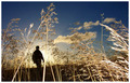
| 04/11/2006 04:34:45 PM | WEEEEEEEEEEEEEEEEEEEEEEE!by yourbuddyjhawkComment: Greetings from the Critique Club!
First, let me say that I am not a professional or even a very good amature photographer, so you may want to take my comments with a grain of salt.
Meeting the Challenge: Definitely.
Composition / Title: I love the composition. Aside from the telephone pole, which you can't clone out in basic (and is sort of nit-picky anyway) I think the composition is awesome. I like that the frog forms a sideways oval and the person forms another sort of oval, and I like the angle between them. Hope that makes sense!
I do agree with the earlier commenters that showing the face would definitely have added a lot. It would have added to the shot on its own, by showing the playful emotion, but it would also have fit with the title better. Hypothetically, if you had to choose to change the title or the face, I'd add the face, but if it weren't possible for you to reshoot or whatever, I'd tone down the title a little bit. I love the title because it is so much fun! But maybe making it not all capital letters would have made it fit with the image a bit better.
Lighting / Color: I wish the sky were more blue, but that can't be helped I think. Also, it being white does help to set off the mountains in the distance, and they are pretty cool. I think the shadow underneath definitely should be there as it goes with the outdoor look but maybe shooting at a different time of day would make the shadow a bit less noticable? I am not sure. I like the highlights on the frog - they add depth but are not overpowering.
Camera Work / Post Processing: Not sure what is what because of no photographer's comments.
Image Dimensions and Filesize: At least one side should be 640px to maximize size and impact but not a huge deal here.
Misc / My subjective thoughts: I didn't enter this challenge, but this - someone who doesn't look like a child, riding one of those toys at the park - was what I would have gone for if I had. So I definitely like your photo. :-) I wonder if it is just me who thinks the frog looks angry? Maybe not angry, but determined. In any case, it adds an extra interest for me. Also, great shoes.
I hope this helps! Feel free to PM me if you have any questions. Message edited by HBunch - Fixed CC glitch. |
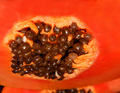
| 04/11/2006 11:49:42 AM | Hawaiian Delightby DigiFotoBuddyComment: Greetings from the Critique Club!
First, let me say that I am not a professional or even a very good amature photographer, so you may want to take my comments with a grain of salt.
Meeting the Challenge: Macro, definitely. It seems abstract to me - I can identify it as fruit but not a specific type of fruit. However I do wonder if others would be able to identify it better than I did.
Composition: I like how the main circle figure is not centered. I would like to see how this might turn out with a tighter crop - especially to eliminate the seeds at the bottom, which I feel detract from the seeds at top. Also, this would have eliminated some of the surrounding peach colored area, and that might not be a bad thing as this area lacks the texture which I feel can be important to a macro shot.
Lighting: No real problems here - I like how there is a definite shine to the seeds but the highlights are not overpowering.
Color / Title: A good color scheme - it makes me think of how I might decorate a sun room at a beach house. The title certainly adds to that feeling.
Camera Work: It looks like you do have some focus issues. The front seeds, the main point of the picture are decently focused but again, there is so much else that isn't, and a tighter crop could have helped matters here as well.
Post Processing: No photographer's comments so I can't speak to this area.
Image Dimensions and Filesize: The filesize should be as close to 150kb as possible to minimize compression artifacts although without checking the properties I would not have been able to tell.
Misc / My subjective thoughts: A lot of this repeats what has already been said so I am sorry if this is less helpful than I would like. I think that overall you have done a good job with capturing a fresh, "hawaiian delight"ful image, and if it weren't for the focusing/crop issue this may have done better in the challenge.
I'll add this: I hate seeds and fleshy bits of fruit next to seeds (yes I am strange) and wow did this picture make me go eww! A few of the macro entries did this to me. This is not a criticism, but an additional comment to how you have captured the spirit of the fruit.
I hope this helps! Feel free to PM me if you have any questions. | | Photographer found comment helpful. |
| 04/11/2006 09:47:31 AM | | | Photographer found comment helpful. |
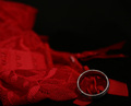
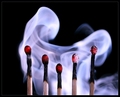
| 04/05/2006 05:21:35 PM | Extinguished but not Forgottenby riotComment: Greetings from the Critique Club!
First, let me say that I am not a professional or even a very good amature photographer, so you may want to take my comments with a grain of salt.
Meeting the Challenge: You did excellently here. You definitely captured the spirit of the original, paying attention to details such as the border.
Title: This is where you put your own spin on it. The title defines the image well, and the recently extinguished look made this tribute photo uniquely yours.
Composition / Color: You said you wanted to show the inner light of the matches, rather than making them look cold and dead. You definitely achieved your goal. The red glow is what makes this photo have a strong emotional impact, which, in my opinion, takes it further than the original.
I feel like maybe the matches should be a bit closer together and higher in the picture, as they were in the original. However, your version emphasizes the negative space more, which is a good contrast to the warmth of the matches. Also I can see how it would have been hard to crop it so that there is less space on the top.
Lighting: The smoke seems to overtake the matches just a little - maybe less light on the smoke would have helped this. But I don't feel that this detracted from your overall image.
Camera Work: As others have said, the left match is out of focus. Other than that, everything's amazing. I loved looking at the pictures of your setup and I am in awe at the time and effort you put into this.
Post Processing: You definitely got what you were going for. The blue-colored smoke definitely reminds us of the original while the black background provides perfect contrast.
Image Dimensions and Filesize: Filesize could have been a bit bigger but I don't notice anything where this is a problem.
Misc / My subjective thoughts: This is a very detail-oriented photo - one thing I noticed was the border. While in the same style as the original, the different color adds to the relative warmth of your photo.
I have to say, you did an amazing job. I think the strength of this image is in the emotional pull - the "heroic symbolism" you were going for is definitely what you got.
I hope this helps! Feel free to PM me if you have any questions. | | Photographer found comment helpful. |
|
Showing 3521 - 3530 of ~3582 |
Home -
Challenges -
Community -
League -
Photos -
Cameras -
Lenses -
Learn -
Help -
Terms of Use -
Privacy -
Top ^
DPChallenge, and website content and design, Copyright © 2001-2025 Challenging Technologies, LLC.
All digital photo copyrights belong to the photographers and may not be used without permission.
Current Server Time: 08/01/2025 04:25:37 PM EDT.
|