| Image |
Comment |
| 05/19/2006 12:30:21 AM |
|
 Photographer found comment helpful. Photographer found comment helpful. |
| 05/19/2006 12:30:02 AM |
|
| Photographer found comment helpful. |
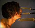
| 05/17/2006 12:24:01 AM |
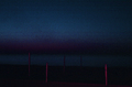
Colors of Nightby Miss TaterbugComment: I hate how abstracts are received here, but I guess that's the way things go. This is one of my favorite photos ever. |
| Photographer found comment helpful. |
| 05/16/2006 01:02:04 AM |
Colors of Nightby Miss TaterbugComment: GORGEOUS. Absolutely wonderful. I love the stripes balanced with the perpendicular lines in contrasting color. |
| Photographer found comment helpful. |
| 05/15/2006 12:17:48 PM |
|
| 05/09/2006 03:56:22 PM |
|
| Photographer found comment helpful. |
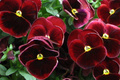
| 05/08/2006 01:53:04 PM |
Red Pansiesby KathyComment: Greetings from the Critique Club!
First, let me say that I am not a professional or even a very good amature photographer, so you may want to take my comments with a grain of salt.
Meeting the Challenge / Title: As people said, the yellow stands out a bit more than the green. But I would say that it still meets the challenge. Maybe if you had incorporated something about the green leaves into the title, that would have drawn attention to the green in the photo.
Camera Work: Hmm, okay. I am going to at the same time agree and disagree with those who say that a sharper, more detailed image would have been better. I agree because with a close up like this, you want the detail to be present. However, I think that your shot as is looks like a painting. It is soft and delicate, and makes me feel relaxed and close to nature. There is enough definition to the edges of the petals and the color differentiation in the petals is clear. If that had not been the case I would have said that I very much do not like the soft focus, but as it is, I do.
Image Dimensions and Filesize: No real problems here.
I hope this helps! Feel free to PM me if you have any questions.
Edit: My sister just came in the room .. "did you take that picture?" I said no and she said "Oh. Looks good." :-) Message edited by author 2006-05-08 13:55:04. |
| Photographer found comment helpful. |
| 05/08/2006 01:38:30 PM |
Five into Oneby kombizzComment: Greetings from the Critique Club!
First, let me say that I am not a professional or even a very good amature photographer, so you may want to take my comments with a grain of salt.
I think you did a great job with colors and composition. You could have benfited from more detail, as mentioned. A larger filesize and larger dimensions would have helped. You are able to have dimensions up to 640 pixels and a size of 150K - take advantage of that. If you use Photoshop, you can try "save for web" and optimize it to the particular file size you want.
I am glad to see you jumping into the challenges here! I look forward to more from you - it seems from your profile that you have a great appreciation of the world around you and when that comes out through a photo, it is truly amazing.
I hope this helps! Feel free to PM me if you have any questions. |
| Photographer found comment helpful. |
| 05/08/2006 01:32:27 PM |
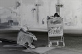
Just Think Positive!by usiaComment: Greetings from the Critique Club!
First, let me say that I am not a professional or even a very good amature photographer, so you may want to take my comments with a grain of salt.
Meeting the Challenge: A good job here.
Composition: I don't think the background is distracting. I think it adds a lot of great context. Black and white helps here, I think, because color may have given the eye too much to focus on. The tilt of the cart is interesting. I don't know if I like it or not, but it draws me into the photo, so that is a good thing. I like how you used the rule of thirds.
Lighting: Shadows in the negative challenge have seemed really weird to me, so I would have liked to see the cart have less shadow, but this is not a big problem.
Title: Ahh, a pun!
Image Dimensions and Filesize: The filesize should be as close to 150kb as possible to minimize compression artifacts.
Misc / My subjective thoughts: I think you really captured the feelings of the guy and displayed a lot of emotion in your photo. The black and white, and the road signs (saying there is only one way) all help to add to the "needing to think positive" feelings that the guy has. I think possibly more detail in the face, as well as a slightly different angle to the shot, may have helped up your score some. But overall, I think you did a great job.
I hope this helps! Feel free to PM me if you have any questions. |
| 05/03/2006 01:09:01 PM |
|
| Photographer found comment helpful. |
Home -
Challenges -
Community -
League -
Photos -
Cameras -
Lenses -
Learn -
Help -
Terms of Use -
Privacy -
Top ^
DPChallenge, and website content and design, Copyright © 2001-2025 Challenging Technologies, LLC.
All digital photo copyrights belong to the photographers and may not be used without permission.
Current Server Time: 08/01/2025 04:25:30 PM EDT.