| Image |
Comment |
| 09/06/2006 12:17:31 AM |
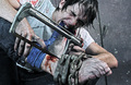
SAW by Joey LawrenceComment: I was so afraid this would ribbon, because now I have to stare at the thumbnail on the front page for a while! Congrats though. :-) I am so disturbed by the thoughts of the movie, and I haven't even looked at the full version of this photo - just your thumbnail alone has enough impact for me to be bothered. I hope that you will consider this a compliment, because I am truly in awe of your ability to bring this movie to the photographic medium. |
 Photographer found comment helpful. Photographer found comment helpful. |
| 09/05/2006 10:06:49 PM |
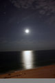
Moon Reflection.jpgby renegade1966Comment: I agree with jpochard's comment. The sky and the water just look so lovely and dreamy by themselves.. the foreground is not bad at all! just detracts a bit from the mystical quality of the other elements. The water looks like chrome - a really cool effect. |
| 09/05/2006 10:05:48 PM |
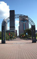
IMG_3602.JPGby renegade1966Comment: This may possibly benefit from a tighter crop on the bottom. Also the perspective looks a bit off, like everything is tilted - try rotating. (Another thing to be careful of is how you are positioned when shooting - if you had stood right in the middle of the middle lines it may have not needed post processing to get the perspective better)
I like the lines showing the way towards the distance, and the vibrant colors. |
| Photographer found comment helpful. |
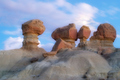
| 09/05/2006 10:03:07 PM |
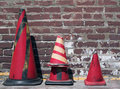
Abstract Conesby renegade1966Comment: I really love the contrast and colors and composition. The only thing that's a bit weird is the shape of the shadow on the center cone. Other than that I think this is perfect! |
| Photographer found comment helpful. |
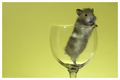
| 09/05/2006 09:52:26 PM |
Peekby JutildaComment: Ooooh, I LOVE how the hair blends into the background. |
| Photographer found comment helpful. |
| 09/05/2006 06:21:13 PM |
|
| Photographer found comment helpful. |
| 09/05/2006 06:18:30 PM |
|
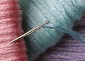
| 09/05/2006 05:40:34 PM |
Sew-Sewby KarenNfldComment: Oh wow... this is a color combination I have always ADORED and you captured it so nicely. |
| Photographer found comment helpful. |
| 09/05/2006 05:40:00 PM |
|
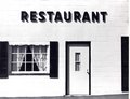
| 09/05/2006 02:40:11 PM |
B & W Restaurantby TomMMDComment: One thing I notice is that the lines are at an angle, like the perspective is just a bit off. I don't think that detracts too much, because the photo has an old-timey feel, obviously enhanced by the absence of color.
I very very much like how this image has really black blacks and really white whites. It's great how there is so much contrast and yet I don't feel like any of the details are missing.
Also incredible is the shadowing - almost as if the shadows were placed there by someone using Photoshop in order to enhance the letters and other details.
Very good photograph and one I greatly enjoyed looking at! |
| Photographer found comment helpful. |
Home -
Challenges -
Community -
League -
Photos -
Cameras -
Lenses -
Learn -
Help -
Terms of Use -
Privacy -
Top ^
DPChallenge, and website content and design, Copyright © 2001-2025 Challenging Technologies, LLC.
All digital photo copyrights belong to the photographers and may not be used without permission.
Current Server Time: 08/08/2025 02:55:12 PM EDT.