| Image |
Comment |
| 04/23/2008 03:03:34 AM |
|
 Photographer found comment helpful. Photographer found comment helpful. |
| 04/23/2008 01:52:46 AM |
|
| Photographer found comment helpful. |
| 04/23/2008 01:33:47 AM |
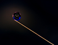
Smallest Clock on a Needleby danielcheong1974Comment: Stunning. I only wish (and this is a very small nitpick) that the pink color next to the "9" had the edge smoothed out a little bit instead of dipping in like that. Otherwise this is perfect. |
| Photographer found comment helpful. |
| 04/23/2008 01:32:12 AM |
|
| Photographer found comment helpful. |
| 04/23/2008 01:30:56 AM |
|
| Photographer found comment helpful. |
| 04/21/2008 01:47:40 AM |
|
| Photographer found comment helpful. |
| 04/16/2008 09:49:51 PM |
Colors7.jpgby BSteelsComment: Very nice! Awesome shapes, love the high contrast, composition is great and the way the background and necklace echo each other is incredible. Only thing is that I think the skin tones are a tad off, maybe doing a levels adjustment would help? And a bit of sharpening would probably help as well. Overall a very engaging photo!! |
| Photographer found comment helpful. |
| 04/15/2008 06:18:13 PM |
Lizardby FranziskaLangComment: Love how the background is the same color but such a different texture - it compliments the subject well while still allowing it to stand out! |
| 04/15/2008 06:17:21 PM |
Mr. Big-Eyesby FranziskaLangComment: Yeah, the DOF is fantastic! I love the colors and composition too. Not too fond of the border, just because I'd like to see the image bigger and in more detail. This is the type of image that should be poster-sized on a wall. Great job! |
| 04/09/2008 05:59:01 PM |
Bathroom Texturesby CLiPPeRComment: Wow, great job for your first entry. I am proud of how you got this effect from your window. I am in your position and find myself using windows a great deal. A tiny bit more light on the left would have helped - try maybe positioning (having someone hold) a mirror to reflect some light? but it's not a major thing. Besides the lighting, the composition is really nice - lots of elements without seeming busy, and the lines flow nicely. When I first saw this shot I thought that it would work really nicely as an element in a website that sells bath products. It's just really put together well and captures what "bath time" is (at least for women :-) ) all about. |
Home -
Challenges -
Community -
League -
Photos -
Cameras -
Lenses -
Learn -
Help -
Terms of Use -
Privacy -
Top ^
DPChallenge, and website content and design, Copyright © 2001-2025 Challenging Technologies, LLC.
All digital photo copyrights belong to the photographers and may not be used without permission.
Current Server Time: 08/05/2025 10:02:12 PM EDT.