| Image |
Comment |
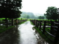
| 01/26/2007 03:35:15 AM |
Billings Farm (Woodstock)by melismaticaComment: Besides the tilt I just ADORE this. The lack of subject really seems inviting to me - like I want to walk down that path to see what's at the end. The greens are really great, and I love the blurred-but-still-in-focus feel (it gives the image a magical sort of quality). |
 Photographer found comment helpful. Photographer found comment helpful. |
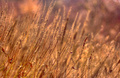
| 01/26/2007 03:33:19 AM |
On the edge of paradiseby quiet_observationComment: I agree about the circles. But it is a very small thing for me. The way it is, I still LOVE the image. Especially the colors; autumn is my favorite season and the colors here really bring it to life for me (even if those don't grow in autumn, the colors are just perfect!). |
| Photographer found comment helpful. |
| 01/26/2007 03:31:35 AM |
|
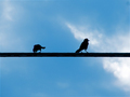
| 01/26/2007 03:30:38 AM |
Birds on a wireby MelethiaComment: Awesome composition! The colors are fantastic too.
The concept reminds me of  peroty peroty's recent photo with birds and a wire. I think I really like the concept because... hm. I like birds (I wish I could fly) but I see a lot of shots with just a bird flying, and a sky for background. Having the wire in there gives some really great context and makes for a more unique image. |
| Photographer found comment helpful. |
| 01/26/2007 03:28:02 AM |
Overlookby levyj413Comment: I definitely prefer it without it being completely black. And I love the contrast and perspective too.
edit: And I meant to say that I just LOVE the vibrant blue color. Message edited by author 2007-01-26 03:28:24. |
| Photographer found comment helpful. |
| 01/26/2007 03:25:09 AM |
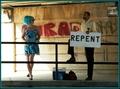
Moment of Truceby NikonJebComment: Also interesting is the fact that the visible letters almost spell "Iraq" - yet another controversial thing! I would never have guessed that the girl was actually a guy. |
| Photographer found comment helpful. |
| 01/26/2007 03:23:33 AM |
study of a young womanby silverfoxxComment: Oh my gosh so amazing. Congrats on a great score and placement! Lighting is so beautiful and it looks so much like a painting. |
| Photographer found comment helpful. |
| 01/26/2007 01:03:30 AM |
Christina by grigrigirlComment: I like the blue ribbon winner but in my opinion this is a better image. Congrats on the ribbon. |
| Photographer found comment helpful. |
| 01/26/2007 01:01:10 AM |
In the studioby sickdogComment: Awesome story about this, congrats :-) I really like the colors.. kinda gives it a feeling that to my mind matches the subject. |
| Photographer found comment helpful. |
| 01/26/2007 12:58:39 AM |
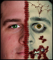
I find it kinda sad, the dreams in which I'm dying are the best I ever had.by Elvis_LComment: I like the processing on the right side but I really feel that the dividing line detracts heavily. The right side seems more realistic than the red and black just is, to me, and so the line does not seem to be connecting the two sides of the face. I want to be able to give the benefit of the doubt here and say that the line is only connecting two photos (so the final image is a photo of two paper photos) but the border does not allow me to do that. (It would work if the red line extended onto the border, or if the border were not present.
Other things: Light in the left eye and not in the right is a tad distracting. Focus is good and colors are great. I like the "alive" feel to the colors on the left and the "dead" feel to the colors on the right. I think maybe the sharpness of the red "underneath" parts on the right could be increased for more realism. The cracked part is very effective looking. The shot on the right seems like it is a tad bit larger than the one on the left (lips look lower and eyebrow looks higher than the left). Some of your processing is a bit obvious - I specifically refer to the right eye where I can see a harsh unnatural line where it looks like the white of the eye was pasted in.
Okay, all that may sound like a lot of negatives but there are definitely things I like about this image - focus, colors, and cracked part as mentioned above. I also want to say that it is a rare image that will immediately grab me to do this detailed of a comment, so that in itself is a good thing. :-) |
| Photographer found comment helpful. |
Home -
Challenges -
Community -
League -
Photos -
Cameras -
Lenses -
Learn -
Help -
Terms of Use -
Privacy -
Top ^
DPChallenge, and website content and design, Copyright © 2001-2025 Challenging Technologies, LLC.
All digital photo copyrights belong to the photographers and may not be used without permission.
Current Server Time: 08/24/2025 06:27:08 AM EDT.