| Image |
Comment |
| 10/28/2006 01:14:16 PM |
Lake Erie Skylineby shibooComment: Well - your background is blurry but there really isnt a strong interest factor in that part of the image. It doesnt really do a whole lot to enhance your foreground plant - which itself lacks alot of interest with it being so shadowy and dull in color. Just seems flat and a has an overall lack of wow to it. |
| 10/28/2006 01:11:20 PM |
Masters of the Windby apauhlComment: I love watching kite flyers - especially with these types. But in this challenge this image just doesnt seem to fit. I am not quite sure if the kites would be considered the bokeh as both the kites and the men seem pretty clear and in focus. Tweak this some in advanced editing and you have a pretty sharp image - but would probably score better in another challenge. Could do better in the Wind challenge for sure. |
| 10/28/2006 01:07:24 PM |
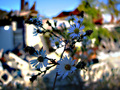
Out of the Rubbleby robbobsaysComment: Back to comment - Well you surely have bokeh going on here but it is so busy that it really takes away from your front image rather than adding to it. It competes with it and overpowers your flowers. The flowers are also a bit on the dark side which doesnt help them against the brighter background. It is visually alot to take in without a primary focus. |
 Photographer found comment helpful. Photographer found comment helpful. |
| 10/28/2006 01:04:19 PM |
Drain Dropsby Conskier2003Comment: Back to comment - On my run through voting I didnt spend much time on this one. Coming back i see that the water is what is in focus and everything else is the bokeh. Unfortunately so much is out of focus that even with the small amount of water in focus it doesnt seem like a main subject. The drain feels like an odd blob among the patterns of the ground and the white right side feels out of place as well. Looking at the picture longer it almost feels like it is vibrating a bit. Overall this just doesnt grab me amongst the other strong images in the challenge. |
| 10/28/2006 01:00:06 PM |
Here and Thereby jandpComment: I guess I am not really sure what the bokeh would be in this shot. The splash seems a blurry but it doesnt really help the image. A bit too busy with no point of focus or area in general that my eye wants to go to. Unfortunately this shot doesnt make me feel much of anything. |
| Photographer found comment helpful. |
| 10/28/2006 12:57:34 PM |
Beautiful Fall Dayby chip_kComment: Well you have background blur which could be considered the bokeh but it really doesnt enhance the picture any. The colors are a bit blah and there arent really any pleasign patterns. The foreground leaves really dont grab my interest as well. A nice yellow color but nothing in the composition makes me feel this is any more than a quick snapshot. |
| Photographer found comment helpful. |
| 10/28/2006 12:55:25 PM |
Alcatraz Behind Barsby Hugs TreesComment: I guess your foreground could be considered bokeh as it is blurred but it really doesnt add anything to the image. If anything it really takes away from your main subject which should be the island. Check out the forums and do a search for "saving for web". There is a great tutorial to show you how to maximize your image size. Took me a couple of challenges to figur eit out myself. |
| 10/28/2006 11:50:02 AM |
A Bloomin' Spannerby PegasusComment: Good use of fiberoptics. They offer a great compliment in color to your wrench. The bokeh is nice and balances out the image well. Maybe kicked down a tad darker overall would be nice. Good combination of two items that really have nothing to do with each other and making it work. A pleasant picture overall. Bumping up 1. |
| Photographer found comment helpful. |
| 10/28/2006 11:46:37 AM |
Beauty & the Beastby sherpetComment: Back to comment - Cool image. Nice sharp focus on the beetle and he offers a great contrast to the rest of the image. The blurred background offers a nice compliment both in colors and patterns. I like bugs so I find this shot to be pleasing with him as the main subject. The frame may be a bit of overkill but I wont let that affect my vote. Bumping up 1. |
| Photographer found comment helpful. |
| 10/28/2006 11:44:14 AM |
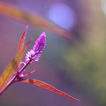
Morning watercolorsby quiet_observationComment: Back to comment - Nice colors and the background blur does have a watercolor type feel with the soft pleasing colors and patterns. You rforefront image does seem a bit soft though in focus and shadow depth. Had this been advanced editing some burning could have helped the flower bud stand out stronger I think. Maybe a elvels or curves adjustment could have helped it pop out a bit more. In general a pleasing shot just maybe not as strong as some of the other images. |
Home -
Challenges -
Community -
League -
Photos -
Cameras -
Lenses -
Learn -
Help -
Terms of Use -
Privacy -
Top ^
DPChallenge, and website content and design, Copyright © 2001-2025 Challenging Technologies, LLC.
All digital photo copyrights belong to the photographers and may not be used without permission.
Current Server Time: 08/19/2025 12:25:56 AM EDT.