| Image |
Comment |
| 03/20/2011 07:53:16 PM |
Favorite blanketby MelethiaComment: So I open this picture and I think to myself "man this cat looks comfy. Way comfier than my cat pic. It just oozes comfy." And then I pull down to look at the comments. LOL! |
 Photographer found comment helpful. Photographer found comment helpful. |
| 03/20/2011 07:51:26 AM |
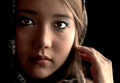
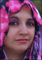
you take my breath awayby curtpetguyComment: Hey Curt. I gave this a 5. The thing that sticks out most about this image is the editing. Multiple issues - it is too soft for my tastes and the softness is not a pleasing type (too much neatimage or the like). That gives a weird feel to her skin and her eyes. There is visible work done to her eyes that comes off as overedited and a bit sloppy. Whites too white (which I myself am often guilty of) and her pupils turning a bit blobby (is blobby a technical term?) A reflector on camera left may have given you some fill to bring out her eyes more naturally a well as the pattern of her veil. I have this craving to see her eyes and lips be a bit more natural and certainly in focus. I do like her gaze and the slight tilt of her head. Overall I think you have a good base image that has been overtaken with a heavy handed edit. I would be interested in seeing the original to see what other options you had. |
| Photographer found comment helpful. |
| 03/19/2011 02:37:59 PM |
E V O N N Eby KristinaGComment: Hey Kristina. I gave this a 7. I find this to be a lovely image. Aspects I liked included nice clean editing with good work on her eyes. The fan offers up a nice pattern without being too aggressive or scene stealing. The natural light is pleasing and your colors are as well. Couple of things that I think could have made this stand out more - I think I would prefer if you had shot a bit above her to make her look up even just a little bit to gain some separation between her pupil and lower lid (which I believe would make her eyes stand out even more). This would also give her a more intentionally looking gaze that could possibly even add to the feel of her hiding behind the fan. From the perspective that are at here she is just looking straight on at the camera - which is not as dramatic. A reflector on camera right would have also offered up a bit of fill to not have that side as much in the dark. And as I look at this image just a bit longer a slight shift in the fan position to make more of a diagonal across her face, letting in more of her face on the left (maybe even the edge of her lips) may have been nice. I think you have a very nice image here and I hope it is scoring well for you. |
| Photographer found comment helpful. |
| 03/18/2011 09:53:23 AM |
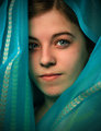
Soft blue stareby markwileyComment: Hey Mark. I gave this a 6. You have some good things going on here. I like that it isn't hyper edited and the pimping you did to her eyes is nice and clean. My tendency is to go borderline overboard and I would have probably done just a bit more sharpening on her pupil to make them pop a bit more (sounds gross that I want her pupils to pop). I like the angles of the scarf. brings a couple of good diagonals in and the patterns on the material bring a cool texture with out being too heavy. A couple of things that I think of that could improve the score on this image. First is the color on your models face. Working with veils (at least in my limited experience) is challenging in that the color and/or tone of the veil is often translated to the skin. What this gives you here is a skin tone around her cheek and jaw that is bluish-green. That can be taken care of in postprocess with various layers and masks. I think that if her skin tones were skin tonish all the way around, this image would be a bit more striking. The other thing (and this is one I have made several comments to on other images) is the angle at which you shot your image. You have a pretty much straight on level look. Had you come from above a bit your model would have had to look more intentionally into the camera and allowed her eyes to stand out even more. Shooting from above would allow more of the whites in her eyes to frame the pupil and then stand out more and possibly make more of a connection with the viewer. If you look at some of Librodos straight on portraits they still tend to have the models face down slightly causing the eyes to have to look up to connect with the camera. Gives them a more intentional purposeful feel to the gaze rather than just an "ok I am sitting here, take my picture " kind of feel. All that said, you have a lovely image here (just checked out your portfolio - is this your 13.5 yr old?) Is it DPC eye candy? Nope. But it is an image that you and your model should be pleased to have - DPC be darned. ;) |
| Photographer found comment helpful. |
| 03/18/2011 08:49:39 AM |
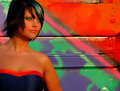
Spring Breakby Luci11eComment: LOL! I am not sure how to get past those two issues though as they are the biggest. I would be interested in seeing the original on this one to understand better where you started from. But let's see what else I can add. I think you are a bit too heavy on bus. Cropping a bit off the right side - maybe just past the vertical line, would give you a better balance in the image. The other things that stand out are the over saturation and smoothness. Sorry - keeps dragging me back. Your model has a good gaze. I would be interested in seeing her maybe looking at me from the same head position. I know Manny has his models looking away often, but the gaze through the camera connecting with the viewer is a strong thing. But really, the issues you brought up are the biggest reason for your score. A different crop and a more relaxed editing hand (and a tweak on her skin tones to mellow them out even if those colors are the natural ones) would get you a different score. You have a very pretty model there and would be good to use her more often if for nothing else than portrait experimentation. |
| Photographer found comment helpful. |
| 03/18/2011 08:38:47 AM |
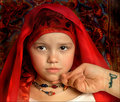
Daughterby HipychikComment: I gave this a 6. Tough when you have a reluctant model. I like the colors and tones that are working in the image. I actually also like that it doesn't feel heavily processed (though I would have probably pimped the pupils at least a bit more to make them a bit brighter to allow that awesome color to shine and be a focal point). The editing may not be the style of Librodo but i think you did your model well in not going to town on the editing. And to be honest the hand coming in to help guide your reluctant model is somewhat endearing and fitting of the tone of the image. Things I wish were different - I wish she was looking at me. It appears that she may be looking at the person who is standing behind the photographer camera left taking cues. The other issue is the tattoo. I dont have an issue with tattoos in general, but in this image it is an attention grabber. I want it to all about the girl and the mom helping the girl. But I can't help but wonder who Damon is and whether or not the person whom that arm belongs to is still with him. |
| Photographer found comment helpful. |
| 03/18/2011 08:20:48 AM |
My Childby KelliComment: Hey Kelli. I gave this a 5. I think you have a couple things missing here that Librodo tends to have in his images. The first is the one that you pointed out - dramatic lighting. The light is pretty flat and dull which is going to cause other issues. That dramatic lighting (both caught and enhanced in postprocess) is going to help create that POP that Librodo images have. Without it your colors come off as drab and your models eyes don't stand out. Which is a bummer because she certainly has lovely eyes - great color that could be enhanced, and you have pleasing base colors in the veil. But the lighting doesn't help to take advantage of that. The other issue that I am having is with the really tight crop. You have presented pretty much a straightforward head shot where a little more room and maybe a slightly different angle (from slightly above to make her eyes a bit more open and intentionally looking) would allow for more flow in the image, that the elements of the image would lead us to her eyes rather than just being around them. Drama. Librodo images capture drama - in lighting, color, connection and flow. And in a challenge with that theme, those are the things that I was looking for. Hope that helps and that I wasn't too harsh. |
| Photographer found comment helpful. |
| 03/18/2011 08:01:47 AM |
Sweet and Delicate by MinsoPhotoComment: Hey Joshua. I voted this image a 6. The good - you have a cute model and you have some pleasing colors surrounding her. The head thingee is a nice adornment that has a Librodo feel to it. The bad - I am not digging certain aspects of the editing. The halo around her head from the blurring doesnt work for me and the burning of your edges to give the vignette takes away from the pleasing purple that you have going on closer to her. I think you would have been fine in keeping it the color it was. I would be interested in seeing this without the vignette and without the blur to see what the background was like a bit more true to capture. The indifferent - you have a very cute model (no issue from me whatsoever in using children in challenges) but I am not getting much grab from her gaze. I am not saying this to rip on your subject, but there is a difference in how people look at the camera. Some people look at the lens and have an appearance of knowing that someone is taking their picture. Librodo's models look beyond the lens and right at the viewer - as though there wasn't a camera there at all but a person they were connecting with(if that makes any sense).That doesn't mean that this image is a failure or a bad picture, but it highlights the true challenge it is to capture and create an image with the magic that Librodo has. That all said, you have a lovely picture of this little girl and I would not hesitate for an instant in getting this printed out at least 11x14 and having it framed to hang in her home. |
| Photographer found comment helpful. |
| 03/18/2011 07:09:49 AM |
|
| Photographer found comment helpful. |
| 03/17/2011 06:02:16 PM |
|
| Photographer found comment helpful. |
Home -
Challenges -
Community -
League -
Photos -
Cameras -
Lenses -
Learn -
Help -
Terms of Use -
Privacy -
Top ^
DPChallenge, and website content and design, Copyright © 2001-2025 Challenging Technologies, LLC.
All digital photo copyrights belong to the photographers and may not be used without permission.
Current Server Time: 08/05/2025 03:58:38 PM EDT.