| Image |
Comment |
| 05/07/2007 09:07:16 AM |
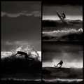
Sunrise Waves by hotpastaComment: Greetings from the Critique Club -
Wow - what were you thinking submitting this image? Did you think you would ribbon with this or something? Oh - wait a minute - you did ribbon? What was I thinking. Oh yeah - I was thinking this was the best shot in the challenge, thats what I was thinking.
What else can I say Enzo. Great work. All three are great images that fit perfectly together. The b&w was a great choice over the color - though the color has its own special charm I dont think it would have scored as well. I have absolutely nothing to suggest to make this better. This shot cuaght me at first glance and I felt bad for every image that came after it in voting cause this was my benchmark. High benchmark to reach thats for sure.
Keep up the great work and congrats once again!
Tim |
 Photographer found comment helpful. Photographer found comment helpful. |
| 05/07/2007 09:02:57 AM |
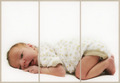
Pure Innocenceby angela_packardComment: Greetings from the Critique Club -
Always happy to pull one of your images. As a single image this is great. Great lighting, nice subtle colors and I like how the outfit just kind of blends into the background. On top of that the look is priceless. A very nice image overall.
As for the challenge I am not sure if its the best choice. You met the challenge with the division into three parts, but I am not sure if thats the best choice for this pic. I would prefer to have this image without the borders and just had baby all to him/herself. I am not sure if I could suggest a way that splitting it into three would have served you better.
Again - very nice image. I really have no issues with any of the technical or artistic choices made. Get rid of the borders and print this baby out.
Tim |
| Photographer found comment helpful. |
| 05/07/2007 08:51:19 AM |
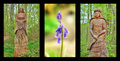
Lord & Lady of Bluebell Woodsby alpharichComment: Greetings from the Critique Club -
Looks like you had a pleasant walk through the woods. Very cool to have statues like this standing along the paths.
Well - you obviously met the challenge and your layout is good. Nice choice to have the statues on either side kind of like guardians.
The colors on the statue images seem a bit oversaturated and a little too fourescent. Toned down a bit to give more of a natural color I think would have been nicer. I havent really done any HDR work but maybe this is a result from that. The colors on the flower and its background bokeh seem more natural, even though the greens are probably the same as the other images.
I think my biggest issue is with the statues not being symmetrical in the frames. It leaves the overall image feeling a bit unbalanced. The strongest image is the center one. Having the other two be more similar woudl have been better bookends for the flower.
That said - your vote spread is pretty tight. Not a stinker of an image for sure but also not a stunner that would have brought you the higher votes. You have an in general pleasing image here and nothing to be ashamed of. Keep on working at it and the higher scores will come.
Tim
|
| 05/07/2007 08:38:24 AM |
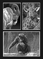
The Zooby moviemanComment: Greetings from the Critique Club -
First off - nice image and great score. You caught and presented 3 cool shots of the zoo animals. The b&w conversions are nice (though I would love to see a color version - even with the issues you had) and the layout is well done.
Not a whole lot I can comment to make the pic better. One thing that I may have done is flipped the giraffe on the horizontal. This would have placed him in a mirror position to the flamingo with his neck coming out of the right corner rather than the left. That may have offered a better balance. But this is just a small thing.
You have nice detail, caught nice poses and have three very different animals pictured. Just a very nice shot overall presented very well.
Not much else to offer you here. Keep up the good work!
Tim |
| Photographer found comment helpful. |
| 05/07/2007 08:20:41 AM |
Footballby marvinComment: Greetings from the Critique Club -
First off - you easily met the challenge. I kind of like the odd framing of them, how they arent all the same or rectangular for that matter. Good way to maximaze your spacing. I found it hard to try and get a proper lineup of my images. Your choice to overlap is a good solution to that issue.
The focus being on the ball is good. The main model between your three images and the distinct color of it stands out well.
Some of the distractions in the image for me are these - the blur is a bit too much. I realize that you are shooting action shots here, but having a sharp focus onthe ball in each image could have made them more powerful. The blues also seem a bit oversaturated. And I think that the lighting on the right hand image needed to be bumped up a bit to be closer to the other two.
This isnt a horrible picture but at the same time it doesnt have the punch that would allow it a higher score. Not alot of high votes but really not alot of the lower votes either. Hope some of this helps.
Tim
|
| Photographer found comment helpful. |
| 05/07/2007 07:46:32 AM |
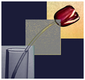
Tulip Triptychby Buckeye_FanComment: Greetings from the Critique Club -
Hi Gayle! Funny that I pull your image to comment on.
Well I will first tell you that I voted a 4 on this in challenge. But I was obviously in the minority on this one. This shot didnt grab me. While it easily met the challenge, the filters used were a bit over the top for my tastes. It felt more like a painting than a picture. Now I can see that you were going for somethign maybe a bit more surreal - just not my cup of tea.
That said - the triptych is laid out well. Good use of the overlapping squares to isolate the parts. The colors in the boxes are nice, though I am not sure if there would have been a better background color than the blue. Hard to give you any feedback on any of the technicals of the shot from a focus, detail point of view as your filters covered up most of that detail.
Now looking down at your other comments I can really see that people connected with your image. 22 comments almost all praising the shot is awesome! And your score is a great gauge as well. This might be a good image to post as a print. You could draw some good attention from it.
Hope some of this helps. Keep up the good work and we look forward to seeing you at Hocking Hills!
Tim |
| Photographer found comment helpful. |
| 05/07/2007 07:34:38 AM |
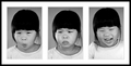
Facial Expressionsby pla2Comment: Greetings from the Critique Club -
Loved seeing this picture come up for me to comment on. I really enjoyed your model throughout the 30 days of portraits and I enjoyed this picture as well. I gave this shot a 6 in challenge. I think there are a couple of things that could have been changed to bring that score up.
You sure caught three nice expressions, but the change in framing on the last image really breaks the flow. The third image has such a strong expression that I think it would have fit better in the middle - even if the alignment of the girl in the image had been the same.
Well - I guess thats it. I think that is the biggest reason your image didnt break 6. The b&w conversion is nice, the frame is pretty cool (maybe a bit thinner on the black outer part) but overall it compliments your images nicely. Nice detail and a really cute girl. This is a just a really nice and pleasing image. Not a whopping stunner to bring you in the higher votes but really nothing drastically wrong either which shows in your tight vote spread. Not alot real high but no real low ones either.
Keep on with the good work. I look forward to seeing your future images!
Tim |
| Photographer found comment helpful. |
| 05/07/2007 05:46:55 AM |
Sunrise Wavesby hotpastaComment: Great work Enzo - this was my fave right of fthe bat. Congrats on the new monster PB and first blue. Reall well done!
PS - I was using Aimees DPC window when I first commented - so now she has to come back and leave you a comment to clean up that empty space below. ;) |
| Photographer found comment helpful. |
| 05/05/2007 02:27:49 PM |
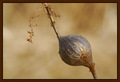
Nature in Actionby SimpaComment: Greetings from the Critique Club -
There are a couple of things that I do like about this image. I like the background bokeh. It has a smooth paint like feel to it and just feels nice. I also like the simplicity of the image. You met the challenge with both the bulb and the off shooting stems falling into the crosshairs of thirds. I think the score you recieved is pretty much fair for the image. because of these two aspects.
I think more could have been done in postprocess. to help bump this up a bit. The subject seems a bit soft in sharpness. By your description it sounds like the only editing done was adding the frame. I almost always use an Unsharp Mask after resizing my images. 95/.5/1 are the settings that I find work best for me in giving my resized image that bit of sharpness back that seems to get lost in resizing. A slight tweak in levels to bring out some of the shadows on th ebulb or to tweak the blacks a bit could have also given the bulb more body. And maybe just a slight tweak in saturation to make the color a bit stronger may have been nice.
And thick borders can be tricky, especially when using color as you did. I try real hard to use the eyedropped tool on the color I want form inside the pic when choosing border color to make sure I have the proper complmenting color. Your border color feels a bit dark in relation to the colors in your image.
Now please let me say that these are just my suggestions based on the types of images that I prefer and how I would edit it based on my tastes alone. I think you scored where it should have against the images that were in the challenge. These types of challenges tend to be along the lines of a Free Study and to get the higher scores you really need an image with strong power and impact.
Hope some of this helps.
Tim |
| 05/05/2007 01:53:21 PM |
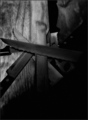
Cross Knifesby JamesAComment: Greetings from the Critique Club -
First off - let me welcome you to the wonderful world that is DPC. I trust that you will find it quite as addictive as I have.
Now to your image. I will be upfront and tell you I voted this a 4. You did meet the challenge with an image of knives but I felt there were some issues with the image that prevented me from scoring it higher.
I guess my main issue is the black corner. It takes up alot of the image, more than I prefer. It leaves the pic feeling unbalanced to me, and to have such a big area with absolutely no detail seems to have no purpose for this shot.
The composition is a bit uninteresting to me as well. I can tell that you set up the knives but the pattern or rhyme isnt flattering. They feel arranged but again with no purpose. There isnt a focal point with the knives or a center of interest.
Overall this picture is just there. It doesnt grab my attention or make me want to look longer.
Let me say that my first entry (first four actually) were all sub 5 scores. They stunk real bad. But I took my time, studied winning images, learned how to process and over the past year my results have changed. You have come across a great place to learn and suck information. Look over past winners, read their descriptions, read the how to threads and ask people questions. Don't be bummed out by a low scoring first image but look at it as your bench mark. Pay attention to what does well and try to implement that into your style. And most of all have fun here. This is a great place to play.
And again - welcome to DPC!
Tim |
| Photographer found comment helpful. |
Home -
Challenges -
Community -
League -
Photos -
Cameras -
Lenses -
Learn -
Help -
Terms of Use -
Privacy -
Top ^
DPChallenge, and website content and design, Copyright © 2001-2025 Challenging Technologies, LLC.
All digital photo copyrights belong to the photographers and may not be used without permission.
Current Server Time: 08/23/2025 06:08:09 PM EDT.