| Image |
Comment |
| 06/20/2007 12:11:41 PM |
Keeping Watchby jeannybeanyComment: To make this work, the bird and the pole should be really sharp, else they do not attract the eye.
I found out that side-lighting early or late in the day is great for birds, it enhances their graceful shape.
Just my 2 cents, because I like your idea. |
 Photographer found comment helpful. Photographer found comment helpful. |
| 11/16/2006 04:28:00 PM |
|
| Photographer found comment helpful. |
| 11/16/2006 04:25:58 PM |
Hold On To Your Hat! by scalvertComment: Cool! Very creative. The cloud background works well. I know I ask a lot, but if this propeller could turn somehow, I'm sure you're picture would ribbon. The colours seem to be oversaturated. |
| Photographer found comment helpful. |
| 11/16/2006 04:01:59 PM |
Homemadeby carotop111Comment: This highly colourfull hat is a great idea and looks gorgeous on the black background. The purple towel however is to prominent and spoils the main subject, IMHO. |
| Photographer found comment helpful. |
| 11/15/2006 08:31:28 AM |
Caught a Glimpseby KelseeComment: Unsharp foregrounds are usually a bad idea and should in any case take less of the picture's surface. |
| Photographer found comment helpful. |
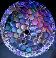
| 11/15/2006 08:24:30 AM |
Abstract Spotsby SaraRComment: Very nice colours, great idea. I think that if you would have cropped it more, in order to have only the pattern of circles, with half circles at the borders, it would look much more interesting. This glass ring, or whatever it is, spoils the abstraction, IMHO. |
| Photographer found comment helpful. |
| 07/23/2006 11:01:54 AM |
Focus on Greenby MistyMuckyComment: I don't agree with people telling me that the picture would be better without the poppy, it would be boring.
I know that it's disturbing to have unfocused stuff in the foreground, but I thought the title would compensate for it.
I like it! |
| 06/07/2006 04:12:25 AM |
|
| Photographer found comment helpful. |
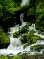
| 06/07/2006 03:59:13 AM |
Olympic Rainforest by ZoomdakComment: Nice composition. Regrettably, the green is way too oversaturated and looks very unnatural. |
| Photographer found comment helpful. |
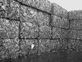
| 05/30/2006 08:09:05 AM |
Failing to Withstand the Stormby spistoleComment: In this kind of shots, it looks wrong when objects from the foreground and background merge (second and third pillar from the left). It breaks the feeling of depth. By changing a bit the angle and with a better lighting (early morning or before sunset) it could ribbon. Just my 2 cents. |
| Photographer found comment helpful. |
Home -
Challenges -
Community -
League -
Photos -
Cameras -
Lenses -
Learn -
Help -
Terms of Use -
Privacy -
Top ^
DPChallenge, and website content and design, Copyright © 2001-2025 Challenging Technologies, LLC.
All digital photo copyrights belong to the photographers and may not be used without permission.
Current Server Time: 08/04/2025 07:31:08 PM EDT.