|
|
| Image |
Comment |
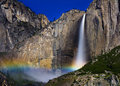
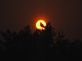
| 07/08/2011 11:50:07 AM | Night Time Moon bowby mgarsteckComment: Congratulations on the 5th place! A pity it did not ribbon IMO.
By the way, there's a similar picture which won the 1st price of the Outdoor Photographer contest (see July 11 issue), but yours is better. |  Photographer found comment helpful. Photographer found comment helpful. |
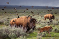
| 07/03/2011 03:20:39 PM | The Family Rush by AllenPComment: It's exactly the type of wildlife shot which feels alive and puts the viewer right there. Therefore quite worthy of the National Geographic! The birds' motion blur does it for me. The lighting is also great. Just the composition feels a bit wrong, I guess not enough space in front of the calf. | | Photographer found comment helpful. |
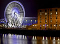
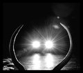
| 02/03/2011 03:28:15 PM | Fanning the Dock.by Jon_HComment: Greetings from the Critique Club :)
First impression: WOW
Technically, it is flawless, absolute perfection! Your exposure is fantastic, giving a gorgeous motion blur to the wheel and the river, and the lighting is spot on. It is sharp with no visible noise. To make a long story shot: it has a very professional look.
The subject is obviously well chosen. Spinning is the essence of a wheel, etc. It was a great idea to include the building on the right. It gives an interesting contrast between new and old, which tells a story about Liverpool. The river helps to locate your subject, but I would have liked your photo just as well without it, leaving just the docs as a base.
The composition is good, but from a point of view of pure design, there is maybe a tad too much going on. There are a lot of shapes: circles, rectangles, lines, stars, curves,... Plus two strongly contrasting warm and cold color tones, also those do reinforce the old/new contrast.
Anyway, my warmest congratulations for your well deserved ribbon!
If you have a question or a remark about this critique, feel free to contact me.
Mike
| | Photographer found comment helpful. |
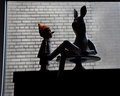
| 01/22/2011 05:31:41 AM | Driving visionby photomad_2007Comment: Greetings from the Critique Club :)
First impression: not very appealing harsh background
By looking at it much longer, I still do not fall in love with your tones. The lighting on the skin and hair looks fine and the colored diffraction pattern in the eyes is a plus. But most of the surface is this imperfect harsh white, with an ugly yellowish vertical streak. The top right blue-grey triangle just destroys the strong contrast, that's certainly no added value.
The mirror gives a nice frame within a frame for the portrait. The eyes are very close to the border, which draws a lot of attention on them and creates a tension in the picture. I guess that is your concept of out of balance. But the mirror itself is placed where you would expect it on a windscreen (they are also always a bit tilted), meaning that the rest of the composition is quite traditional. Therefore I wonder if you did not get some DNMC votes.
Sorry for sounding rather negative. I like a lot some of your photos and the way you think about them.
If you have questions or remarks about this critique, feel free to contact me.
Mike |
| 01/18/2011 05:27:51 PM | Tall talesby mariucaComment: Greetings from the Critique Club :)
My first impression: Boring subject, interesting lighting.
The angle of view is well chosen for these little guys. It does also sustain your idea of a conversation you have run into by surprise. The low key lighting is elegant and gives shape and depth to your subject, definitively the strong part of this picture. The focus is perfect, there is nothing to object technically.
The composition from a point of view of design is not so strong. There is a framing of the subject by the window frame and the base, but the effect is completely lost by the open space in the bottom left corner, which draws the eye out of the picture. I think that cropping the left part and leaving a "filmstrip" framing would be more effective. There is a good contrast between the dark foreground and the light background. High contrast is usually a good thing, but here it does draw the attention to the smudged part of the tiles on the right, weakening the great pattern of the bricks.
I love the little stories that come with your pictures. In a blog for instance this photo would be acclaimed by most viewers. In such a context you would deserve by far a higher score. But on DPC it's the first impression which produces the score, you can already forget the title. Trivial subjects (cannot be bothered to get out of her flat type) can do well, but they usually get battered for the slightest flaws, which would not even be considered with another subject...
Anyway, keep on the good work and occasionally you will produce a very successful mainstream picture by mistake ;-)
If you have a question or a remark about this critique, feel free to contact me.
Mike
| | Photographer found comment helpful. |
| 01/07/2011 01:59:24 PM | Sunsetby sarawagidkComment: The alignment of sun and bird look amazing, well done! But would it not be better after cropping a lot of the empty space and slightly off-centering? | | Photographer found comment helpful. |
| 01/06/2011 05:08:08 PM | Mr. Buck's Last Memoryby mefnjComment: Incredibly effective composition, should go straight in a textbook. Works well because of the humor! My favorite so far. | | Photographer found comment helpful. |
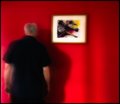
| 05/29/2010 06:36:55 AM | Paintingby rooumComment: Brilliant way of taking the picture of a painting without losing the photographic interest. I love it! | | Photographer found comment helpful. |
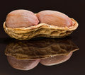
| 05/26/2010 02:41:20 PM | Arachis hypogaeaby andrewtComment: Great close-up, I like the impressive amount of detail and the color tones. The symmetry of the composition is a bit disturbing, I would not have included the full reflection. | | Photographer found comment helpful. |
| 05/03/2010 03:00:31 PM | Conscience Decisions by jasonlpriceComment: LOL I love her expression. Some fun, that's the spirit of this challenge! A pitty for the sharpened stuff on her skin. 9 | | Photographer found comment helpful. |
Home -
Challenges -
Community -
League -
Photos -
Cameras -
Lenses -
Learn -
Help -
Terms of Use -
Privacy -
Top ^
DPChallenge, and website content and design, Copyright © 2001-2025 Challenging Technologies, LLC.
All digital photo copyrights belong to the photographers and may not be used without permission.
Current Server Time: 08/01/2025 10:40:30 PM EDT.
|