|
|
|
Showing 311 - 320 of ~893 |
| Image |
Comment |
| 02/11/2003 05:51:00 PM | emotional distanceby jurasComment: Critique Club:
Meets the Challenge: I would say very well, not only peppers but food still lifes would be to me a photography cliche!
Composition: Excellent, fairly good use of thirds, the stem kind of leads to the yellow one in the background. Like the variety of focus and "pose" of the other pepper. The black background works well against the intense colors of the pepper.
Technical quality: Good use of DOF, colors very natural and intense, sharpness in the foreground pepper is excellent. No post-processing issues noticeable. I, too, use black posterboard and hate the way it looks like grain, but fabric gives me a prob. too, so don't mind this in the photo. The lighting is great and adds a bit of mood to the photo.
Creativity: Good use of a rather common subject, especially with the lighting and DOF to add interest.
Conclusion: Very nice photo meeting the challenge well. Very well executed, I would have given it more like a seven, it's a shame so many nice photos end up in the "average" range when they are really above this (at least in MHO).
Feel free to email me with any questions or comments! |
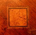
| 02/09/2003 11:36:45 PM | Inlayby PtmanComment: Critique Club:
Meeting the Challenge: Great job of this
Composition: I prefer a non-centered focal point, but this symmetrical (sp?) design seems to work fine for this shot. I might have cropped just a little bit closer to avoid that white spot at the top that distracts me a bit.
Technical Quality: You caught the grain, dings, and warmth of this wood extremely well! I like the way the age shows in this wood. For some reason, the right side seems a bit less focused than the left, even with your 8 aperture. Likely due to the macro nature of the shot?? No post-processing problems noted. This is a good looking shot for as long as it was exposed.
Creativity: If this wood hadn't been so weathered, you would have had a very dull shot. Nice use of an otherwise likely boring subject. Even if this was the only thing you could find to shoot, it's a very interesting shot to me.
Conclusion: Interesting shot with good technical quality, and tons of warmth and character.
If you have questions, please email me! |  Photographer found comment helpful. Photographer found comment helpful. |
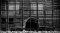
| 02/09/2003 11:19:53 PM | Reflectionsby imagesloyolaComment: Critique Club:
MEeting the Challenge: I think you did an excellent job of this. I do not mind the distorted squares behind the windows a bit, in fact love the way they repeat the theme.
Composition: This is adequate. The light bushes at the bottom give me a sense of perspective and gives the shot a bit of added contrast and a feeling of stability. I think I would have cropped this up a bit differently, but due to some distortion it was a difficult shot to crop. I do like the arch reflected not being on center.
Technical Quality: As noted by others, the slant to the windows at the top bothers me a lot and seems to be a technical problem caused by the positioning of your camera. Maybe a slight lightening up would have also helped or a levels adjustment to lighten up your midtones.
Creativity: Excellent! I love this idea!!
Conclusion: Nice shot, needed some techical help, really liked the way you captured these cool distorted squares within the window squares.
If you have any questions, please feel free to write me!! |
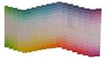
| 02/09/2003 11:10:56 PM | Squared Rainbowby freakazoid252Comment: Critique Club:
Meeting the Challenge: I had a very difficult time figuring out where the squares were, but I am guessing that they are in the folds, or right in the middle of the strips.
Composition: Very interesting.
Technical Quality: This looked to have been a very difficult shot to execute due to the writing on the strips. What is leftover to be visible is distracting. The shot could be sharper. The lighting made this shot interesting.
Creativity: This is the strong point of this shot (IMHO). How anyone could make a bunch of paint strips interesting is a real tough challenge in itself.
Conclusion: A great idea, tough shot, could have been better with improved technical changes. |
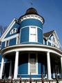
| 02/09/2003 11:03:12 PM | The Blue Houseby boyte1Comment: Critique Club:
Meeting the Challenge: Well done!
Composition: Very good, I like the crop, even if some below don't agree! You took this at a very nice angle, accentuating the heighth of this old house, and the capture on a clear day helped bring out the blue in the home. The repeating circles and straight lines are nice, and even though I'm not crazy about the shadow on the porch, it emphasizes that nice round roof.
Techical Quality: Very good. The only thing I might have done differently is to have tried to get this on a partly cloudy day or when it was backlit if possible so that the shadows wouldn't be so pronounced. Very nice DOF, very clear shot with no noticeable post-processing issues.
Creativity: Good, as said before, really like the way this house towers into the sky due to the angle of the shot. Maybe not the most unique shot in the challenge, but still nice on the eyes.
Conclusion: Very well done photo, can't say much more. Except to ask if this is in Pine Bluff, AR??? I'm an Arkansan(Jonesboro) and noticed this city name on your comments.
Hope this helps, email me if you have questions. |
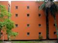
| 02/09/2003 10:52:35 PM | Squaremaniaby pikytoComment: Critique Club:
Meeting the Challenge: Excellent job of this!
Composition: I wonder what this had looked like with only one window as a focal point with maybe that window on the left framing it? It is difficult to understand the photo without knowing the challenge. I do like the use of contrasting colors. Might have cropped out the top due to the "hot" lighting up over the roof. Although the group of square windows are somewhat framed by the other things in the photo. I do like the repeating patterns with the windows somewhat.
Technical Quality: The lighting is a bit uneven, the bottom bush a bit out of focus (windy day maybe?). No grain or post-processing problems noticed. Fairly clear shot overall.
Creativity: Interesting idea for the challenge, although no real outstanding creativity seen in the shot.
Conclusion: Well done photo, meets the challenge, may have used a little more energy/mood qualities to increase interest.
Hope this helps@! If you have questions, do not hesitate to p-mail me.
|
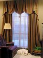
| 02/09/2003 10:41:54 PM | New Curtainsby Frank BeckmanComment: Critique Club:
Meeting the challenge: Well done here!
Composition: The window is definitely the focal point, with the dog and furnishings as add-ons to complement it and give the photo some bottom weight and framing. I am not wild about focal points being in the center, so might have wanted to see this a bit more off center for interest. I also am not sure if I like the way part of the top of the curtain was cut off, and part is visible. Might have also cropped out the image on the right. The dog helps add warmth and gives it a nice "someone lives here" look. There is a nice use of compimentary colors in teh composition with the sheers having a purplish red cast, and the rest more of a yellow green color.
Technical Quality: No post-processing problems, no grain, no .jpg artifacts, no out-of-focus noticed here. Very nice use of lighting.
Creativity: Not the most creative shot in this challenge, but would have made a nice magazine ad!!
Conclusion: Nice photo, not a lot of "wow" factor, but very pleasing to the eye and well done. Congrats!
Hope this helps!
|
| 02/03/2003 12:58:58 AM | The Sanctuary by RackatComment: A great shot for another ribbon! Congrats. No 3's or under, that's a statement in itself! |
| 02/03/2003 12:54:11 AM | Helical Illumination by crabappl3Comment: I first looked at this as a thumbnail and thought it was a woman's necklace!! Concrats on your win with a beautiful image. | | Photographer found comment helpful. |
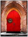
| 02/01/2003 12:40:23 PM | Church Doorby jodiecostonComment: Very nice, I like how this church door has the wreath to break the monotony of the composition of a centered subject. | | Photographer found comment helpful. |
|
Showing 311 - 320 of ~893 |
Home -
Challenges -
Community -
League -
Photos -
Cameras -
Lenses -
Learn -
Help -
Terms of Use -
Privacy -
Top ^
DPChallenge, and website content and design, Copyright © 2001-2025 Challenging Technologies, LLC.
All digital photo copyrights belong to the photographers and may not be used without permission.
Current Server Time: 08/10/2025 12:58:16 AM EDT.
|