DPChallenge: A Digital Photography Contest You are not logged in. (log in or register
 
Browse Settings
Currently viewing:
Registered UserDirt_Diver

Show comments:

Per page:

Order:

Comments:


Comments Made by Dirt_Diver
Pages:   ... [108] [109] [110] [111] [112] [113] [114] ... [369]
Showing 1101 - 1110 of ~3687
Image Comment
Tabby Cat
03/03/2008 02:53:34 PM
Tabby Cat2nd Place
by yanko

Comment:
Hey WTG man. I knew this was a good shot.
Photographer found comment helpful.
The bridge
03/03/2008 08:28:58 AM
The bridge
by pellemannen

Comment:
Greetings from the Critique Club :)

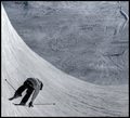
Let me start by saying that I like this picture. I like your other leading lines one better but this has a smooth feel to it. I think what may have dinged you was the fact that at the end of you’re leading lines you have a building that basically stops the lines. They do how ever LEAD you to the building but I think the people here on DPC expect the lines to lead off into the distance of a nothingness blur of a lake or a snowy top mountain. For the other few hundred people that take leading lines pictures, we come up with something like this.

Over all lighting of the picture is kind of dark. I think your aperture is a little low and should have been some where higher than F/10. While doing this it would allow more light to come into the lens and it would also create a little blur in your distance. Another thing that really catches my eyes in this picture is the fact that there is a LOT going on. I would normally tell people to look at the 1st place entry to see why theirs is so different but in this case I don’t think the 1st place entry has a leading line in it and to be honest I don’t think it meets the challenge, but that’s another story.

One thing you really want to do when shooting something like this is to make sure that you watch for other things around the camera. I see power lines, lights off both sides of the bridge, looks like maybe a house on the left side. Just make sure that you see these things before you actually shoot there. Would have it been any better or worse if you lowered the camera, or shot this from the other side of the bridge? Could you have improved the shot if you shot it during sun down or sunrise?

I see that you edited the picture in Lightroom. One thing about making black and whites in LR is you can really turn out some pretty cool pictures. Google the keywords “Lightroom, B&W” and see what comes up. I actually found some really cool How-to’s and I was able to do a lot with Lightroom.

If you have any questions I will be glad to answer them for you. If you don’t understand something I said please feel free to contact me for that as well. If you think this comment is helpful please mark it so, if not please let me know why it wasn’t.

Thanks and good luck.
~Joe~
Photographer found comment helpful.
SMILE
03/02/2008 09:05:53 AM
SMILE1st Place
by ZeppKash

Comment:
OMG this is so funny. I love it.

Just came back because I think this is just so cute.
10 from me
Misunderstanding Gravity
03/01/2008 10:08:39 PM
Misunderstanding Gravity
by JimiRose

Comment:
Greetings from the Critique Club :)

Overall I think this image is a good one but with some planning and a little editing it could have been better. Let’s start with planning.

I think that what you wanted to show here was the fact that the skier is in the air and Gravity should be pulling him down any minute right? Well with a little more planning you could have really captured him a bit more in the air or maybe shot it from a different angle to really make him stand out and show the height or empty space between him and the ground.

Lighting:
IMO the photo is a bit under exposed. I see that you processed it Photomatix but I'm not really sure why. Reason I say this is Snow is a very white and reflects light very well. Shooting snow is much like shooting the sun, (in some cases). For this one I think it’s possible that you’re camera settings were a little off. I can see why you shot at ISO 100 but to allow a little more light I would have shot at ISO 200 or even higher and slowed the shutter down some.

Another thing you could have done if you didn’t was over expose the photo and actually create an HDR image from the NEF file. Anyway IMO the over all photo should have been a little brighter.

I’m also having a hard time seeing how our camera shot this and the BG was still in focus at F/5.6, I think I would have blurred the BG and try to get rid of some of the other trails. IMO this would have really put more focus on the skier and make me spend more time looking at him instead of everything else in the BG.

If you have any questions or comments feel free to PM me.
Photographer found comment helpful.
Mis Standing.jpg
03/01/2008 07:09:00 PM
Mis Standing.jpg
by sigfusson

Comment:
See... MUCH better. I think this would have done so much better in the challenge had you adjusted the light. Good work!!!

~Joe~
What's A Conundrum?
03/01/2008 12:07:26 AM
What's A Conundrum?
by sigfusson

Comment:
Greetings from the Critique Club :)

Okay let me start with first impressions...
When I first look at this image the first thing I see is the lighting or the lack of lighting I should say.
Not sure what you used for lighting but it's just not enough light.

After reading all your comments I see that everyone said the same thing. What you might want to try is using some sunlight in the morning or later in the evening to allow a soft glow of light. If you used the light in the middle of the day it would give you a very hard harsh light creating shadows that make some really weird objects sometimes. For a long time I shot outside until I got some lighting and used towels and sheets for backdrops.

Over all the idea is good and the expression is wonderful. You really do look confused. Keep those great ideas coming.

~Joe~
Skirts Only?
02/29/2008 11:58:50 PM
Skirts Only?
by eos5d

Comment:
Greetings from the Critique Club :)

I'm not exactly sure why you wanted this critiqued but I'll do it. After scoring 11th place I'm sure you're pretty pleased huh? I mean after all this is your first entry and ummm well you did pretty good.

Overall the image and content fairly good. I can see where the confusion of which bathroom to use comes in.

I personally liked this image and thought that it would do much better than what it did. You're creativity will do you very well here on DPC and I am looking forward to seeing what else you will push out.

Because you were inside and lighting isn't usually all that well you might want to try and watch the B&W conversions using ISO400. That is why you have so much Image grain.

All in all, I have to say congratulations on such a wonderful finish on your fist challenge.

~Joe~
Difference of Opinion
02/29/2008 11:52:23 PM
Difference of Opinion
by Jacques123

Comment:
Greetings from the Critique Club :)

I'm not exactly sure why you wanted this critiqued but I'll do it. After scoring 10th place I'm sure you're pretty pleased huh?

Overall the image and content is good. I think what got you was the slight motion blur on your shirt collar, ear and hair. If the image was overall sharp and in focus I defiantly think you would have done much better.

Oh and for fake blood, next time try using karo syrup with red food dye in it.

Good work and congrats on getting a top 10.
Fork Handles?
02/29/2008 11:07:17 AM
Fork Handles?
by menele

Comment:
Greetings from the Critique Club :)

Well I do not know who Ronnie Barker is but like pineapple said I'm sure that he would have been proud of you.

As far as the image itself goes, you were right about the lighting. The mismatch lighting doesn't help this image. To fix it, you should have closed the blinds on the window or turned off the house light. If you like using ambient light from outside and you are shooting inside I might suggest the light bulb "Daylight". It has the exactly what you are looking for to give you that perfect indoor/outdoor lighting.

I personally don't use Neat image but know a lot that do. From the looks of it you may have applied too much to try and smooth out the background. A good helpful hint for blurring the background is to pull your subject away from it. This is called Depth of Focus or "DOF" for short. The further the subject is from the background the blurrier it becomes thus creating a sharper subject image.

I'm also seeing a bit of blurriness on the paper that you're subject is holding. This is caused by the slow shutter speed. Try shooting at ISO 200 or higher while indoors so you can have a faster shutter speed. You might also consider using the flash or a soft box to increase lighting.

Over all, the entire image is fairly good. After all 26th out of 74 isn't bad at all if you ask me. And I can see how 4 candles can sound like fork handles. Good work on coming up with the idea for the image.

~Joe~
Photographer found comment helpful.
SH100060a.jpg
02/28/2008 10:24:16 AM
SH100060a.jpg
by ZeppKash

Comment:
That looks dangerous, hahaha
Pages:   ... [108] [109] [110] [111] [112] [113] [114] ... [369]
Showing 1101 - 1110 of ~3687


Home - Challenges - Community - League - Photos - Cameras - Lenses - Learn - Help - Terms of Use - Privacy - Top ^
DPChallenge, and website content and design, Copyright © 2001-2025 Challenging Technologies, LLC.
All digital photo copyrights belong to the photographers and may not be used without permission.
Current Server Time: 06/25/2025 03:28:45 AM EDT.