| Image |
Comment |
| 04/07/2003 08:23:24 PM |
Kids Colorsby vtruanComment: I like the idea for this picture but there are a few things that are taking away from an otherwise strong photograph. I would have liked it better if none of the letters were flipped over and if the light was softer. These two problems are easy enough to fix. To make the light softer you can place a piece of tissue over the flash to diffuse the light some. You could also try it outdoors in natural light. I think you might have left some upside down so we can see that they are magnets but for me I would like tem all to be right-side-up. The other thing that seems to be detracting from this photo is the cropping. I would have completely cropped away the drawer so it is only letters. I think that with a little more work here this one could be a prize winner. The way it is now I give it a 4.
Greg
|
 Photographer found comment helpful. Photographer found comment helpful. |
| 04/07/2003 08:16:56 PM |
Winter flowersby ursulaComment: I love the pastel colors here. Are those flowers made of glass? They have a very nice texture to them, especially the purple one. Overall I think the composition is nice but the crop might be a little tight for me. I would give it a little more negative space on the top and to the right. I enjoyed looking at this one and gave it a 6.
Greg
|
| Photographer found comment helpful. |
| 04/07/2003 08:14:17 PM |
Primariesby ruthiekComment: I like the use of color in this picture. The colors are very bold and I like the simplicity of the picture. The color totally makes this picture. I think the composition might be stronger if you offset the blue lines a little more. I wish the lines were a little sharper but it is only a minor thing. I like it and I gave it a 5.
Greg
|
| Photographer found comment helpful. |
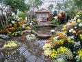
| 04/07/2003 08:09:39 PM |
Japanese Gardenby lykofosComment: I like all the colors in this picture but I think you might be running into resolution limitations here. This is a picture that contains a lot of detail and the limited resolution we are given to work with eliminates a lot of the detail. This lack of detail really takes away from the impact of an otherwise great picture. The way it is now the picture looks too busy. I think the composition looks good and I think you have done a good job considering the difficult nature of the subject. I am giving this one a 5.
Greg
|
| Photographer found comment helpful. |
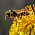
| 04/07/2003 08:05:31 PM |
Yellow by miracComment: This is one of my favorites for this week. I love the use of color and I really love the subject matter. Whatever lens you used for this one has great bokeh. The DOF looks pretty good on this picture but it might be better if you had just a little more (maybe 1 stop smaller on the aperture?). The reason I say that is that the antennae look soft to me but the body looks great. I don�t know what the rest of the picture looked like but it might be nice if you left a little more open space on the left side of the picture. I gave this one an 8.
Greg
|
| Photographer found comment helpful. |
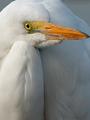
| 04/07/2003 08:00:48 PM |
Great Egret Beak'on of Colorby progersctComment: This is the kind of picture that I love to take. You must have a pretty long lens to get one this close. The focus looks a tad soft to me, I am guessing you might have hand-held the camera when you were taking it. It would be nice if you could have made the picture a little bigger (like 640x480 resolution) so we could see more detail. The orange really stands out due to the lack of color in the rest of the photograph. You might try boosting up the saturation a little and adding a bit of contrast. I have found that upping the contrast can sometimes make a slightly un-sharp picture look sharper. As far as composition goes I would like it better if the crop wasn�t so tight. As it is right now the picture �feels� somewhat cramped. I especially find the way the beak is touching the edge of the picture disturbing. I think you have a great start here and with a few minor modifications you could really have a high-quality picture here. I am giving this one a 5.
Greg
|
| Photographer found comment helpful. |
| 04/07/2003 07:55:47 PM |
Candles in the darkby DrakeComment: I like your use of color here but I wish the darker colored candles showed up a little better. I can barely see the color in the green, red and blue(?) candles. I like the way the flames have those halos(?) around them. That is a cool effect. I think that a little lighting from somewhere behind the camera to one side might help this picture. I think it would bring out the color of the darker candles and allow the table to show up a little so they don�t appear to be floating in mid-air. Overall I like the composition but I might have given a little more space on the top. I think this is a strong picture and I am giving it a 6.
Greg
|
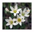
| 03/20/2003 12:03:53 AM |
Weedsby one66stangComment: I love to take pictures like this one. In fact this looks very similar to some I took over the weekend. Overall I think you did a good job here. It might have been better if you had clipped off the one closed bud in the background and went for a little less DOF. The grass in the background is a tad distracting. |
| Photographer found comment helpful. |
| 03/10/2003 12:20:44 AM |
What came first?by ParentxComment: What a rip-off. I guess there are too many uptite people in here, I fully expected this pic to get 1st place. GREAT PIC! I was laughing about this one all week long. It is the one pic that really stood out for me.
Greg |
| Photographer found comment helpful. |
| 02/24/2003 01:48:33 AM |
|
| Photographer found comment helpful. |
Home -
Challenges -
Community -
League -
Photos -
Cameras -
Lenses -
Learn -
Help -
Terms of Use -
Privacy -
Top ^
DPChallenge, and website content and design, Copyright © 2001-2025 Challenging Technologies, LLC.
All digital photo copyrights belong to the photographers and may not be used without permission.
Current Server Time: 08/20/2025 06:58:06 AM EDT.