| Image |
Comment |
| 12/18/2003 11:13:25 PM |
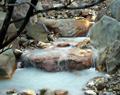
Winter Creekby Firstrich1Comment: The water color looks a bit unnatural, but the saturation looks pretty good on the grass and the foliage. I think toned down a little (color), this would be a great shot. -7- |
 Photographer found comment helpful. Photographer found comment helpful. |
| 12/10/2003 12:10:28 AM |
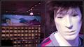
48 Months of Debt Smiling at Meby MaverickComment: Thanks for the comments. I'm not sure I understand the lack of sharpness comments, it looks sharp to me. That said, this is pretty much the vote I expected. The grill is stock, actually.
For a college student with only a co-op (similar to an internship) for income, a new car is a big investment. The car is my "baby" ; ) So far I'm very happy with it. |
| 12/04/2003 11:34:01 PM |
Prospectingby AntithesisComment: Where is the prospecting? Having someone panning in the river would do well to tell the story without the title here. It is a lovely scene, but depends completely on the title to relate to money. |
| 12/04/2003 11:31:02 PM |
Spend Here!by melongrindComment: I like the idea of taking a picture of a shop window, but there really isn't much of interest in this window. It looks like a shoe store based on the background, - a more glamorous (ie, pricey) store window might get the point across a little better. |
| 12/04/2003 11:28:44 PM |
Rebusby jvanderauComment: lol, very interesting. creative interpretation of the challenge. Seems a little low in contrast, maybe playing with levels and such would give more life to the subjects. |
| Photographer found comment helpful. |
| 12/04/2003 08:27:04 PM |
handsby protectorComment: I'm not sure about the challenge connection, I'm guessing it is about marriage or a proposal in some way? If that is the case I think a ring (in color against the bw background) would be necessary. Regardless of the challenge topic, I like this image. I'm not sure if you have heard of the band "Fuel," but they're newest CD (Natural Selection) has cover art that this reminds me of. |
| 12/04/2003 08:22:57 PM |
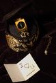
The "spell" of moneyby RonBComment: I haven't heard of a few of those, but I'll take your word for it = )
Nice idea, the exposure is just right imho, although it seems slightly out of focus in the lower left, might be just my eyes. |
| Photographer found comment helpful. |
| 12/04/2003 08:20:21 PM |
Material Girlby RiderGalComment: Nice idea, I think I would include a little more light, or a different colored background - It matches the camera case, but the two seem blend together and are hard to distinguish - this is really only a slight issue though. Cropping is well done and the subject conveys the topic well. -7- |
| Photographer found comment helpful. |
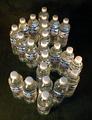
| 12/04/2003 08:17:58 PM |
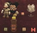
Water.... Who'd A Thunkit !by DrakeComment: I like both the idea and the meaning behind it, but I think the exposure could be done better. The lighting is such that it creates faint shadows - If they were either more prominent or non-existent it would create a stronger effect. The lighting also seems to be throwing off the white balance. I think the setting for the bottles is fine. With different lighting, I think this could be a very good picture. |
| Photographer found comment helpful. |
| 12/03/2003 09:53:47 PM |
|
| Photographer found comment helpful. |
Home -
Challenges -
Community -
League -
Photos -
Cameras -
Lenses -
Learn -
Help -
Terms of Use -
Privacy -
Top ^
DPChallenge, and website content and design, Copyright © 2001-2025 Challenging Technologies, LLC.
All digital photo copyrights belong to the photographers and may not be used without permission.
Current Server Time: 07/28/2025 11:13:59 PM EDT.