| Image |
Comment |
| 01/30/2008 06:58:20 PM |
"Solid Foundations"by negativeComment: Nice! And thinking outside the box. While I like the high-contrast B&W, I almost want to see a little color in the coffee and/or a bright colored mug. |
 Photographer found comment helpful. Photographer found comment helpful. |
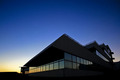
| 01/30/2008 06:54:40 PM |
Fadingby ReM_FrComment: Very simple... beautiful sky... and you used the perspective to your advantage. |
| Photographer found comment helpful. |
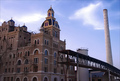
| 01/30/2008 06:52:59 PM |
What Was Will Beby SandyPComment: I think there is so much interesting architecture on that building that you could have gone closer and left out the uninteresting smokestack and dead-end walkway. It feels busy yet there's so much negative space. |
| Photographer found comment helpful. |
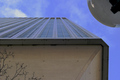
| 01/30/2008 06:47:43 PM |
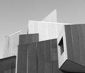
beneath a skyscraper by gcswannyComment: For me, the light globe actually hurts this composition -- on one hand it fills in the corner and creates more consistent breathing space around the building, but on the other hand the rounded line detracts from the stark, straight lines. |
| Photographer found comment helpful. |
| 01/30/2008 06:43:41 PM |
|
| Photographer found comment helpful. |
| 01/30/2008 06:42:36 PM |
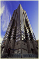
P I N N A C L E by ericwooComment: Cool ... symmetry and isolation really work when dealing with this much perspective! A building this tall pretty much has to be in the center to avoid looking like a certain tower in Pisa. |
| Photographer found comment helpful. |
| 01/30/2008 06:40:29 PM |
Gotham Cityby SaadComment: Great lighting and colors, though seems a bit soft. Darn cranes... |
| 01/30/2008 06:38:45 PM |
|
| Photographer found comment helpful. |
| 01/30/2008 06:35:52 PM |
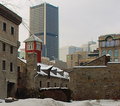
Overshadowing Historyby codfishComment: Creates an interesting atmosphere. I might have desaturated the blue-green range to get rid of that color shift around the skyscraper at the expense of less color in the glass windows. |
| Photographer found comment helpful. |
| 01/30/2008 06:31:12 PM |
|
Home -
Challenges -
Community -
League -
Photos -
Cameras -
Lenses -
Learn -
Help -
Terms of Use -
Privacy -
Top ^
DPChallenge, and website content and design, Copyright © 2001-2025 Challenging Technologies, LLC.
All digital photo copyrights belong to the photographers and may not be used without permission.
Current Server Time: 08/20/2025 09:39:46 AM EDT.