| Image |
Comment |
| 11/23/2006 01:10:30 PM |
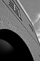
Archby MeGoobieComment: The posted picture is too small. Next entry use the largest size allowed by DPC. |
| 11/23/2006 01:01:43 PM |
Romaby unicumComment: I like the grundgy feel of this picture. |
 Photographer found comment helpful. Photographer found comment helpful. |
| 11/23/2006 12:55:18 PM |
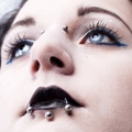
Emmieby coldaComment: Ok, I've seen all the piercings before. But what is up with those hubcap eyes. Are those contacts? The detail in the photo is great...the fine hairs in the nose, the texture of the skin, the wrinkles in the lips...great job! |
| Photographer found comment helpful. |
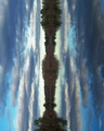
| 11/23/2006 12:28:25 PM |
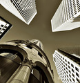
To the sky by nico_blueComment: I love it!!! The way the modern buildings are almost overexposed and the old building is darker. The modern seems to lean out over and dwarf the old. Yet the older building appears sturdier and well grounded where the modern seems fragile. Fantastic! - 10 |
| Photographer found comment helpful. |
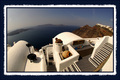
| 11/23/2006 12:24:17 PM |
Greek Perspectiveby DIVIANComment: I'm not a big fan of fisheye photos but this is well done. Don't like the size of the border and my guess is you'll get lots of comments about it. |
| Photographer found comment helpful. |
| 11/23/2006 12:19:13 PM |
|
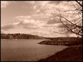
| 11/23/2006 12:18:02 PM |
Priest Lakeby dhumann1Comment: Nice clouds...good composition. This duotone is a little to brown for my taste though. Also, the overall image seems just a little out of focus. |
| Photographer found comment helpful. |
| 11/23/2006 12:15:17 PM |
Above the Restby KWStudiosComment: Yikes! Is that a stove he's sitting on? My cat learned the hard way about stoves. The photo seems a little to flat to me. Could use a little more contrast. |
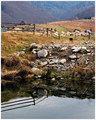
| 11/23/2006 12:09:44 PM |
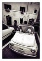
Beyond the fenceby GiorgioComment: I think I would have cropped a little tighter to remove the blue (car?) on the upper left. It takes away from the shot. |
| Photographer found comment helpful. |
| 11/23/2006 12:07:31 PM |
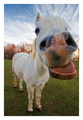
Naysayerby scalvertComment: Too funny!! Reminds me of the toothless Grandma from hell in Bill and Ted's Bogus Journey. "Come give your grammy a kiss." I love it. |
| Photographer found comment helpful. |
Home -
Challenges -
Community -
League -
Photos -
Cameras -
Lenses -
Learn -
Help -
Terms of Use -
Privacy -
Top ^
DPChallenge, and website content and design, Copyright © 2001-2025 Challenging Technologies, LLC.
All digital photo copyrights belong to the photographers and may not be used without permission.
Current Server Time: 08/04/2025 02:38:30 PM EDT.