|
|
|
Showing 861 - 870 of ~1142 |
| Image |
Comment |
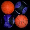
| 02/09/2003 12:25:29 PM | basketballsby Wheeler1992Comment: Critique Club
I don't feel that this photo really met the challenge, and thats probably where you lost points.
I like the bright colors on the black background, it helps them to stand out, though some of the black gets lost on the blue and black balls. The composition is fine, it is very centered but for something symmetrical like this it can work. Your focus seems off to me, I would have maybe concentrated on that more then it looks like you did. Often focus can take away from a good photo, even if it is well composed and make it look lacking in something, sometimes you just can't put your finger on it.
It might have been kind of cool if you had built 4 wooden barriers for each ball, and then put them together to make one big square, this would have carried you into the challenge ideas more, while still having your original idea of having the 4 round items make a square.
For some reason the orange ball in the upper left tends to grab my attention more, I think it may be brighter than the other orange ball. Since you used two similar balls for the blue and the black ones, I would have tried to have two similar balls for the two orange ones.
The one other thing I think needs to be commented on is the fact that the spacing on the right and the left, and the up and the down sides are not equal... it looks like you left more black on the right and the down sides, which lends it less of a square look.
The lighting seems pretty good here, equal, though I can't tell if the bright spot on the bottom left ball is from a flash or not.
I think you have an interesting idea for a picture here, that would be worth working on for future ideas. Though it did not meet the challenge per se, I think you could expound on this idea, to make it into an excellent picture. Good luck in future challenges.
-Talya |
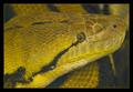
| 02/08/2003 02:06:18 PM | Cute Pet Cliches ?by GordonComment: This is truly a beautiful specimen! Not necessarily cute, but an amazing creature :-) I like your picture and the DOF this is just awesome. -10- Talya |  Photographer found comment helpful. Photographer found comment helpful. |
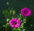
| 02/08/2003 02:03:22 PM | Stagesby rcrawfordComment: Pretty, and I love your DOF, definitely would have cropped some off the left though. | | Photographer found comment helpful. |
| 02/08/2003 02:01:06 PM | Dad and Dogby crzystarbuckzgrlComment: Hi this must be Danny's daughter, I have some tips for you. First off this is a great portrait, very cute, and well lit, with the lighting being even on the faces, with no shadows, very nicely done! The main criticism I have for you here is the tree going out of your dad's head. When taking pictures, especially ones that you can control your settings, pay attention to your backgrounds, this would have been an almost perfect picture if you would have moved the duo over a bit, and only had what looks to be the wooden fence behind them. The leading lines in this picture are excellent everything from the iron fence behind him to the wooden fence they all lead your eye to the main focus the heads, also your dad's arms tend to bring you that as well. One other thing I might have tried would have been to move your camera a little more the the left, and gotten more if his shoulder in and maybe less of the right side in. Just an idea though. Nice picture overall! Good luck! -Talya | | Photographer found comment helpful. |
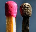
| 02/03/2003 09:42:59 PM | Mis-matchby Fibre OptixComment: GREAT macro shot... the light is a little heavy coming off the unlit match, but this is an awesome photo... I don't think I've ever looked that closely at the detail in matches. Very nicely done. |
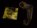
| 02/03/2003 09:28:04 PM | When it Rains, Wear a Raincoatby AnachroniteComment: You fit the challenge however this is not an overly attractive photo, either compositionally or stylistically. I really don't care for the super dark on the right and the super light on the left, plus your light source shines brightly off the condom package. I would have maybe cropped in more and moved the condom package closer, so that they were almost on top of each other, might make it somewhat more visually attractive. I give you some points for meeting the challenge, and the photo is in focus... -5- | | Photographer found comment helpful. |
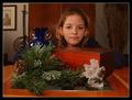
| 02/03/2003 02:57:09 PM | Missing Sunsetby crabappl3Comment: I think some people miss the point of challenges... this challenge was not about how much cliche you could get into the photo, but how you could really make a thing we see all the time look super nice, and be a great photo. Ok, you go everything in but the sunset but unfortunately your photo is not extremely interesting, or greatly appealing. There are some major problems with this picture... for one it is much too busy, I have no clue what I should be looking at and even the background detracts from the setting, for another, I think it looks almost centered, yes the girl is slightly off center, but I think I would have liked a different crop here, as well as shooting this from a different angle. The lighting isn't too bad, it looks pretty even, and your focus is good, though I might have liked to see a different DOF, with some of the background blurred. I'm sorry for ripping on your photo, but this site is about photography often more then just meeting the challenge. | | Photographer found comment helpful. |
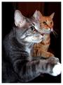
| 02/03/2003 02:49:17 PM | Both Wave on Command...All the Time!by GraciousComment: That's adorable... not sure how you, or whoever is holding the treat taught them to do that, but it's so cute. The picture isn't extremely appealing, although it's nice to see you got down somewhat on their level. It seems like you used a flash which lit the front one too much, though the back cat is nicely lit... also you can see the flash in their eyes. They are adorable cats. | | Photographer found comment helpful. |
| 02/03/2003 02:46:18 PM | Candid Shoe Tieby Hotshot132Comment: You included shoetie in the title, but you can't actually see her tying her shoes, plus this isn't exactly a candid as she is looking directly at the camera and obviously knows your there. I prolly wouldn't have used ths title. It bothers me that her hands are cut off at the wrists and the fact that your lighting is uneven, there must be a window somewhere to the left?! The colors are good, and I think the focus is good, but overall not a very interesting photo. | | Photographer found comment helpful. |
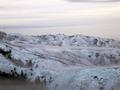
| 01/24/2003 12:06:44 AM | Misty Mountainsby falveyComment: Critique Club
This photo is pretty neat with the blanket of clouds/mist covering it. I think it really gives it an eerie untouched sense which is very cool. I think i would have maybe tried taking away about 1/3 of the extra sky... it might have improved the composition a little bit, but thats just personal preference. Since this shot isn't quite blue, but tries to be, I think it may have looked cool in black and white... or you might have tried using a polarizing filter on it to bring out more dramatic colors, but maybe you like the soft look of the light blue, thats up to you as the photographer. I like the softness of this photo, it's not sharpened which I think gives it a nice look, not every picture has to be tack sharp. I like your exposure on this picture, as well as the lighting... everything is pleasantly lit with no harsh shadows, and you can pretty much make out all the details which is very nice. I think this is a very cool landscape, that must have been fairly hard to get (and cold) you did a nice job with it. :-) good luck with your next challenges!
-Talya |
|
Showing 861 - 870 of ~1142 |
Home -
Challenges -
Community -
League -
Photos -
Cameras -
Lenses -
Learn -
Help -
Terms of Use -
Privacy -
Top ^
DPChallenge, and website content and design, Copyright © 2001-2025 Challenging Technologies, LLC.
All digital photo copyrights belong to the photographers and may not be used without permission.
Current Server Time: 08/26/2025 08:23:19 AM EDT.
|