| Image |
Comment |
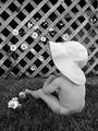
| 06/13/2003 06:44:51 PM |
B&W Magazine (The Joys of Summer)by SonifoComment: This is so cute! I really like it! Is there actually a magazine with that title? Just curious. I love the fact that the baby is anoynomous, we don't know who she/he is which is kind of alluring. I love the daisies all over as well! I would like to see this in color too, just to see what it looks like. Good Luck! |
 Photographer found comment helpful. Photographer found comment helpful. |
| 06/13/2003 06:42:22 PM |
Canadian Gardeningby mcraelComment: Very nice macro shot... well done! Very pretty and I like the shadows. This could definitely be on the front cover of a gardening magazine. Plenty of room for type... it gets your attention, bright colors, everything is very well done. Good job not puting the stamen dead center either! Very nice. Good luck! |
| Photographer found comment helpful. |
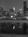
| 06/13/2003 06:40:02 PM |
New YorKby jpb56nyComment: This looks slightly tilted. It's a beautiufl view and reflection of the city though. For some reason, I don't really see this site in black and white... how did it look in color? I hope your one of the people coming tomorrow (Saturday) to the East Coast GTG . I could see this on an older magazine I think... prolly not one of the new glossy ones but thats just my opinion. I like the room at the top for type. Good luck. |
| Photographer found comment helpful. |
| 06/13/2003 06:37:22 PM |
Artist's Magazineby Ricky CleaveComment: Wow! Those two are quite talented... I like this photo... it shows "local" art which is kind of fun. I'm not sure where you would put the type on the magazine... but I guess you could ddo a top or bottom border? I think I would have liked brighter colors maybe... Great composition here... everything keeps you in the photo. |
| Photographer found comment helpful. |
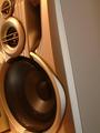
| 06/13/2003 06:35:19 PM |
Hi-FiChoiceby The KidComment: The light on the bottom speaker is slightly annoying... also why is it going off to that side? Just curious. It looks awfully plain on the right side... the left side is where the staples would be so I would think you might want to have the plainer side be on the left, but no big deal... I do like your composition though. |
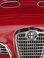
| 06/13/2003 06:33:14 PM |
Sports Car Illustratedby autoolComment: I'm salivating. What a beautiful car! I love Alfa-Romeo's (have a dog originally named after the car (Romeo) full name of the car, but now we have Juliet too ;-) ) This picture is nice, but the front part is kind of distracting... it's hard not to get reflections in the car... but some of the reflections are just too bothersome. Nice cropping though! I love to do cars! See my triptych . Good luck! |
| Photographer found comment helpful. |
| 06/13/2003 02:04:05 AM |
Magic Fluteby adineComment: Greetings from the critique club
This is REALLY COOL! I like it a lot. I didn't pay enough attention to this when I was rating photos during the challenge but the details in this are awesome! Not sure if you could have.. but it might have been kind of cool to turn the flute around... and get a part of someones face with lips playing the flute and the smoke coming out, but this is really cool on it's own.
I like your composition a lot... just beautiful... the way the bottom right hand corner is all black, really lovely... and the incense really filled up the rest of the photo beautifully.
I love your use of sepia here... really gives it a mystic old time feel. and as Frisca said in her comments, the contrast is very nice as well. Also very glad you decided to put it on the black background, it really makes the flute and the smoke pop out.
In terms of the challenge I think you met it very well. In fact I can't get the chirpy flute sound out of my head right now I actually think you should have placed higher than 12th but I guess some people don't have the imagination that it's in fact "magic" and playing itself. It's a shame sometimes the literal ways people judge on this site, but it's not about placing it's about making a picture that your happy with.
I think this photo would be absolutely beautiful for a flutist to have on their wall, I do hope you offer it as a print. It looks like one I would enjoy giving to my best friend for her wall. The one thing I would touch up on for the print is the bottom left hand corner... i think you got a little bit of the arm in there? Or maybe I'm wrong, but it doesn't seem to fit with the rest of the photo.
Overall this is a gorgeous photo, and something I might like to try... GREAT IDEA! Looking at some of your other work it's very dreamy cool stuff. Nice job! Good luck in the future, oh, and did I mention... offer this as a print!
-Talya |
| Photographer found comment helpful. |
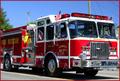
| 06/13/2003 01:51:28 AM |
EMERGENCY!!by RuchartComment: Greetings from the Critique Club...
I guess for this to be more sound oriented I would have liked to have seen a racing truck with it's emergency lights going... it makes sense that this was taken at a parade, there is no sense of quick racing, siren pumping action... which to me, makes it just a photo of a fire truck.
Composition wise... not much to say here. it's not dead center which is good. I like the way it's coming towards you but not completely... I'm glad you didn't just shoot it as it went by in a straight line. I think this adds more of a sense of 3d. Good job filling the frame.
One thing that could have improved this shot since you didn't take it as it was rushing past to an emergency would have been paying closer attention to your background. The poles seem to be coming out of, maybe even attached to the truck, especially the back one.
As a photo, not as a sound photo, I like the reflection in the truck... kind of a hometown, fourth of july feel. Very nice.
Your colors are pretty good here, and your lighting seems to be nicely done, I like the fact that the shadow is underneath the truck... and there doesn't seem to be too many harsh shadows on the truck itself.
Overall not a bad photo, I don't think it got sound across, at least not to me, but it's a well composed nice looking photo.
-Talya |
| Photographer found comment helpful. |
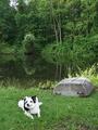
| 06/12/2003 04:19:41 AM |
Country Magazineby GolferDDSComment: You've got a tough situation here... a white dog on a green setting. You lose some of the detail in the dog... to overcome this, I think you should try zooming in on the dog and taking a meter reading off of him (correct exposure) then zooming out and manually setting the camera to the dogs meter reading, although the overall photo maybe a tad bit darker, I think it will help to get more detail on the dog and not just a white blob with some black. The composition of your picture is pretty good... It looks like a nice peaceful setting something that could probably be on the front of the said magazine. Not terribly exciting but a good wholesome job. |
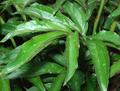
| 06/12/2003 04:14:10 AM |
Canadian Gardeningby YethComment: Personally I do not consider magazines to be in a horizontal shape... thats just me though. Is this a particularly nice plant? It looks fairly crowded to me. The lighting in this photo is somewhat bothersome, especially the glare in the upper left hand corner. I think I would have liked to have seen less plant, more substance to the photo. |
Home -
Challenges -
Community -
League -
Photos -
Cameras -
Lenses -
Learn -
Help -
Terms of Use -
Privacy -
Top ^
DPChallenge, and website content and design, Copyright © 2001-2025 Challenging Technologies, LLC.
All digital photo copyrights belong to the photographers and may not be used without permission.
Current Server Time: 08/24/2025 08:53:53 PM EDT.