| Image |
Comment |
| 06/16/2003 11:45:31 AM |
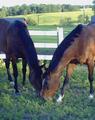
Thoroughbredby LeahStephenComment: The color on this and the graininess aren't very good... I like the two horses and where you put them in the photo, but I think it could have been improved. Good job leaving space at the top for type. I would have played with Photoshop or similar program on this. |
 Photographer found comment helpful. Photographer found comment helpful. |
| 06/16/2003 11:44:28 AM |
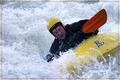
Playboatingby vjozComment: Personally I do not consider magazines to be in a horizontal shape... thats just me though. This is a pretty good action shot... I really like it... His face looks a little off color, but that may be how it was. I would have liked to have seen this as a vertical. Where were you when you took this? |
| Photographer found comment helpful. |
| 06/16/2003 11:43:26 AM |
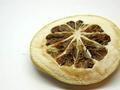
Real Simpleby BeingCleverComment: Personally I do not consider magazines to be in a horizontal shape... thats just me though. It's a pity that you didn't make this a vertical photo... I think you prolly would have scored a lot higher than you are because voters wanted vertical photos. This is nice... I could definitely see it on the front of said magazine? How did you do the lemon (?) Interesting... good texture, good lighting |
| Photographer found comment helpful. |
| 06/16/2003 10:11:37 AM |
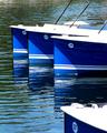
Boating Lifeby mariomelComment: I like your composition here quite a bit, and I love the reflection of the three boats in the water. I think this would make a very nice magazine cover, it's very well done and has room at the top for type. The brown in the upper right hand corner is kind of bothersome, I wonder what that is? The bottom right hand corner looks a little blown out but it's not too bad. Overall a pretty nice photo -8- |
| Photographer found comment helpful. |
| 06/16/2003 10:09:49 AM |
Teen Magazineby draney4Comment: Personally I do not consider magazines to be in a horizontal shape... thats just me though. The entire picture looks a little tilted to me... but maybe I'm wrong. Cute idea, the comment of teens on the phone, and I love the expression on the right teens face, shee looks oh so happy, the one on the left seems to have somewhat of a "cool" attitude. I'm not sure if this would work as a magazine cover, especially not for teen magazine which tends to focus on fashion for the cover, and is always a studio shot. This looks like a fun picture for the girls involved to have in a frame though! |
| Photographer found comment helpful. |
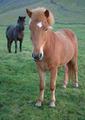
| 06/16/2003 10:07:24 AM |
The Horseby birgirComment: This is so cute (I love horses!) I love how the one is in front of the other, it's like they were posing for you. Just absolutely darling. I would have liked to have seen this somewhat bigger, I'm sure you've gotten that a lot in your comments, but in case you don't know how to do this, if you have photoshop, when you move the dpi down to say 72, then put your pixels of your largest size to 640 (maximum) this will put it at full size. Hope that helps. I would have liked to have seen maybe slightly more room at the top for type, but it's not imperative. I can't tell if these little guys are in focus or not, but I'm guessing they are. Also there seems to be some kind of a film over the whole photo, kind of a greyness, maybe it was foggy? If not, play around with your levels and contrast. I really like this though, even with the faults I'm going to give it a -9- good luck! |
| Photographer found comment helpful. |
| 06/16/2003 10:03:25 AM |
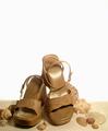
Flare (Canada's Fashion Magazine)by friscaComment: I like this a lot... I love your use of negative space... I think it really works well. The transition from the sandy look on the bottom to the white is also very nice. Why did you choose to use shells in this photo? I don't think that these are the kind of sandals you would wear the the beach are they? I guess it's kind of a very interesting statement about how far people will go for fashion Ex. wearing these sandals to the beach. Your lighting is somewhat bothersome on the higher sandal... but not horrible, more bothersome is the dirt or whatever on the other sandal, though I suppose if they used this for a magazine cover people wouldn't be so anal about using some sort of cleaning up tool. Anyway.. I think this is kinda neat, I like the overall effect. |
| Photographer found comment helpful. |
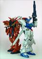
| 06/16/2003 01:09:33 AM |
Model Graphix: Paying Attention To Detailsby zerocusaComment: Interesting... I'm not sure what Model Graphix is about... but I think I get the idea with this magazine cover. Very well placed and lit. I like how you have two and not just one... that makes it much more visually interesting. I could definitely see this as a cover, it's not an extremely wonderful photograph, but it works, plain and simple. I like how you left plenty of room for type. |
| Photographer found comment helpful. |
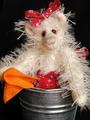
| 06/15/2003 10:41:30 PM |
TeddyCrafts (www.teddycrafts.com)by GinaRothfelsComment: Very cute... did you make the bear? I like this... really good lighting... love the black background overall pretty good. Not particularly exciting, but it is a stuffed bear I would have liked a little more room at the top for type. |
| Photographer found comment helpful. |
| 06/15/2003 10:39:34 PM |
Fashionby TonesOfGrayComment: This is interesting... What a weird dress! I was going to ask about the lighting then I realized the dress hadd some kind of a mesh thing on the bottom that was catching more light. The light on the hand is a little akward though. I would have like a little more room at the top for type, but it's not too bad. This is ddefinitely different. |
Home -
Challenges -
Community -
League -
Photos -
Cameras -
Lenses -
Learn -
Help -
Terms of Use -
Privacy -
Top ^
DPChallenge, and website content and design, Copyright © 2001-2025 Challenging Technologies, LLC.
All digital photo copyrights belong to the photographers and may not be used without permission.
Current Server Time: 08/24/2025 12:34:50 PM EDT.