|
|
|
Showing 151 - 160 of ~1142 |
| Image |
Comment |
| 06/05/2006 10:48:33 AM | She's got the devil in her heart...but her eyes they tantalize ; )by jeroweComment: A couple of things I notice here... one - the electrical box or whatever it is that is coming out of her knee is quite disturbing 2 - while I love the chipped pain next to her - the plain white, modern door detracts from the scene, and 3 - I think this would have served better as a much closer portrait - it looks like your model has wondeerful eyes... but why not focus on them? Especially because of your title?! Get in close... you've got a great model, don't let a busy scene detract from her. |  Photographer found comment helpful. Photographer found comment helpful. |
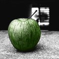
| 06/05/2006 10:45:07 AM | She Came in Through the Bathroom Windowby loveComment: Interesting choice to use an apple. I'd be interested in hearing why? Is it in the lyrics? I can't seem to remember that... I might have leaned towards a silver spoon perhaps. Also why is there an apple in the bathroom? I'm really not seeing your meaning in this photo. | | Photographer found comment helpful. |
| 06/05/2006 10:42:01 AM | Sgt. Pepper's Lonely Hearts Club Bandby bobgaitherComment: You picked a good subject in bad lighting conditions. It's important when you are doing a portrait (even candid) of just a single person that you really watch your background... also I'm feeling that you might have gotten a more interesting moment from this guy. I'm guessing the group were playing for a while? How many shots did you take? | | Photographer found comment helpful. |
| 06/05/2006 10:39:23 AM | Wearing the face that she keeps in a jar by the doorby Breeee123Comment: I think you did an excellent job here... especailly with your DOF being perfect so that you can still see her real face in the mirror, and I like the haloing that the back lighting creates in keeping with the song and the fact she works at a church. Nicely done. -10- | | Photographer found comment helpful. |
| 11/07/2005 05:05:59 PM | Eyesby philupComment: *Critique Club*
First of all - does it meet the challenge? Well... I know you prolly lost some points from those who wanted a solid white background... to me it isn't a big deal, but to those who take it literally you might not have met the challenge.
On to the details of the image.
I like your composition here a lot. I think it's a good choice not to include that second ear... I think it keeps you in the photo, and I love the way that the mouth and nose are right on that rule of thirds. Also the eyes are just a tad off center which I really like.
In terms of the eyes - I love that they are tack sharp and fairly well lit! No huge pupils, and no red eye, overall nice use of DOF it isn't so shallow that you only have the eyes in focus and the rest of the face isn't. You did a very good job with eing the entire face in focus along with the whiskers etc.
The major thing that bothers me here, is something that was mentioned in a lot of your comments... the neck of the kitty is definitely blown out... and not having any detail there, really kind of ruins the photo for me. If it wasn't for that you would have a really great photo, but especially because the challenge specifically mentioned watch out for blow out... it's something that you should have looked at carefully. Also that light grey (shadow?) just above and to the right of the cat's head is a little bothersome.
I would suggest reshooting, and specifically working on getting detail in the white of the fur, it's not easy, but the excercise could be beneficial to your skills as a photographer.
-Talya | | Photographer found comment helpful. |
| 11/04/2005 11:06:27 AM | My little escapist by nico_blueComment: *Critique Club*
First of all does it meet the challenge? Yes I believe it does... as do others because you got a ribbon! Congrats on a wonderful job :-)
OK now on to specifics :-)
First of all let me say that I really like this image... it's just plain fun, which I like!
Composition wise - I think you did a very good job... even though the glass and fish are centered, I think that it works here, because of what you were going for. I'm glad to see that you left quite a bit of room at the top for your little fishy to fly into ;-) I think it would have felt quite cramped if you hadn't.
I am not against a little bit of trick photography... I think your idea was creative and fun, and who cares how you get the image, it's the image you get!
Great job with your lighting and exposure, as well as your post processing... I think you did an excellent job getting everything just perfect... and the fish looks absolutely gorgeous!! Interesting setup you are talking about... I'll have to play around with that perhaps in my own dorm room (when I can find a patch of floor to set up on :-).
I notice in your comments that you used a nickel to make the splash and that you feel it worked well because it passes as a reflection of the goldfish... this is my one nitpick. I disagree with you on the reflection thing, and I feel that the extra color in the bottom of the glass draws my eye away from the fish and the splash... that however is just my opinion.
Despite that... I think you did a wonderful job!! Congrats on your ribbon.
-Talya | | Photographer found comment helpful. |
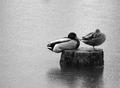
| 11/04/2005 10:55:28 AM | Rainy Dayby philupComment: *Critique Club*
First of all... does it meet the challenge? Yes... you have grain... I feel that maybe there is a bit too much here... but I actually kind of like it (which is unusual for me). Good choice to put this in black and white, or it wouldn't have worked with the grain.
On to specifics...
Great composition... my eyes go right to where they are supposed to and nice use of empty space as well, The darkness of the duck really draws you to that right corner, which is a good thing. And that mallard, leads you to the other duck, who by having his head turned and not looking off the frame manages to keep you in the image.
I agree with metatate I feel there is something funny about to happen... in a sort of Charlie Chaplin way. The pond is just too calm... and that mallard looks ready to end the duck's peaceful sleep :-D.
I like the fact that you didn't go for extreme contrast here... it's all slightly greyish and I think it works... I think this is really a picture that at first looks a bit dull, but as you look at it, it draws you in more, which is a good thing. Did you get more frames? Did anything funny happen next?
Nicely done.
-Talya | | Photographer found comment helpful. |
| 11/03/2005 06:38:49 AM | a birthday wishby chucksinncComment: *Critique Club*
First of all does it meet the challenge? YES I like your nice light application of grain. It adds to the fact that she is an old dog (although 8 isn't that old for a small dog) and it looks like one of those pictures you would find on a greeting card!!
Now let's get specific...
Composition wise, you did a beautiful job... perfect use of rule of thirds with both the dog and the ball. You can almost see the tension between the two objects... it's kind of funny.
Really nice lighting... you found (or made) some nice lighting, and you don't have any blow out, and the face is so well exposed!!
The image itself is very well done... nice use of shallow depth of field... you've got the dog knowing it's her birthday dreaming about the ball... and the ball just right there... come on let's play!! I love it. Doing this in sepia made it kind of dreamy looking and fun.
Your focus on the face is just superb and her eyes seem almost alive... starying at you from the photo. I love the little fur on the ears that you can really see... The photo just has a dynamic to it... lik you could easily picture the dog jumping and and ready to play which is really nice.
I love your use of sepia... I think it's really great...
Overall I think that this is a beautiful picture, that you will probably cherish for some time to come. I feel you didn't do aw well as you deserved to in the challenge because you didn't have enough grain for some people to see... I would suggest maybe offering this up to a stock image company... they might be interested. Good luck and nicely done!!
-Talya |
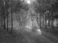
| 11/03/2005 12:07:05 AM | sunraysby melodeeComment: *Critique Club*
First of all does it meet the challenge? Yes it does... it's got grain although personally I'm not sure that the grain was extremely beneficially to this image.
In terms of the size of your photo, this one is much too small to see anything, and that caused you to lose some major points here on DPC. How can you fix this? DPC allows you to enter an image that is 640 px at it's longest side. So in photoshop - or an equivalent program under image, image size resize your photo so that it is (for this image for example) Width - 640 pixels Height will change with that... Resolution - 72 pixels/inch. Make sure that the boxes for scale styles, constrain proportions and resample image (bicubic) are all checked. That should help you have the right size for next time!
Now on to the technical stuff...
First of all why did you think this should be in black and white? I'm not sure, but to me it looks a tad bland in black and white... maybe if you had upped the contrast some, given it some blacks, that might have helped... but I don't really care for it as it is... I wonder if this image had a really nice brown pathway with sprinkles of green prickly things (whatever they are called) from the trees and nice green at the top? Maybe the sun was blown out?
I like what you caught with the sun illuminating the pathway... Now put a person there!! or a dog, or something... just a bit more to add some interest.
Composition wise I think it's pretty nice... I like that you kind of got to the side of the path, and also that you have path leading from your feet onward. Looks very nice that way. I like the nice straight trees juxtaposed with the rounding path, I think it works.
Overall I think you found some nice light, and a good image, but I think that maybe you might have wanted to play around a little more with the post processing, to come up with something a bit more dynamic and interesting - as well as of course larger.
-Talya | | Photographer found comment helpful. |
| 11/02/2005 11:39:08 PM | Alone againby nico_blueComment: *Critique Club*
First of all... does it fit the challenge? Yes... and those who could not see the grain must have fairly low resolution screens. The nice light application of grain really adds to this image, I think you did a wonderful job of it!
On to specifics...
First of all, I find this shot to be incredibly beautiful, and very well done...
In terms of composition... I can't decide whether I like the composition or not... it's not your everyday type of portrait and composition... but it's not your everyday type of picture... it goes above and beyond the "typical" which is very good. Rules are meant to be broken, and to me, I kind of like that he is centered with light on one side and dark on the other. I guess it would have been interesting to try shooting this from a bit towards his front and maybe getting down lower... or for a dramatic "small and scared" look bringing the camera up fairly high and shooting down?
Your lighting, as you've heard in your comments is beautiful. You did a magnificent job with it, and the high contrast is spectacular. The way that the light doesn't really let you see his face, adds to the feeling of loneliness, and I love that the light really touches on the rips in the jeans. I'm almost feeling if you were a bit younger that you had been grounded by your mother... possibly for ripping your jeans... hehehe. As you are older, this photo is more dramatic, it almost makes me think of someone who was abused, and has led a life filled with hardship... someone who is afraid of society, and hiding from the light... wanting to go more towards the darkness.
The fact that I am able to delve so deeply into this photo is an excellent thing... I really don't find it often, and rarely on DPC.
Overall a fantastic job... I'm now going to check out your other work!!
-Talya | | Photographer found comment helpful. |
|
Showing 151 - 160 of ~1142 |
Home -
Challenges -
Community -
League -
Photos -
Cameras -
Lenses -
Learn -
Help -
Terms of Use -
Privacy -
Top ^
DPChallenge, and website content and design, Copyright © 2001-2025 Challenging Technologies, LLC.
All digital photo copyrights belong to the photographers and may not be used without permission.
Current Server Time: 08/21/2025 01:12:11 AM EDT.
|