| Image |
Comment |
| 05/13/2008 04:59:27 AM |
|
 Photographer found comment helpful. Photographer found comment helpful. |
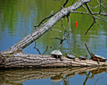
| 05/13/2008 04:53:34 AM |
Peacefulby RetroesqueComment: The negative space in the bottom does not add much. Personally i like th eimage better if there was only half the negative space below |
| Photographer found comment helpful. |
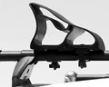
| 05/13/2008 04:41:33 AM |
Bootby littlegettComment: could you have avoided that knob or at least the blown out highlight in the knob at the back? |
| 05/13/2008 04:40:36 AM |
|
| Photographer found comment helpful. |
| 05/13/2008 04:35:54 AM |
|
| Photographer found comment helpful. |
| 05/13/2008 04:28:27 AM |
|
| Photographer found comment helpful. |
| 05/13/2008 04:27:04 AM |
Stopby knowvakComment: minimalist! do u really need the black border? I mean did you explore some other coloured border/no border |
| Photographer found comment helpful. |
| 05/13/2008 04:24:08 AM |
|
| Photographer found comment helpful. |
| 05/13/2008 02:46:45 AM |
|
| 05/13/2008 02:46:24 AM |
Gyreby InnerRastamanComment: This is definitely different, but i feel at least one small central area in clear focus (maybe round the nose/eyes i.e. the center of rotation of the implied motion) would have largely enhanced the gyre experience |
Home -
Challenges -
Community -
League -
Photos -
Cameras -
Lenses -
Learn -
Help -
Terms of Use -
Privacy -
Top ^
DPChallenge, and website content and design, Copyright © 2001-2025 Challenging Technologies, LLC.
All digital photo copyrights belong to the photographers and may not be used without permission.
Current Server Time: 08/25/2025 01:10:20 AM EDT.