| Image |
Comment |
| 02/21/2006 10:48:09 PM |
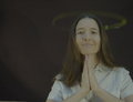
Spun (self portrait)by RyShuComment: Greetings from the Critique Club!
Hard to say much about this photo. It was an interesting submission for this challenge. The lighting is strange with the bright stripe behind you and there's a large shadow across your face. The long exposure made your face distort which is distracting. I think you probably could've achieved what you were looking for here with a shorter exposure which would have resulted in less 'deformation.' I think this didn't score well because nothing is jumping out of the picture. The idea behind motion panning is to blur the background to give a look of speed to the subject and bring the subject out of the shot. Here, you're blurred too (because it's hard to stay still in the frame) so it's basically just an interesting study in motion panning as opposed to a picture that makes people really interested in the subject. Very clever idea though and definitely very interesting. |
 Photographer found comment helpful. Photographer found comment helpful. |
| 02/20/2006 12:38:23 PM |
|
| Photographer found comment helpful. |
| 02/20/2006 12:35:29 PM |
Motherby jayitaComment: Not sure if this was purposefully out of level, but it's very distracting. |
| 02/20/2006 12:35:02 PM |
|
| Photographer found comment helpful. |
| 02/20/2006 12:34:17 PM |
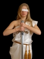
Justiciaby mesmerajComment: Blindfold would've worked better for the 'Lady Justice'. |
| 02/20/2006 12:31:09 PM |
For These Things.......by missinseattleComment: Great shot. Try and prevent the hotspots from window lighting. Try not to crop off parts of her head (unless you're cropping off a lot to get the face). I actually would've preferred to see a closer crop over her shoulder with her hands and face only. Smaller DOF to remove the distracting bedpost. |
| Photographer found comment helpful. |
| 02/20/2006 12:28:27 PM |
Justiceby smykComment: Same shot I was trying to do...it's a little hard to see justice without the scales. |
| Photographer found comment helpful. |
| 02/20/2006 12:27:29 PM |
Hope- A New Day Dawnsby deanaComment: Level your horizon...place it at either a 1/3 or 2/3 of the image (depending on if you want to accentuate the sky or the sea). Nice concept. |
| Photographer found comment helpful. |
| 02/19/2006 04:08:32 PM |
Aflameby toffleComment: Greetings from the Critique Club!
Please remember to leave comments when you request a critique. Without them, it's very hard to tell what you were trying for and makes a critique very difficult.
Composition:
There doesn't seem to be any real subject of this shot and what's in focus tends to take my eye out of the image (the round thing on the right). The orange area in the bottom left is also distracting since the rest of the image is this soft peach color.
Camera Work & Technique:
Focus is good. DOF is quite small and doesn't seem to serve a purpose for being so small. The in focus areas don't attract my attention. Lighting looks good with no hot spots.
Post-processing:
It's hard to tell but it looks like the saturation may have been bumped up too much since there seems to be sections where the color changes abruptly in the top left. That may not be true but with the limited DOF it's hard to tell what's going on up there (and without knowing the post-processing steps so please include them in the future).
Suggestions:
You've got this nice diagonal line coming from the top that would be great coming from the top-left corner. Try and keep in focus areas away from the edge of the shot as they lead the eye out of the image. Moving the subject a little to the left in the image would've helped this out a lot. Increasing the DOF some so that we can see the extent of the shape also would've given the subject more interest.
I hope you find this critique helpful. Please feel free to PM me if you have any questions.
Regards,
Zeke Smith |
| Photographer found comment helpful. |
| 02/18/2006 04:19:03 PM |
Bob no!by senojComment: Greetings from the Critique Club.
Keep in mind, when asking for critiques (the check box when you submit your picture) you should provide comments so the reviewer knows what you were trying to get from your shot.
Composition:
This shot has great potential...the leading lines of the keys draw the eyes into the picture.
Camera Work & Technique:
FOCUS...You'll hear this a thousand times when there's not something in focus in your image. Keep the viewer interested by having something in focus and using OOF areas to keep their eyes where you want them. Try and prevent highlights from blowing out as well.
Suggestions:
Only thing to say here is to get your picture in focus. Abstract challenges are usually won by interesting colors and shapes that don't necessarily make the viewer see a larger picture...just appreciating the image. Good luck. I hope this review has been helpful. |
| Photographer found comment helpful. |
Home -
Challenges -
Community -
League -
Photos -
Cameras -
Lenses -
Learn -
Help -
Terms of Use -
Privacy -
Top ^
DPChallenge, and website content and design, Copyright © 2001-2025 Challenging Technologies, LLC.
All digital photo copyrights belong to the photographers and may not be used without permission.
Current Server Time: 08/22/2025 11:08:50 PM EDT.