DPChallenge: A Digital Photography Contest You are not logged in. (log in or register
 
Browse Settings
Currently viewing:
Registered Userszalona

Show comments:

Per page:

Order:

Comments:


Comments Made by szalona
Pages:   ... ... [74]
Showing 271 - 280 of ~733
Image Comment
Spin the bottle!
07/14/2006 06:35:02 AM
Spin the bottle!
by andreis

Comment:
VERY good idea but very out of focus.. it owuld have been nice to have the opening of the bottle focused.
Photographer found comment helpful.
"Kiss"
07/13/2006 11:43:58 PM
"Kiss"
by Jas

Comment:
pleased to see this is refreshing to see something like this coming from you, though youre still sticking alot to the whole water, water droplets, water here, water there. it would be nice to see you experiment with other elements a bit, like the "exilir of jealousy" with smoke, that was interesting and you have good potential playing with it. Dont stick to water just because you know you can photograph it well, dare to try (and fail if you must on the way); in the end it will only broaden your capacities.

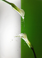
PERTAINING MORE DIRECTLY TO THIS PHOTO, i must say here at least you used water a bit differently than you have before (ie. couple drops sitting all over the place but god knows why, a splash here, a spash there but with no clear motive or hint as to what youre trying to expess with it) so its really interesting, even though this is a sort of splash, the water's movement and the photo composition really make the photo's particularity.
Moreover, i like how the title adds to the photo, gives it more meaning than it would have perhaps without it. The power of a title is allmighty after all. it can make or break a photo (to a certain extent)
Im not gonna go through the obvious "oh how sharp the drop are" because its obvious, so moving on.
I like the fact that there is a division in the middle of your background, it balances the composition somehow (though i dont know if chosing green was the best idea, perhaps so). i dont know what it would have looked like had you used anything else, but its just that the green background seems to take away from the bottom flower and as such is distracting. but definitly the idea to have made a seperation in the first place, i like. perhaps its just something to play around with until its perfect perfect perfect ! (thats a lie, there is actually no such thing)
Finally, before i wish you luck and that you experiment more in further photos, one thing that kind of bothered me is this harsh reflexion of the light off the stem of the top flower. some smoothening perhaps would have not distracted the eye to such frivolty but rather keep it focused on the main "happening" area, the focus of the photo. Unless theres a major underlying reason for that and i am totally off in which case i hope you develop on it in photographers comments ;)

Good luck and i wish you to experiment further in your next photos
Paper Patterns
07/13/2006 11:25:07 PM
Paper Patterns1st Place
by timfythetoo

Comment:
oh i didnt notie this during voting/// i like the swirls
Photographer found comment helpful.
Stationary Bike Stationery
07/07/2006 05:51:28 PM
Photographer found comment helpful.
Litterae De Veritas
07/07/2006 05:51:03 PM
Litterae De Veritas
by Plachoochi

Comment:
nice setup.
Photographer found comment helpful.
Paper airplane
07/07/2006 05:50:42 PM
Paper airplane
by pinbokeshatta

Comment:
elastic on side and blurred frontal bit are distracting. otherwise ok shot
Photographer found comment helpful.
Staple City
07/07/2006 05:49:18 PM
Staple City
by Marston

Comment:
very cool concept i would have pushed firther with stationery for the background, its hard to know what this background is. you get a 10 for originality
Photographer found comment helpful.
folded pages
07/07/2006 05:46:56 PM
folded pages
by parallax

Comment:
done many times before but i think the fact that your paper is purpuley-pink makes it very disco and very different which makes it stand out in my eyes and give it a high score. my sole disapointement is the fact that the title is so unstimulating. im giving you a 9 and hope that you find a backup unofficial better title.
Photographer found comment helpful.
From the desk of...
07/07/2006 05:45:32 PM
From the desk of...
by Kdbattista

Comment:
dont see what the photo is supposed to convey. the title doesnt help indefining that either
Writers Block
07/07/2006 05:45:06 PM
Writers Block
by fullmetalfinn

Comment:
i like this alot, 9.
Photographer found comment helpful.
Pages:   ... ... [74]
Showing 271 - 280 of ~733


Home - Challenges - Community - League - Photos - Cameras - Lenses - Learn - Help - Terms of Use - Privacy - Top ^
DPChallenge, and website content and design, Copyright © 2001-2025 Challenging Technologies, LLC.
All digital photo copyrights belong to the photographers and may not be used without permission.
Current Server Time: 08/21/2025 01:54:45 PM EDT.