| Image |
Comment |
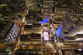
| 01/02/2009 09:31:43 AM |
Gizmo's Christmasby hi131Comment: Cute shot! I like how you have the blurred lights in front and the circles of light in back (though I wish there were a few more on the left side). |
 Photographer found comment helpful. Photographer found comment helpful. |
| 01/02/2009 09:24:13 AM |
|
| Photographer found comment helpful. |
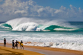
| 01/02/2009 09:12:19 AM |
Banzai Pipeline circa 2008by gliphixComment: Great capture of an amazing wave and surfer. I think I might like this as a closer crop, cutting off the dull sky and the person in the water to the right. It might look funny though if the surfer was running into the edge of the frame, so who knows. You may have done the right thing by keeping the entire wave in the shot. |
| Photographer found comment helpful. |
| 01/01/2009 06:42:31 PM |
|
| Photographer found comment helpful. |
| 01/01/2009 10:47:43 AM |
arboreal flotsamby krnodilComment: Leaves, tree, sky? A reflection? Unique. Not sure it'll do great with the voters, but a lot to look at and wonder about within this abstract. |
| Photographer found comment helpful. |
| 01/01/2009 10:42:30 AM |
The Fogby rob_smithComment: Love the fog and the shapes in the scene, but not sure if I like the peachy color. |
| Photographer found comment helpful. |
| 12/30/2008 04:03:47 PM |
Sad Clockby ferrygunComment: Greetings from the Critique Club!
First Impression: The face and feet on this one are very easy to spot though there are a few extra "parts" to the head. I do like though that the extras are a bit out of focus though (but there isn't a super sharp part of the shot that I can pick out). Oh, and his eyebrows look a little funny, and I can't tell if that bump should be a nose or a funny mustache! I kind of like the neon green since it adds a nice splash. I don't really get the ring in the front though. I wonder if "sad" is the right emotion for this little guy... confused or surprised at what's in his path perhaps?
After reading about the shot: Yes, I agree... this little guy needed some extra drama. I wonder if some creative lighting could have helped to make this more dramatic... a spotlight on the ring perhaps? Some interesting lighting on the face? Or perhaps giving this a different crop would have worked, allowing more space on the sides and top.
I hope this critique was helpful. If you have any questions about it, please feel free to PM me. I see from your profile that you have returned from a 2 year hiatus... so welcome back to DPC and good luck in your future challenges! |
| Photographer found comment helpful. |
| 12/28/2008 07:53:31 PM |
Cat Napby jhomrighausComment: Greetings from the Critique Club!
First Impression: A good use of the shallow dof to bring attention to the cat's head, but it's still difficult to see the cat clearly due to the lighting. I'm not sure that the bokeh adds to the overall photo, in fact the lines and color seem to help the cat blend in a bit. All that being said, I like the composition and the feel you captured with the cat finding the last little bit of sunshine on the floor to nap in. I doubt though that this did very well during voting because it doesn't have the DPC mass appeal.
After reading comments and info: Not quite sure what aperture you used here... it says f/ 1.2 but that doesn't work with the lens you listed. I think if you had added a bit of reflected light back towards his face, it would have evened out the lighting a bit, but still giving you the bokeh in the background. You may have been able to bump the ISO to 400 too, giving you a bit less noise and maybe a smoother background.
Hope this has been helpful! Please feel free to PM me if you have any questions. |
| 12/28/2008 10:14:49 AM |
Botch.....eh?by PikkelComment: Greetings from the Critique Club!
First Impression: I remember this one from voting... the bokeh in the background didn't stand out at first because of the harsh lighting on the front of the candle. An interesting candle for the challenge since the glittery candle would compliment the spots in the background. I think giving the candle more space in the frame though and leaving more of the bokeh in the background would have not only helped the composition, but also the lighting may not have been as harsh if you were further away.
After reading your information: I think you captured the bokeh idea quite well. You placed the candle far enough away from the tree and used a shallow dof to get the nice round circles in the background (which is just one way to use bokeh). Unfortunately, I think one of the keys to bokeh is that it is a background used to enhance the subject (if I even understand it correctly), and you didn't leave enough background to really let it do that job. It also looks like you used a flash, which is a bit harsh on the front. Lighting your candle with a soft light and turning the flash off would have helped with that. You can also diffuse the flash with a sheet of paper to get rid of that harsh lighting.
Last thoughts: Overall, this was a good example of bokeh, but you may have been trying so hard to get the concept down, that you didn't focus enough on composition, lighting etc. Keep playing with those shallow dof's and see what kinds of interesting backgrounds you can get. You're off to a good start!
If you have any questions about this critique, please feel free to PM me! Good luck in your future challenges! |
| Photographer found comment helpful. |
| 12/24/2008 10:05:59 AM |
steaming hotby PixelstateComment: This was one of my favorites in the challenge. I like how the bokeh really becomes the main subject instead of just enhancing the photo. The brightest spots of light are closest to the mug and then dim as they drift away, just like steam would rise from a cup of hot cocoa.
Someone below mentioned the use of a darker table, which could work well, as could a different color mug, but something about the way all of the colors blend together is pleasing for me. Well done! :) |
| Photographer found comment helpful. |
Home -
Challenges -
Community -
League -
Photos -
Cameras -
Lenses -
Learn -
Help -
Terms of Use -
Privacy -
Top ^
DPChallenge, and website content and design, Copyright © 2001-2025 Challenging Technologies, LLC.
All digital photo copyrights belong to the photographers and may not be used without permission.
Current Server Time: 08/18/2025 10:15:35 PM EDT.