| Image |
Comment |
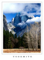
| 11/21/2006 09:42:02 PM |
by mpetersComment: Yep. I'd buy this one in a store. Absolutely beautiful, and a perfect fit for the challenge. |
 Photographer found comment helpful. Photographer found comment helpful. |
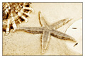
| 11/21/2006 09:31:33 PM |
Beach Memoriesby JeniYComment: A great shot, and I can see this photo on a postcard on a shelf. I wish you'd added some text though to give it that finished feel of a postcard... that blank space in the sand is just calling out for some simple text! |
| Photographer found comment helpful. |
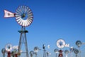
| 11/21/2006 09:28:42 PM |
Spearman, Texasby bsatttuComment: What a fun shot! I really wish you'd added the text though to show where it was from... that blank sky is just screaming for some cool text to finish off this postcard! |
| Photographer found comment helpful. |
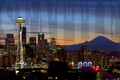
| 11/21/2006 09:24:43 PM |
Seattleby cabaComment: Beautiful shot of Seattle... the lighting is great, and I appreciate that the brightest of the lights aren't blown out. The text for this one is a bit distracting. I think if it were a bit smaller, it would fit completely into the sky instead of running over the buildings/mountains, and it would make it more readable. |
| Photographer found comment helpful. |
| 11/21/2006 09:20:45 PM |
Million dollars viewby whiterookComment: I'm not sure I get this one... photographically, the shot is unappealing and seems hazy with a tilted horizon. As far as the postcard part of the challenge, I don't get the added text, and the font and color choices don't seem to go well with the postcard. Even a few simple fixes like a levels adjustment, rotation and a different font could have been very helpful for this shot. |
| Photographer found comment helpful. |
| 11/21/2006 08:54:05 PM |
Meadowhall Shopping Centre, Sheffieldby PegasusComment: A bit too much negative space for my tastes... the shopping center seems to get lost in the shrubbery at the bottom. The text is also difficult to read on this one. I think perhaps a bit tighter crop on the building with a slightly bigger font would work just a bit better for this one. |
| Photographer found comment helpful. |
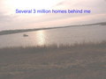
| 11/21/2006 08:50:47 PM |
Welcome To Mississippi!by cpurserComment: The negative space at the top is just calling out for some text to make this more postcard-like! A lovely shot... it's amazing how moving cars over a bridge can look so serene when it's a long exposure! |
| Photographer found comment helpful. |
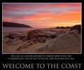
| 11/21/2006 08:47:56 PM |
Everyone's Welcomeby lentilComment: Beautiful shot... looks very relaxing and peaceful. My eye is drawn to the text at the bottom though, which is a bit wordy for such a serene and quiet place. |
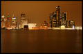
| 11/21/2006 08:45:08 PM |
City Nightby jbabalaComment: All of that negative space in the water is just screaming for some text! I'm not sure I like the horizon right through the center, but with text added at the bottom, it might work. |
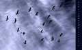
| 11/21/2006 06:02:29 PM |
by undieyatchComment: I'm having a very difficult time reading the text, since it's small and also a more whimsical font. I like the idea of the top to bottom text though, that is a unique twist. I'm also not sure what the photo has to do with the location (since I can't tell what the location is), but there is definately an interesting sky in there! |
Home -
Challenges -
Community -
League -
Photos -
Cameras -
Lenses -
Learn -
Help -
Terms of Use -
Privacy -
Top ^
DPChallenge, and website content and design, Copyright © 2001-2025 Challenging Technologies, LLC.
All digital photo copyrights belong to the photographers and may not be used without permission.
Current Server Time: 08/27/2025 02:56:45 AM EDT.