| Image |
Comment |
| 09/14/2006 06:24:53 AM |
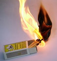
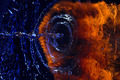
Chemistry of Fireby DAWARComment: I wish the top of the flame hadn't been cut off. I think that the image could have been better if the box of matches was not at an angle. |
 Photographer found comment helpful. Photographer found comment helpful. |
| 09/14/2006 06:21:07 AM |
|
| Photographer found comment helpful. |
| 09/14/2006 06:20:10 AM |
|
| Photographer found comment helpful. |
| 09/14/2006 05:11:19 AM |
|
| Photographer found comment helpful. |
| 09/13/2006 08:09:44 AM |
|
| 09/13/2006 08:07:06 AM |
|
| Photographer found comment helpful. |
| 09/13/2006 08:05:48 AM |
|
| 06/21/2006 03:05:56 AM |
|
| Photographer found comment helpful. |
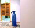
| 06/06/2006 02:51:42 AM |
VACANTby coolblueComment: I find this picture strange. I think the plain wall on the right is pretty uninteresting, and yet takes up 40% of the picture - it could have been cropped. The rug is quite busy. The blue pot is unusual, but hasn't been placed in a position that makes me interested in it. |
| 06/06/2006 02:48:52 AM |
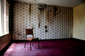
Desolated Roomby funny pieComment: What an ugly place! I don't like the window and it's light on the left. Would it have been better if they had been cropped? |
| Photographer found comment helpful. |
Home -
Challenges -
Community -
League -
Photos -
Cameras -
Lenses -
Learn -
Help -
Terms of Use -
Privacy -
Top ^
DPChallenge, and website content and design, Copyright © 2001-2025 Challenging Technologies, LLC.
All digital photo copyrights belong to the photographers and may not be used without permission.
Current Server Time: 08/20/2025 05:33:17 PM EDT.