| Image |
Comment |
| 03/15/2010 05:01:51 AM |
Summerby rinacComment: Nice result - I gave this one of my top scores and I didn't even know it was your shot :) |
 Photographer found comment helpful. Photographer found comment helpful. |
| 03/15/2010 04:58:55 AM |
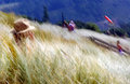
The Twilight Zone by JaimeVinasComment: Intiguing shot but why is this fine art - I just don't get it. I wish someone would educate me.
Congrats on the yellow, even if i don't understand it ;) |
| Photographer found comment helpful. |
| 03/14/2010 09:13:14 PM |
Ancient Lines and Patternsby pmichaudComment: Greetings from the Critique Club.
First impressions are that the Giraffe is lost in all those lines.
Technically this is ok. Composition is good and I'm a fan of shots where the subject is only a small part of the frame. I agree with some voters that the hue is quite unnatural. The lighting looks like it was in full sun - hence the monotone?
Artistically I like the small in frame concept. I'd like to have the Giraffe's head not in the hole as the Giraffe looks a little awkward like he is. Given the advanced editing rules I'd have cloned a couple of distractions from the fence that seem to be attention grabbers.
In summary a cool shot but an unusual toning.
Feel free to PM me if you have any queries.
Gerry |
| Photographer found comment helpful. |
| 03/14/2010 06:07:37 PM |
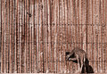
The Witch is back!by tokyoaheadComment: Greetings from the Critique Club.
First impressions are of the eye, it stands out really well!
Technically this is ok. The bright spots are perhaps a little too bright even though they help make the eye stand out. Composition is good. The tones are lovely indeed. Good choice of DOF.
Artistically you have captured what looks like a great expression on the toads face. this clearly appealed to the voters who commented (note their average vote).
In summary a pleasant shot but lacks a "wow" to get a 6 score.
Feel free to PM me if you have any queries.
Gerry |
| Photographer found comment helpful. |
| 03/11/2010 03:43:27 PM |
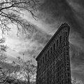
Flatiron Buildingby JohannesFrankComment: Greetings from the Critique Club.
First impressions is the grainy feel of an old horror movie!
Technically it's hard to tell if this is the result you were going for or it's gone a little wrong. Given your profile I'll assume this is what you had in mind. I find the composition awkward in that the building grabs my attention but the tree branches then immediately pull it away. The grainy movie look is done well but the processing has caused some halo effects around the building.
Artistically the is good. The look is not the usual DPC style. The POV could be a little more dramatic if you were a little closer to the building and that may also remove some of those branches.
In summary a unique shot that probably was a little to off the "DPC path" to score high.
Feel free to PM me if you have any queries.
Gerry |
| 03/11/2010 02:26:08 PM |
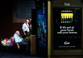
Considering A Change?by Covert_OddityComment: Greetings from the Critique Club.
First impressions are of the nice contrast between the darks and the colours.
Technically this is composed well - follows the rule of thirds largely. Exposure is great as it brings out the contrast nicely. In some areas is appears a little over-sharpened but that may be the resizing? Shutter speed is spot on as it has just a little motion blur in the walking man to give us a sense of movement.
Artistically this is great. Your notes sum up the various plot-lines that are going through this shot. There may actually be too much going on though. A square crop without the beer add would allow us to focus our attention on the men better - that is where the real story is and it's one we can "connect" with - the beer add is just a poster after all. A real bonus is that the mean look similar so my first thoughts upon looking closely were that it's the same man considering an alternative path his life have taken!
In summary this is a great shot that you need to stop and think about. That's the problem score-wise, most voters don't stop long enough. A very under-rated shot IMO.
Feel free to PM me if you have any queries.
Gerry |
| Photographer found comment helpful. |
| 03/10/2010 12:07:29 AM |
|
| Photographer found comment helpful. |
| 03/09/2010 09:22:39 PM |
Boom boomby gyabanComment: Great shot, thanks for the details in your notes too! |
| Photographer found comment helpful. |
| 03/09/2010 05:23:29 PM |
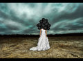
Sleeping Beautyby kingskingdomComment: Greetings from the Critique Club.
First impressions are that the model is a little overwhelmed by all the flowers.
Technically this is good. Exposure is good, tones are nice, composition is ok but not one I favour too much.
Artistically I want to like this but find something pulling me back. Her face is made up lovely and her pose is great - sort of a sleeping beauty thing. I find she almost gets lost in the mass of flowers. Perhaps a square crop with less torso would have reduced that effect.
In summary a lovely shot but the flowers detract from the model a little.
Feel free to PM me if you have any queries.
Gerry |
| 03/09/2010 05:17:26 PM |
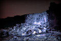
Frosen Power by svavaComment: Greetings from the Critique Club.
First impressions are the bright spots on the rocks and the star trails.
Technically it seems like you had a trade-off between such a long exposure (282 seconds, wow) for the star trails and exposing the water correctly. In the end you went with the star trails. I think that was a mistake as the bright spots in the rocks are quite attention grabbing. Composition is good but maybe crop a little off the right as the darkness doesn't add much.
Artistically there are some good "lines" for our eyes to follow that all converge on the waterfall. Overall though the shot lacks a bit of punch, I'm not sure what to suggest to get that though - maybe duotoning?
In summary this is an ok long exposure water shot but they are common at DPC so you need to nail it to score well. Having zero comments during a challenge is quite an achievement - I've still not managed that! Keep submitting!
Feel free to PM me if you have any queries.
Gerry |
Home -
Challenges -
Community -
League -
Photos -
Cameras -
Lenses -
Learn -
Prints! -
Help -
Terms of Use -
Privacy -
Top ^
DPChallenge, and website content and design, Copyright © 2001-2024 Challenging Technologies, LLC.
All digital photo copyrights belong to the photographers and may not be used without permission.
Current Server Time: 06/17/2024 01:50:04 AM EDT.