| Image |
Comment |
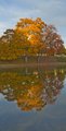
| 11/10/2009 11:44:46 AM |
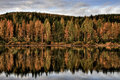
Maple Multipliedby rseeleyComment: Placing the horizon in the center makes the image to symmetrical, which places equal weight on the top and bottom halves of the image, which confuses the eye as to what it should be focusing on. Maybe crop out half of the reflection?
Also, I know the HDR brought out a lot of detail in the shadow areas, but it also made the overall image flat and grey. Maybe throw on a little more contrast to pump everything back up? |
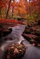
| 11/10/2009 11:41:22 AM |
Arcadiaby Pipe_DreamComment: I think the bright spots in the sky are a little distracting. Cropping them out lets the river lead the eye to the bridge. |
 Photographer found comment helpful. Photographer found comment helpful. |
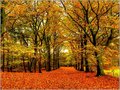
| 11/10/2009 11:39:17 AM |
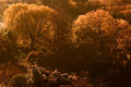
Forest Paletteby ThingFishComment: I love the blanket of color on the floor, but I can't help but wish there was something else to help anchor my eye. My eyes follow the path, but at the end, there's nothing to hold me there. |
| Photographer found comment helpful. |
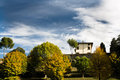
| 11/10/2009 11:35:56 AM |
Tuscan Landscapeby domComment: With all the objects stuffed in the bottom of the frame, this looks more like a Tuscan Skyscape : ) The sky is very pretty, but I think it takes too much attention away from the land. Maybe tilt the camera down more or crop out some sky? |
| 11/10/2009 11:34:15 AM |
Golden Fallby wei1108Comment: I love the color, but wish there was the slightest bit more contrast, just to bring out the detail in the treetops. |
| Photographer found comment helpful. |
| 11/10/2009 11:32:45 AM |
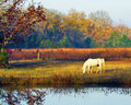
Fall Pastureby karenkComment: The brightness of the sky and sky's reflection compete for attention with the horse. i think that if you brought the sky andthe reflection down in tone, it would have placed more focus on the horse. |
| Photographer found comment helpful. |
| 11/10/2009 11:31:03 AM |
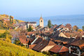
Autumnal Robeby MistyMuckyComment: It looks like the sun is still pretty high in the sky. If you waited a little longer, just until when the light turns gold, it would have painted the buildings to match the foliage and made the scene look more like autumn, IMO. |
| Photographer found comment helpful. |
| 10/21/2009 12:51:33 AM |
|
| Photographer found comment helpful. |
| 10/10/2009 03:48:53 PM |
|
| Photographer found comment helpful. |
| 10/10/2009 03:28:53 PM |
Kilver - Againby korpenComment: This is beautiful. I'm going to have to disagree with Andrewt and say that the reason why this is so perfect is *because* it's not oversaturated! The partial desat makes this image, in my opinion. It says "autumn" mush more than a colorful image would! |
| Photographer found comment helpful. |
Home -
Challenges -
Community -
League -
Photos -
Cameras -
Lenses -
Learn -
Help -
Terms of Use -
Privacy -
Top ^
DPChallenge, and website content and design, Copyright © 2001-2025 Challenging Technologies, LLC.
All digital photo copyrights belong to the photographers and may not be used without permission.
Current Server Time: 08/08/2025 03:33:15 PM EDT.