| Image |
Comment |
| 11/11/2009 03:01:34 AM |
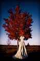
Cold Feetby kvickreyComment: It took me a minute to realize that this is a dress hanging on a tree, not a bride in a strange position that hid the arms and head. I know that these types of images are very popular in wedding photography, but it still seems like a strange place to stick the dress. Besides the weird context, this is a very pretty image. |
 Photographer found comment helpful. Photographer found comment helpful. |
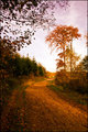
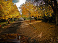
| 11/11/2009 02:58:00 AM |
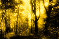
Early Morningby bubeltrubelComment: The sky is a bit bright on the horizon for my taste, but the soft gold light on the path is very beautiful. |
| Photographer found comment helpful. |
| 11/11/2009 02:57:03 AM |
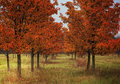
Fallby TyraComment: I might have used the hue slider (or something similar) to bring the yellows of the trees closer to the reds/oranges than the greens. |
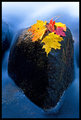
| 11/11/2009 02:55:10 AM |
Faonsolasby DJWoodwardComment: I think I would have angled the leaves differently or cut off their stems. The stems are like leading lines, but they don't lead your eye to anything, which is particularly distracting considering how soft and curved the rest of the image is. |
| Photographer found comment helpful. |
| 11/11/2009 02:54:56 AM |
Snow is Comingby ti_evomComment: This looks like such a great location. The detail and soft color of the grasses look like the perfect place to stick a delicate model!
I wonder what this would look like if your camera was a little closer to the ground so that the leading lines of the bottom of the treetops didn't form a straight line. |
| Photographer found comment helpful. |
| 11/11/2009 02:52:20 AM |
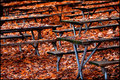
Picnic Grove In Fallby TommyMoe21Comment: I keep wanting to tilt my head to the left to straighten the tables. If I draw an imaginary line from the table to the ground, they look straight, but the tilted tabletops still make me want to rotate the image a little clockwise. |
| 11/11/2009 02:52:16 AM |
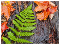
Old logby BMacDComment: I love the texture of the log! The green fern complements it nicely, but I would have preferred only one red leaf on the right and none on the left. The way it is now gives too many kinds of texture for my liking, so I think I would have preferred something a little more simple. |
| Photographer found comment helpful. |
| 11/11/2009 02:52:11 AM |
Exploreby BebeComment: I wish you yellows had the slightest bit more red in them so that they would look more gold (slightly orange instead of slightly green). |
| Photographer found comment helpful. |
| 11/11/2009 02:51:45 AM |
Passing Throughby BeckyTComment: I can't decide if I prefer this with the car or without. Without it, this would look like most of the other literal interpretation in the challenge, but the truck of the car still seems somehow out of place. I also find it interesting that you chose to use the back end of the car (or at least it looks like it to me!) instead of the front. |
| Photographer found comment helpful. |
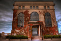
| 11/11/2009 02:49:10 AM |
Encroaching upon Architectureby david_cComment: This looks like HDR, but luckily, it's not too overdone to make it grey and dull; the colors are still nice and bright! The building looks very beautiful, old, and calm, but the distortion gives off a feeling of strength and arrogance, which I think doesn't work with this particular building. Maybe try a longer lens (the reflection in the windows make me think you had plenty of room to back up) or a tilt-shift lens? The reflections in the windows are gorgeous, by the way, especially the inclusion of the flag. |
| Photographer found comment helpful. |
Home -
Challenges -
Community -
League -
Photos -
Cameras -
Lenses -
Learn -
Help -
Terms of Use -
Privacy -
Top ^
DPChallenge, and website content and design, Copyright © 2001-2025 Challenging Technologies, LLC.
All digital photo copyrights belong to the photographers and may not be used without permission.
Current Server Time: 08/08/2025 09:07:04 PM EDT.