| Image |
Comment |
| 11/20/2009 05:30:14 PM |
Toriby E109Comment: I would have cropped a little closer (the hand makes her seem too self-conscious) and placed the bubble in the very center. You can get bigger bubbles if you don't use real bubble gum, but a balloon instead! |
 Photographer found comment helpful. Photographer found comment helpful. |
| 11/16/2009 08:33:20 PM |
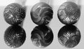
The Grindersby MarsComment: The overall tonality of this image is slightly flat. There are lots of middle grays and a few blacks, but hardly any whites (the lighter parts are actually still grays--check the numerical values in photoshop). Some directional lighting (maybe from the side and/or slightly behind?) would add some beautiful highlights. |
| Photographer found comment helpful. |
| 11/16/2009 08:30:53 PM |
I call it tomato, you call it tomato...by lucky_85Comment: I don't this the long frame does anything for this image. Don't underestimate the beauty of negative space! I also wish there was a gorgeous highlight on the inside of the tomatoes to make them look deliciously juicy. |
| Photographer found comment helpful. |
| 11/16/2009 08:29:37 PM |
Bookendsby PennyStreetComment: I wish this had a different title. I was a little disappointed when I found out these cool statues are actually mundane bookends. But I do like that you paired colorful texture with the solid-toned simplicity of the subject. Maybe leave a little more room at the bottom so their feet aren't cut off? |
| Photographer found comment helpful. |
| 11/16/2009 08:27:08 PM |
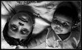
Siblingsby yjoshiComment: The light on the boy is ok, but the light on the baby is "monster" lighting (lit from underneath), which isn't flattering on anyone, no matter how adorable their smile is! Since you have one person rightside up and one upside down, try lighting them directly from the side so no one is lit from underneath. |
| Photographer found comment helpful. |
| 11/16/2009 08:24:57 PM |
|
| Photographer found comment helpful. |
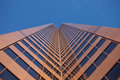
| 11/16/2009 08:24:17 PM |
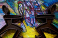
Copper Towerby silverhawkComment: This image has so much potential. The colors are great and the reflections are cool, but I'm looking for a little bit of flare (not the kind caused when light hits the front of the lens, but the kind that shows when the photographer adds a touch of their trademark personal creativity). I wish there was something that made this stand out. Let those creative juices flow! Experiment! |
| Photographer found comment helpful. |
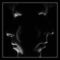
| 11/16/2009 08:20:44 PM |
Dualityby GeorgeComment: I'm curious as to why you lit the face from underneath. "Monster lighting" (as it's called when you do that) is not very flattering on anyone. |
| Photographer found comment helpful. |
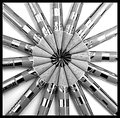
| 11/16/2009 08:18:56 PM |
Pinpoint symmetricsby mojo0302Comment: I don't know if this is due to the reflective nature of the pencils, but this looks over-sharpened and therefore very harsh. |
| Photographer found comment helpful. |
| 11/16/2009 08:17:00 PM |
|
| Photographer found comment helpful. |
Home -
Challenges -
Community -
League -
Photos -
Cameras -
Lenses -
Learn -
Help -
Terms of Use -
Privacy -
Top ^
DPChallenge, and website content and design, Copyright © 2001-2025 Challenging Technologies, LLC.
All digital photo copyrights belong to the photographers and may not be used without permission.
Current Server Time: 08/09/2025 10:46:23 PM EDT.