| Image |
Comment |
| 06/15/2010 06:18:25 AM |
Simplicityby sfaliceComment: This is a cool building, but I wish there were some more light shades. The majority of the shades are middle grey, dark gray, and black, with very few whites or near-whites. It gives the building a pretty gloomy or foreboding feel. |
 Photographer found comment helpful. Photographer found comment helpful. |
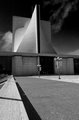
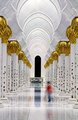
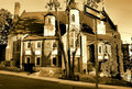
| 06/15/2010 06:16:33 AM |
White Dove of the Desertby gunsmith6Comment: This looks like a pretty cool building, but the lighting isn't very good. Shooting when the sun is lower in the sky would highlight one side of the building and put the other side in shade, which would emphasize the shape of the structure. It would be worth shooting this one again at a different time of day. |
| Photographer found comment helpful. |
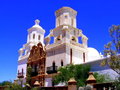
| 06/15/2010 06:12:00 AM |
|
| Photographer found comment helpful. |
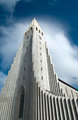
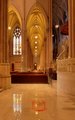
| 06/15/2010 06:10:09 AM |
Majesticby rurikkarlComment: I like that the cloud makes a halo around the spire. The light emphasizes the texture of the building perfectly. |
| Photographer found comment helpful. |
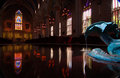
| 06/15/2010 06:03:58 AM |
Abstract Existenceby dwyllieComment: A little more sharpening would bring out the detail in the gold leaves and contrast the blur of the person. |
| Photographer found comment helpful. |
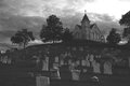
| 06/15/2010 05:30:57 AM |
Fading Stormby PugPopComment: I wish you had pulled the greys of the church and the tombstones a little lighter so they would stand out more. Otherwise, this is a very nice image. The compotition is perfect and the mood is wonderfully foreboding. |
| Photographer found comment helpful. |
| 06/15/2010 05:21:44 AM |
Divinityby YandrosxxComment: I think this image would have worked even without the back wall. That would have put more emphasis on the fountain. |
| Photographer found comment helpful. |
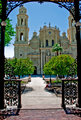
| 06/15/2010 05:20:05 AM |
St. Patrick Cathedral by Kathy_GCComment: I don't mind the people in the background, but the headless person in the foreground is distracting. Some sharpening would also make this pop more. |
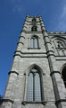
| 06/15/2010 05:14:27 AM |
Notre-Dame Basilica of Montrealby tholmirComment: The light looks very flat. It would look less flat if you moved more to the left so we could see two side of the building, one lit side and one shaded side. I would also back up some so there isn't so much distortion of the verticals. |
| Photographer found comment helpful. |
| 06/15/2010 05:03:48 AM |
One Way To Heavenby J-MeComment: I wish you would have popped a flash on the sign to make it stand out more. I didn't notice it until after I read the title. |
| Photographer found comment helpful. |
Home -
Challenges -
Community -
League -
Photos -
Cameras -
Lenses -
Learn -
Help -
Terms of Use -
Privacy -
Top ^
DPChallenge, and website content and design, Copyright © 2001-2025 Challenging Technologies, LLC.
All digital photo copyrights belong to the photographers and may not be used without permission.
Current Server Time: 08/08/2025 01:04:10 PM EDT.