| Image |
Comment |
| 06/24/2010 05:08:26 PM |
Journey in timeby reneekerrComment: It looks like his one might have been handhold, which caused some camera shake. If you had used a tripod and/or sharpened more, the blur of the turning pages would have stood out more, emphasizing the passing of time.
The light also doesn't suit this very well. There is a bright spot in the upper right of the frame, which draws the eye because it is the lightest part of the image. The title and the weathered look of the book make me wish you had gone further with the "old" feel of the image, maybe by lighting it with a candle or some other more "dramatic" type lighting. |
 Photographer found comment helpful. Photographer found comment helpful. |
| 06/18/2010 04:15:54 AM |
fiery hairby SandymayaComment: I love the painterly feeling of this. The colors are gorgeous and her expression is intriguing. |
| Photographer found comment helpful. |
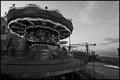
| 06/17/2010 09:01:55 AM |
Tibidabo by samasmith89Comment: Was there a way you could have framed this without the construction rigging on the right side? Since it is sharp, it attracts the eye. It also takes away from the feeling you've created by blurring the carousel. |
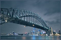
| 06/15/2010 02:46:31 PM |
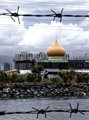
sydney bluesby nivlekComment: Is that really an American flag on top of the bridge or is it just a trick or the long exposure?
Either way, congrats! |
| Photographer found comment helpful. |
| 06/15/2010 07:23:42 AM |
|
| Photographer found comment helpful. |
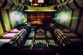
| 06/15/2010 07:21:54 AM |
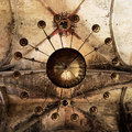
A Salvation Army band played and the morning lasted all day,by JudiComment: Even though the lights are blown out, the overall image is underexposed. The darkness takes away the detail of the lovely organ. The green hue from the lights also doesn't make this image very appealing. Green makes it looks scary, dirty, or foreboding, and that's probably not how you wanted this to come across. You could adjust the white balance to fix that. |
| Photographer found comment helpful. |
| 06/15/2010 07:16:11 AM |
|
| Photographer found comment helpful. |
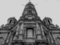
| 06/15/2010 07:14:17 AM |
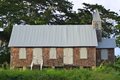
The Church is Closedby Frank_berlinComment: I think this might be better if you moved to the right so that we aren't looking at the building straight on. Showing a second side of the building would make this look less flat. |
| 06/15/2010 06:20:21 AM |
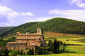
Abbazia di Sant'Antimoby gadionComment: This looks like a wonderful location, but the light doesn't do it justice. If this was shot when the sun was low in the sky and casting golden light, this would be absolutely gorgeous. |
| Photographer found comment helpful. |
| 06/15/2010 06:19:56 AM |
|
Home -
Challenges -
Community -
League -
Photos -
Cameras -
Lenses -
Learn -
Help -
Terms of Use -
Privacy -
Top ^
DPChallenge, and website content and design, Copyright © 2001-2025 Challenging Technologies, LLC.
All digital photo copyrights belong to the photographers and may not be used without permission.
Current Server Time: 08/08/2025 05:32:44 PM EDT.