| Image |
Comment |
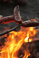
| 07/31/2010 09:22:44 AM |
Weenie Roastby FromDaRockComment: It looks like the stick is more in focus than the food. I love the red underglow from the fire, but I wish there was a little more light on the side facing the viewer. |
 Photographer found comment helpful. Photographer found comment helpful. |
| 07/31/2010 09:19:21 AM |
Lunch in Bar Harbor, Maineby cup4tmlComment: Very well done. I love that you were able to include the location, which gives much more of a sense of summer than any food could! Great balance between the direct sun and shade. The only thing I might change would be to white balance for the shade, since food looks tastier when the color cast is warmer rather than cool. Not docking points for that though. |
| Photographer found comment helpful. |
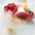
| 07/31/2010 09:14:54 AM |
|
| Photographer found comment helpful. |
| 07/31/2010 09:12:22 AM |
Salmon Pastaby dsp6860Comment: Between the numerous items of food, the pattern on the plate, and the silverware in the corner, this image is too busy. When shooting food, it is also good to brush melted butter or oil over the food so there are some highlights, which make food look tasty! |
| Photographer found comment helpful. |
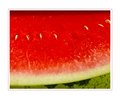
| 07/31/2010 09:10:37 AM |
|
| Photographer found comment helpful. |
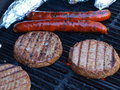
| 07/31/2010 09:09:43 AM |
Burgers and Dogsby E450Comment: This looks like it was taken in open shade, which is why there is a blue/cyan tint to the image. Food usually looks more appetizing when the color cast is slightly warm. |
| Photographer found comment helpful. |
| 07/12/2010 04:33:21 AM |
Danielby MelethiaComment: You know, the Italians say that having a pigeon poop on you is good luck. Sure sounds like they are right : ) |
| Photographer found comment helpful. |
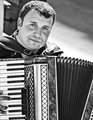
| 07/10/2010 07:34:44 AM |
The Accordion Manby salmiakkiComment: Nice balance between the bright sun and the shade. I wish the white keys of the accordion were closer to white (they are light grey here). Some more space above his head would also balance out the space taken up by the accordion on the bottom. |
| Photographer found comment helpful. |
| 07/10/2010 07:32:54 AM |
Rafa Sheds a Tearby PetRockComment: The light looks very flat. There isn't even a shadow under his chin. The beads behind him are slightly distracting since they are so detailed, and they also contrast too much against his expression. |
| Photographer found comment helpful. |
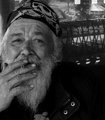
| 07/10/2010 06:03:56 AM |
relativityby tnunComment: I wish you had brightened this a little. There are no whites in this image. The brightest parts are actually light gray. I'd like to see the white of his beard and the white of his headband a bit lighter. That would help put more focus on his face. |
| Photographer found comment helpful. |
Home -
Challenges -
Community -
League -
Photos -
Cameras -
Lenses -
Learn -
Help -
Terms of Use -
Privacy -
Top ^
DPChallenge, and website content and design, Copyright © 2001-2025 Challenging Technologies, LLC.
All digital photo copyrights belong to the photographers and may not be used without permission.
Current Server Time: 08/08/2025 04:47:45 AM EDT.