| Image |
Comment |
| 09/24/2008 10:07:02 PM |
bug =)by troy77Comment: Blacker blacks (upping the contrast) might make everything stand out a bit better. |
 Photographer found comment helpful. Photographer found comment helpful. |
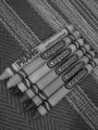
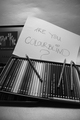
| 09/24/2008 10:04:46 PM |
Crayons!by MikeManComment: The image seems a bit too gray. Upping the contrast to add more white and more black would make everything stand out better. Since most westerners read from the top left to the bottom right, the eye sees it as strange when text is angled the opposite way. |
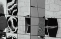
| 09/24/2008 10:02:26 PM |
Reflectionby soozComment: I like the reflections, especially the second square in the middle row (it looks kinda like a peace sign!). I think a more severe tilt would have strengthened the composition. I'm also not really sure what color(s) this is supposed to emphasize or represent. |
| 09/24/2008 10:00:21 PM |
Bell Pepper Detailby davidwComment: The stem and the pepper are similar shades of gray. Different shades (possibly obtained through a different black and white conversion?) might have added some interest to this shot. |
| Photographer found comment helpful. |
| 09/24/2008 09:59:01 PM |
|
| Photographer found comment helpful. |
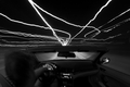
| 09/24/2008 09:58:38 PM |
Ray of Lightby tjmuellerComment: The lights look cool, but the blur on the person is distracting. I'm also not realy sure what color this should make me think of. |
| Photographer found comment helpful. |
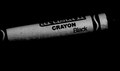
| 09/24/2008 09:57:50 PM |
Crayola Blackby azsweetheart_2122Comment: I like how the shadow fades into the background, but I think the composition would be helped more if the crayon were on a stronger angle, probably from top left to bottom right, since that is the way most westerners read. |
| Photographer found comment helpful. |
| 09/24/2008 09:56:31 PM |
Blood Redby ErikVComment: i think I would have liked this better with a darker background. The white is a bit overpowering. |
| Photographer found comment helpful. |
| 09/24/2008 09:54:43 PM |
|
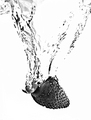
| 09/24/2008 09:53:39 PM |
Strawberry Splash!by socalsteveComment: I wish I could see more of the detail, especially in the splash. It looks like the lighting and the high contrast took away most of that missing detail. |
| Photographer found comment helpful. |
Home -
Challenges -
Community -
League -
Photos -
Cameras -
Lenses -
Learn -
Help -
Terms of Use -
Privacy -
Top ^
DPChallenge, and website content and design, Copyright © 2001-2025 Challenging Technologies, LLC.
All digital photo copyrights belong to the photographers and may not be used without permission.
Current Server Time: 08/04/2025 03:39:56 PM EDT.