| Image |
Comment |
| 01/27/2003 07:49:12 AM |
Start Spreadin' the News by magnetic9999Comment: Holy frick ! How did this happen??? There were many truly incredible shots in this challenge. I'm stunned, and I'll try not to let this happen again. LOL. |
| 01/26/2003 01:36:52 AM |
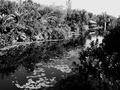
Nature at it's best ...by CreativeFlyPhotoComment: Critique Club Review
Very high contrast image. Trying to reconcile the title with what I'm seeing, and I'm not really sure why you chose to present it in B and W. It's almost as if you're being ironic, when you say it's 'at it's best'.
You've got a blown out sky, and sharpness seems a little low...The picture is really busy with all the tiny details, but there's not really a clear or specific subject. With all the contrast, it's got an old movie feel to it.
I'm interested to hear more about what you were trying to do. :)
|
 Photographer found comment helpful. Photographer found comment helpful. |
| 01/22/2003 09:16:50 PM |
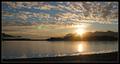
Alaskan Landscape by bdshortComment: Critique Club Review
Greetings.
It is very difficult to say anything critical about this shot.
About the only thing I *might* have done different was put in a little less of that land in the foreground. Maybe done away with it all together, or if possible moved up to the its edge. This might have moved your horizon to the lower third, which is a good place for horizons :)
You've done a great job with composition .. the mountain, the sunset, the additional mountains. the sky, the clouds. you waited till the right time of day to get this shot.
congrats on a well deserved ribbon! |
| 01/22/2003 09:06:31 PM |
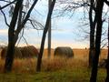
Kansas Hayby moodvilleComment: Critique Club Review
Note: Do not take any comments in this review personally. They are only for the purpose of assisting with photography.
Composition: The trees in the foreground give the feeling that you are in the woods looking out at the cultivated land. I think this is effective in giving a sort of transitional feel. There's a bit of a jumbled feel tho as there is no ONE standout element to draw the eye. Maybe your horizon could have been a little lower in the shot.
Technical: the hay bales seem a little dark as if backlit slightly. Not too bad but that with teh trees makes the pic seem a little dark. There's a bit of softness to the image.
Overall a fine effort! |
| Photographer found comment helpful. |
| 01/22/2003 09:02:22 PM |
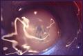
Aqueous Humor, Vitreous Humor (Medical Humor)by GeneralEComment: Critique Club Review
Note: Do not take any comments in this review personally. They are only for the purpose of assisting with photography.
I myself thought briefly of doing this idea. I also thought of doing something on the medieval idea of the 'Four Humours'. But I didn't, because I foresaw I would get the reaction that you in fact did. However, I thought it was a funny play, with much of the humor deriving from the plays on terminology.
You have done a fine job simulating parts of the ocular apparatus with your cup. My only real suggestions would have been to a) use a smaller aperature for more DOF and b) if possible, manually focus on the top of the water to ensure foreground focus.
I am curious as to how you rendered the color. Was that a white balance effect? I am also curious about the hidden message.
|
| 01/22/2003 08:53:53 PM |
Broken By The Windby RaindropComment: Critique Club Review
Note: Do not take any comments in this review personally. They are only for the purpose of assisting with photography.
Composition: I see what you are getting at here. You are trying to show the broken tree. But the problem is that there are too many other busy elements in the scene (ie other trees, other branches, around beside and in front) that they dilute away from the impact of what you're trying to show. In general, you should try to ISOLATE the elements of interest. If they cannot be isolated, then it probably will not be that successful of a shot.
Technical: The black and white works well. The focus seems a little soft. Probably was handheld. There's not really any clear point of focus. Ie it's hard to tell what I should be looking at.
Overall: Strengthen your shot by moving in and clearly isolating elements of interest. This will strengthen all of your photography if you do this. Good luck! |
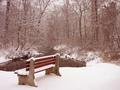
| 01/22/2003 08:42:10 PM |
Shaded Brookby GolferDDSComment: Critique Club Review
Composition: excellent. this image contains some strong compelling elements. the bench was facing out of the shot gives the impression of loneliness.
Technical: exposure is hot for the snow but that's prolly good under the circumstances as the rest of the scene looks right. The scene overall seems a little soft. I wonder if this was shot handheld? There's also too much red in the image. Your white balance didnt really do what it should. This could be corrected in an image editor.
Impact/Content: Overall, a lovely scene. With purer white (see white balance comment), and more sharpness, it could be suitable for framing. |
| Photographer found comment helpful. |
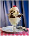
| 01/21/2003 04:51:15 PM |
Sundae Bestby DougPazComment: yum. nice looking background, too :) a little static of a composition. maybe closer on the sundae glass minus the extraneous details? |
| Photographer found comment helpful. |
| 01/21/2003 04:43:17 PM |
Drink Milk?by rj324Comment: lol. i love their expressions. a great contrast. i cant tell what the one on the left is doing!! |
| Photographer found comment helpful. |
| 01/21/2003 04:42:55 PM |
Everybody, che-eee-se!by kenboComment: YUM. love the sky background, too .. the pio is a bit tilted which i would prefer it not to be, and there's a glare on the top of the box. otherwise i like it. |
| Photographer found comment helpful. |
Home -
Challenges -
Community -
League -
Photos -
Cameras -
Lenses -
Learn -
Help -
Terms of Use -
Privacy -
Top ^
DPChallenge, and website content and design, Copyright © 2001-2025 Challenging Technologies, LLC.
All digital photo copyrights belong to the photographers and may not be used without permission.
Current Server Time: 08/08/2025 06:21:23 AM EDT.