| Image |
Comment |
| 02/09/2003 12:52:23 PM |
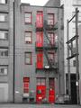
Red 139by JakComment: Critique Club
Composition: Excellent. The repetition of the vertical elements is unusual and original. Color choices in post processing worked very well. I think it would have been more effective shooting perpendicular though, instead of at an angle.
Technical: a little soft. Some weird jaggeding ofr the powerlines. I wonder if a smaller aperature would have helped. Did you sharpen at all in post-processing? Things to think about..
Nice shot :) |
| 02/09/2003 12:10:31 PM |
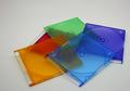
Plastic Rainbowby jgillardComment: Critique Club
OK, so why didn't this do great?
Well, the color choices are nice. The lighting is good.
The sort of detached haphazard placement and distance from the camera doesn't really add.
There is what appears to be jpeg artifacting.
As someone else said, it's a subject that was done by many.
For me, I think the main thing is that there is nothing really 'happening' in the pic. It tells no 'story', and it's not objects that are interesting enough just to be 'on view' (ie like a ming vase). I like to try to either use ibjects that are interesting looking on their own or create some kind of theme.
|
| 02/09/2003 11:55:29 AM |
My left footby av8orboyComment: Critique Club.
Clever interpretation of the challenge.
Good colors on the tat and in the photo.
I think, not to be mean, but it would have probably had more photographic impact if you had shaved that area prior to the photo :).
And perhaps a more extreme angle of view :). |
| 02/09/2003 11:39:06 AM |
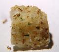
One Square Mealby AnachroniteComment: Critique Club
Interesting concept. What would have made the execution better?
Well, the ants and the brown spots on the crouton are really close to the same color. So maybe you needed some lighting angle that would bring the ants out more. Otherwise they are kind of getting lost.
Maybe a dark bg would have worked better. More contrast.
Your shot is grainy. Which doesn't make sense because the DSC-85 is a really nice camera. Is this a tiny crop? Could you have gotten closer and cropped less? What would a shot looked like of one of the corners with an ant HUGE?
I like your suggestion about a penny for scale. Definitely would have tied it into 'real life' better.
I personally would also have probably shot it from a 'weirder' angle. I would have taken out of the box the absolutely squarest most perfect crouton in there, so the geometry would be impossible to miss. Maybe even gone in closer on an ant. |
 Photographer found comment helpful. Photographer found comment helpful. |
| 02/09/2003 10:33:58 AM |
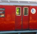
what do we want to see . . . where do we want to go?by tomzinhoComment: Critique Club
The strange property you refer to is 'perspective'. It causes parallel lines to appear to converge. It's caused by your shooting from an angle to the side. You could correct it with the perspective tool in photoshop, if you have that program.
As I said before, it's a bit fuzzy. The colors are great, though. Is that green stained glass in there?
If you shot this again, you shouldn't cut off the words on the left side. The lucky catch of the person inside the right hand door is a good addition. Helps tell a 'story'. It might be a little too subtle tho. |
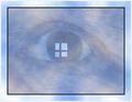
| 02/09/2003 10:29:23 AM |
Window to the Universeby kandyjComment: Critique Club
Interesting concept. Since you were using an image editor, I think you prolly should have blurred out or painted out the distracting area around the eye - ie the skin texture, brow texture, etc. Fill the frame with just the eye. Then you would have a smoother surface to not compete so much with your cloud texture. You could have had the clouds at full strenth around the eye and decreased their opacity over the eye itself. |
| Photographer found comment helpful. |
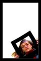
| 02/09/2003 10:23:41 AM |
Life inside the Frameby arnitComment: Critique Club
This image has your distinctive use of negative space, where you leave a large part of the frame empty. It's an interesting effect. I also like how both of the frames are the same color. And approximately the same thickness.
In this case, you make an interesting statement by combining a frame within a frame. This time, the frame inside is tight around the model's face, yet she controls it, she applies it to herself. Does this mean that we are all in control of how we present ourselves and in reality we are all living within our own, personal "frames"? A thought provoking image. |
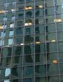
| 02/08/2003 11:03:18 PM |
Reflecting Squares.by catpixelComment: Critique Club
Looks a bit jpeg'd or over compressed like you a) didnt shoot at your camera's highest quality, b) not highest res, c) over compressed after saving.
I like the effect of the building repeated in the building. I tried some similar effects myself for the other challenge but did not submit them.
Still not sure if I like the tilt but if you do, go for it ! |
| Photographer found comment helpful. |
| 02/08/2003 11:00:55 PM |
Let Your Fingers Do The Walking...by dougmc1Comment: Critique Club
This was well shot but the reason it probably didn't do so well is because I think a lot of people feel that the picture of the computer keyboard has been done so many times , esp since most early digital camera aficionados were comptuer users and one thing you always shoot when you're bored is your keyboard :) ..
That said, I like the tilted angle. The clarity and exposure are good. If I was going to do a keyboard shot, I would try to make it a bit different. Maybe some colored light at an angle and take advantage of the reflectivity of the plastic to get some interesting highlights. Just a thought .. |
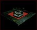
| 02/08/2003 10:58:34 PM |
The Three Sides of Squareby AnnidaComment: Critique Club
I very much enjoy the color choices in this picture. The black background and the mirrors cause an optical illusion such that one gets the impression one is looking at an Escher-like design. The granularity of your camera's image add to the effect such that this really almost has the feel of a painting, or a 3D render with 'dirtied up' texture maps. |
| Photographer found comment helpful. |
Home -
Challenges -
Community -
League -
Photos -
Cameras -
Lenses -
Learn -
Help -
Terms of Use -
Privacy -
Top ^
DPChallenge, and website content and design, Copyright © 2001-2025 Challenging Technologies, LLC.
All digital photo copyrights belong to the photographers and may not be used without permission.
Current Server Time: 08/07/2025 12:33:09 AM EDT.