| Image |
Comment |
| 11/14/2005 10:21:19 AM |
|
 Photographer found comment helpful. Photographer found comment helpful. |
| 11/14/2005 10:15:53 AM |
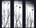
Once Upon A Birdby YoungerComment: I'd really have appreciated to have the central pictures more important..but I like the idea and the overall realisation |
| Photographer found comment helpful. |
| 11/14/2005 10:14:49 AM |
On the Catwalkby alien2thisworldComment: Some details are distracting like the reflects the skin and the hands in the black.
I'm not sure of the positions either that break the symetry... |
| Photographer found comment helpful. |
| 11/14/2005 10:12:35 AM |
|
| Photographer found comment helpful. |
| 11/14/2005 10:11:20 AM |
|
| Photographer found comment helpful. |
| 11/14/2005 10:10:33 AM |
beach sunsetby beafliesComment: The directions, the horizon and the central image are disturbing imho |
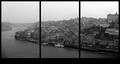
| 11/09/2005 08:49:36 AM |
42th Street 5th Avenue - NYCby NekoNitaComment: Just to confirm that it was a bus that turned during the shot.
For the overexposition at the bottom I wish I had my filters ;)
Thanks |
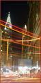
| 11/07/2005 10:43:49 AM |
Transparent Buildingby NekoNitaComment: This was my first challenge...and I didn't think I would end in the last 10 with this picture. The sens I gave to Transparency is something we could look through and the illusion there is that the first building is transparent...
Regarding the choice between B&W and color I thought that the B&W was highlighting the transparency.
For the motion blur I'm actually mixed as I think that without it the picture would have been too dark.
Thanks all for your votes...Good thing is that I can just improve...or can I? :D |
| 11/02/2005 06:51:52 PM |
|
| Photographer found comment helpful. |
| 11/02/2005 06:47:03 PM |
|
| Photographer found comment helpful. |
Home -
Challenges -
Community -
League -
Photos -
Cameras -
Lenses -
Learn -
Help -
Terms of Use -
Privacy -
Top ^
DPChallenge, and website content and design, Copyright © 2001-2025 Challenging Technologies, LLC.
All digital photo copyrights belong to the photographers and may not be used without permission.
Current Server Time: 08/04/2025 09:50:44 PM EDT.