| Image |
Comment |
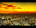
| 01/28/2007 09:01:14 PM |
Nuclear Holocaustby NerdJNerdBirdComment: Davy - fantastic, dramatic shot : the colours are superb. I'm assuming this HDR was done from a single exposure. I think DPC voters are getting over HDR, otherwise this would have done better. I would love to see more detail in the foreground (which I'm sure you have in your prime version). |
 Photographer found comment helpful. Photographer found comment helpful. |
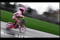
| 01/28/2007 08:36:31 PM |
Speedby oscarmeyerComment: Nice motion-panning - I never manage to pull this sort of shot off. If I'm any judge your lower voted came from people who haven't tried this. |
| Photographer found comment helpful. |
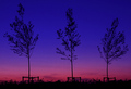
| 01/28/2007 08:32:22 PM |
Treesby oscarmeyerComment: Hi Oscar - fantastic colours and lovely 'elegant' composition. |
| Photographer found comment helpful. |
| 01/28/2007 08:29:16 PM |
featherby directionsforpestComment: Hi Hannah - lovely stuff. I really like the contrasting textures across the image. I am compleed to reach in and touch the droplet to watch it flow down the feather. Superb. |
| 01/28/2007 08:26:15 PM |
Medusaby fattypComment: Nice take. Did a whole better than my Best of 2006. I love the colours you have here. Per the previous commenters - the grain from the noise takes away from the whole. |
| 01/24/2007 11:57:16 PM |
"Just play it where it lies!"by GentleSoulComment: Greetings from the Critique Club.
Hi Elizabeth,
I think you already have a useful distribution of comments here (and a few less useful ones). From a voting perspective this probably sufferred as a result of the relatively high number of similar shots in the challenge. I think Yanko assumed this was submitted by a guy.
Te overall composition here suffers due to the unnecessary stuff in the background, makign it too busy. It wouldn't have been too much effor tto move the stuff behind the toilet for presentation sake. I also think you could have made more of the two models; either by showing their faces, or excluding the chopped-off hand and blurry hand.
Technically I think you struggled with lighting. I see a high(ish) ISO and a slow shutter-speed. even if the camera was mounted on a tripod, you still captured soem subject blur. It probably would have helped to open the aperture a bit wider, or further raised the ISO. Of course more light would also have helped.
I see you paid a bity of attention to the colours. They seem a bit muted to me. Which colour space did you save this in? Always make sure that shots to be published i=on the web are saved in sRGB. This is covered in a DPC tutorial if you are interested.
It is my hope that these insights are helpful and constructive. Please feel free to PM me if you have any questions regarding this critique. And please remember to mark it "Helpful" if you found it so. Good luck with future challenges.
Cheers
Paul |
| Photographer found comment helpful. |
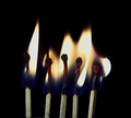
| 01/24/2007 11:42:56 PM |
Five On Fireby ranmComment: Greetings from the Critique Club.
Hi Ran,
Welcome to DPC. I wish you all the best.
Seems that most of the voters didn't go for your grainy take on this subject. I think the main problem though is that in a challenge like this where there are so many buring matchstick based submissions you need a really special, creative submission to do well. What might be useful to you is to take the time to really review the top 20 or so entries.
For myself, I like the grain in your shot. It makes it different to all the other crisp, sharp flames out there. It would have been dead useful to see your post-processing steps so that I could understand what you chose to do to achieve this look. I personally would have loved to see more orange in the flames - best place to get this done is in your white-balance (easiest when shooting in RAW). The fact that none of your matchsticks are cricply in focus I think hit you badly - it makes it difficult to work out exactly where your main subject is.
It is my hope that these insights are helpful and constructive. Please feel free to PM me if you have any questions regarding this critique. And please remember to mark it "Helpful" if you found it so. Good luck with future challenges.
Cheers
Paul |
| Photographer found comment helpful. |
| 01/23/2007 12:38:07 AM |
Teen Attitudeby TlemetryComment: Greetings from the Critique Club.
Hi Theresa,
An interesting one to draw. You have already recieved a number of fantastic comments; both useful and complimentary. I will do my best to add to what they have already said.
I like what you have done - or more precisely, I like what you have tried to do. The curve of shadow on your son's left side is superb and very dramatic. Unfortunately the right side of the face tells the story of how you achieved it. The highlights on the neck and hair as distracting. This together with the strong shadows on the forehead indicate that you used a small(or un-difused) light source which created the harder look. Please let me know if I am wrong. Anyway, I think a softer light-source (bigger from closer, or difused) would have smoothed this out.
I can't tell if the slight softness of the subject is intentional, or subject movement, or camera movement. I notice that your shutter-speed was 1/8, which is fairly long; so I am guess it was subject movement. On the subject of focus. They say eyes are the window to the soul. This is definitely the case in B&W portraits. There are exceptions, but generally the eyes should be looking at the camera and in sharp focus to really engage the viewer.
I really like your 'Spots' entry, btw.
It is my hope that these insights are helpful and constructive. Please feel free to PM me if you have any questions regarding this critique. And please remember to mark it "Helpful" if you found it so. Good luck with future challenges.
Cheers
Paul Message edited by author 2007-01-23 00:42:33. |
| Photographer found comment helpful. |
| 01/23/2007 12:10:42 AM |
|
| 01/22/2007 08:34:50 PM |
Temperature-Risingby outafocusComment: Greetings from the Critique Club.
Hi Jon,
Welcome to DPC, and congratulations on your first few submissions.
I will start with what I like - the lovely rich tones and mixing of colour in the glass bubbles - superb. You have used a very narrow framing - this seriously reduces the numbe rof pixels you have available to yourself to show-off your work. Except in exceptional circumstances in DPC I recommend you go for mroe square shots (make the most of those limits they put on us). for the most part your lighting is lovely, except where you have blown out on the underside of the 'coins' - those are too harsh. Getting lighting right (I am learning) is by far the hardest aspect of photography. Then, as has been commented the focus is for the most part very soft. The 'coins' draw the eye in because of their highlights, but when the eye looks for detail it is all ouf of focus.
On the subject of post-processing I can point you to some useful resources:
- as with photography, keep practising and experimenting.
- a good place to start is DPC tutorials
- these Radiant Vista video tutorials are dead useful.
It is my hope that these insights are helpful and constructive. Please feel free to PM me if you have any questions regarding this critique. And please remember to mark it "Helpful" if you found it so. Good luck with future challenges.
Cheers
Paul |
| Photographer found comment helpful. |
Home -
Challenges -
Community -
League -
Photos -
Cameras -
Lenses -
Learn -
Help -
Terms of Use -
Privacy -
Top ^
DPChallenge, and website content and design, Copyright © 2001-2025 Challenging Technologies, LLC.
All digital photo copyrights belong to the photographers and may not be used without permission.
Current Server Time: 08/02/2025 12:32:27 AM EDT.