| Image |
Comment |
| 05/05/2003 12:51:36 AM |
The Old Millby boyte1Comment: The orange text feels out of place here for me. With that aside the photo itself looks really good I like it a lot. The colors are great, and the scene is very beautiful. |
| 05/05/2003 12:50:31 AM |
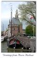
Hoornby AzrifelComment: I think this border would hav ebeen better without a drop shadow. It seems to give it a funny feel. Aside from that the image itself is pretty good though it seems somewhat small. It's hard ot make out some of the details taht owuld add a lot to this image. The color of hte text seems slightly out of place too. Overall nice shot. |
 Photographer found comment helpful. Photographer found comment helpful. |
| 05/05/2003 12:46:21 AM |
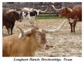
Longhorn Ranchby AnachroniteComment: The text seems a littel grainy. Not sure what happened there. With that said, the picture itself looks great. Teh colors are really smooth and feel really good in this image. It's a great shot and very fitting as a postcard. |
| Photographer found comment helpful. |
| 05/05/2003 12:45:32 AM |
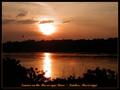
Orange County, CAby StevePaxComment: I don't care for the blue border on this one. A green border, or an orange border, or a white border or something might have worked a lot better. The blue border is very distracting from teh nicely done picture. |
| Photographer found comment helpful. |
| 05/05/2003 12:44:46 AM |
|
| Photographer found comment helpful. |
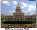
| 05/05/2003 12:42:51 AM |
Austin postcardby xertionComment: Weondeful use of symetry. This picture looks great! Flag waving and all. The only thing I might change is the choice in text. something simpler might have looked better. none the less, overall this is a wonderful image. |
| Photographer found comment helpful. |
| 05/05/2003 12:40:10 AM |
Groningenby RemieComment: This is a beautiful picture of simplicity. I love it. the colors are fabulous, the border is very fitting, as is the text. Overall well done. |
| 05/05/2003 12:39:22 AM |
Hi there! Greetings from Frisco!! by Pep VentosaComment: On a cloudier day I'd say that text would be very fitting, however with a nearly perfect blue sky that text seems very out of place in this picture. A gradient with more blue in it might have looked better... The image itself looks great. The only bad thing about it si the sahdows on some of the buildings, a different time of day might have corrected this. Overall I'd have to say well done. it loooks good. |
| Photographer found comment helpful. |
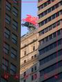
| 05/05/2003 12:36:54 AM |
Mobil Pegasusby cmrk74Comment: I lke the framing on this picture a great deal. I'm saddened that it's not The full 640 pixels in height. I think it would bring out more detail in the pegasus (The focal point of the picture) if it was larger. |
| Photographer found comment helpful. |
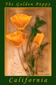
| 05/05/2003 12:35:03 AM |
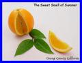
Eschscholtzia Californicaby TarbiniComment: I'm not sure how you achieved this effect without an image altering filter, but this looks fabulous. Looks just like a post card, The colors are awesome together. well done. |
| Photographer found comment helpful. |
Home -
Challenges -
Community -
League -
Photos -
Cameras -
Lenses -
Learn -
Help -
Terms of Use -
Privacy -
Top ^
DPChallenge, and website content and design, Copyright © 2001-2025 Challenging Technologies, LLC.
All digital photo copyrights belong to the photographers and may not be used without permission.
Current Server Time: 08/22/2025 04:58:19 PM EDT.