|
|
| Image |
Comment |
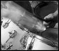
| 06/04/2003 12:23:47 PM | CRASH!by sherComment: I am surprised there is only one symbol crashing shot, I thought that would be the shot of the week, you did it well, I can hear it. Too much "noise"(grainy) in the shot, perhaps a run through neat image.
After further thought, how many people have drum sets :). Just because I do and you do doesn't mean everyone else does:) |  Photographer found comment helpful. Photographer found comment helpful. |
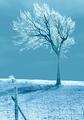
| 05/27/2003 12:28:28 PM | The Loneliest Oneby BigSmilesComment: Very nice, is that infrared? How can it be lonely, it's got a little friend down the way :). Love the inclusion of the fence, adds more depth. | | Photographer found comment helpful. |
| 05/26/2003 07:31:50 PM | The Guitaristby arnitComment: Ahhh, DOF at it finest. I only wish he had cut that string first. Also wish he was looking at the guitar. Oh well, minor nits, awesome shot as is. | | Photographer found comment helpful. |
| 05/26/2003 04:11:26 PM | | | Photographer found comment helpful. |
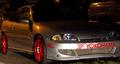
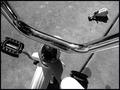
| 05/21/2003 04:30:19 PM | Performanceby MusicmanComment: Critique Club
Hi there.
Interesting perspective on the challenge.
I think you really needed some blue to do well in this challenge, all of the high ranking shots had all three primary colors.
I think the main distraction is the lighting, looks like on camera flash, a bit too bright and harsh on the front bumper. Maybe a tripod with a longer exposure would have created better results.
Like the angle but there are a lot of distracting elements in the background that could be improved with a different one. I am sure you couldn't have moved the car so perhaps you did the best you could under the circumstances.
Overall pretty good shot, I bet the owner would like a copy :) |
| 05/21/2003 04:17:40 PM | Early Primary Colorsby ploogieaComment: Critique Club
Hi there, nice representation of the challenge.
Composition is very good with the placement of the slide in the background, I am thinking getting in a little closer might have improved the composition by getting rid of some distracting elements.
Color
There is something off, looks a bit too pink/purple(esp. in the bark), did you change the colors/saturation? or does your camera give you this type of cast?
cropping and rotating a couple of pixels CCW would help with the tilt.
Good title, suits the image well.
Good luck with future challenges!
Paige | | Photographer found comment helpful. |
| 05/21/2003 04:08:18 PM | Lunch Breakby blemtComment: Critique Club
Great photojournalistic type shot!
Meets the challenge
OK, I do see all three primary colors but they aren't very obvious, I think to do well in this challenge the colors had to be pretty distinguishable.
Composition
Looks like you may have been limited here in order to get a reflection so it's pretty good considering. The line that runs up the right side might look better if you straightened it out a bit. The distortion in the mirror compared to the glass is cool, it looks like his leg is bent in a unnatural way.
Exposure
Looks right on.
Lighting
is good, looks well saturated. Shot in the shade?
Title is nice, works well with the photo and ties it more into photojournalism. Unfortunatley this site doesn't give high merits to photojournalistic shots, it is a totally different art form then the studio type shots that do well here.
You obviously have an eye for good shots, keep up the good work. | | Photographer found comment helpful. |
| 05/09/2003 04:48:11 PM | Hitching a Rideby PaigeComment: Thanks all, for your comments.
This was not set up, I came upon this scene in my yard, thought it conveyed kind of a discarded toy look, that is why I left the toy in.
My kids attention span is about nill and I could feel that in this photograph, guess you had to be there :).
Thanks again for all of your perspectives to help me see through others eyes. |
| 05/09/2003 01:43:55 PM | Not Movingby DougPazComment: Critique Club
Meeting the challenge
A good choice with a great title.
Composition
Probably not much you could do here with the branches, but something seems a bit off, not quit straight on or at much of an angle.
Color
Seems a bit dull, was this shot at high noon? Possibly some more saturation would help, looks like you had some good colors to work with.
Focus and DOF
Something isn't quite right with focus, perhaps it was oversharpened or overly compressed(jaggies throughout).Did you have a tripod? It can be a bit hard to handhold at 1/60 and still get a sharp shot.
Overall
I like your image and your subject, I think the main distraction is the lighting, a bit too bright. Maybe returning in the evening or early morning would have helped saturate it more.
Paige
| | Photographer found comment helpful. |
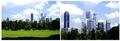
| 05/08/2003 04:56:29 PM | Financial Districtby KingLokComment: Critique Club
By Paige
Hi there.
You have a couple of strong shots that work well on their own, but as a story for this assigment they don't seem to work as well. Perhaps a shot of a man in a suit or a close-up of one of the buildings, to show a walking to work type of story.
I really like the composition and the coloring on the first image, the sky, grass, clouds and shadow work well together with the buildings.
The frame is lacking, it would have been a bit better to have a thin black line around each image to seperate the clouds from the border. It seems a bit thin to me too. Also there is more room on the left then on the right.
Overall nice images, you obviously have an eye for compositions, just work on the presentation and you've got a higher score. |
Home -
Challenges -
Community -
League -
Photos -
Cameras -
Lenses -
Learn -
Help -
Terms of Use -
Privacy -
Top ^
DPChallenge, and website content and design, Copyright © 2001-2025 Challenging Technologies, LLC.
All digital photo copyrights belong to the photographers and may not be used without permission.
Current Server Time: 08/25/2025 04:12:32 PM EDT.
|