| Image |
Comment |
| 02/22/2006 09:51:12 PM |
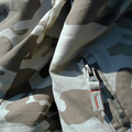
Stand Out in Camoby GeneralEComment: Interesting challenge for a macro... good spin. I like the angled line of the zipper... it give it some energy. I think a little more contrast would have made it pop more. |
 Photographer found comment helpful. Photographer found comment helpful. |
| 02/22/2006 09:48:27 PM |
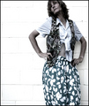
'antipodean trendz'by suemackComment: I like the addtion of the negitive space to the left. In general, I think adding the space to the side that the person is facing would have been better, unless you are trying to get a sense of them leaving. |
| Photographer found comment helpful. |
| 02/22/2006 09:46:00 PM |
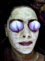
Getting Ready...by richabhatiaComment: Wow... almost alien like. I think this was a good spin on the challenge... nice and different. well executed. I like the texture in the mask. Hats off to your poor model! |
| Photographer found comment helpful. |
| 02/22/2006 09:44:48 PM |
piazza sempioneby kiwinessComment: Nice pose. Good model. I like the splash of wall color. This was a good challenge to use a nude in, which is sometimes risky on DPC. |
| Photographer found comment helpful. |
| 02/22/2006 09:41:43 PM |
Fashion Statementby CalliopeKelComment: Very nice... reminds me of a shot for glasses store. I like the natural framing and the texture in that frame. The catch light in the eyes without reflection in the glasses is also quite nice. Did you use a polarizer to help with that? |
| Photographer found comment helpful. |
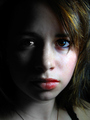
| 02/22/2006 09:39:04 PM |
_I Feel Pretty..._by ArtysteComment: Wow... interesting spin! The focus is sharp and clear... well lit. I like the catchlight in the eyes. A well executed photo... which, as you intended, is a bit disturbing. Title just set it off. Well done. |
| Photographer found comment helpful. |
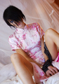
| 02/22/2006 09:36:43 PM |
Kim XXIIby Shiva DasComment: Intersting contrasts between model and setting. I like it. The right arm is in focus and eyes not... hard to say if this is motion blur or very narrow DoF. I'll come back and check your camera settings after the votes. I like the pose and tilted camera angle... It adds to drama which is also enhanced with binding of the hands. Perhaps with a matching cloth color, though. |
| Photographer found comment helpful. |
| 02/22/2006 09:32:06 PM |
Make-Up: Alluring Deceptionby CoralComment: Very nice contrast. Good use of "filling the frame" Nice catch lights in the eyes. Personally, I like the single light source look, but for fasion, I think a little reflected left side light or back light to separate from background would have been nice. No deduction for this however... nicely done. |
| Photographer found comment helpful. |
| 02/01/2006 02:01:02 AM |
|
| Photographer found comment helpful. |
| 01/17/2006 02:15:31 PM |
An Isaiah Burstby KiwiShotzComment: Hey Brett, I didn’t realize this was yours. I see you pegged out the apertrue to shorten your shutter as much as possible. Only other option was to bump your ISO up. I love your description of getting this image. No matter what you did with the rest of the images... you couldn’t have chosen a better expression. I think this should have placed higher. Keep up the good work. |
| Photographer found comment helpful. |
Home -
Challenges -
Community -
League -
Photos -
Cameras -
Lenses -
Learn -
Help -
Terms of Use -
Privacy -
Top ^
DPChallenge, and website content and design, Copyright © 2001-2025 Challenging Technologies, LLC.
All digital photo copyrights belong to the photographers and may not be used without permission.
Current Server Time: 08/04/2025 12:58:55 PM EDT.