| Image |
Comment |
| 11/24/2005 09:47:57 AM |
|
| 11/24/2005 09:47:16 AM |
|
 Photographer found comment helpful. Photographer found comment helpful. |
| 11/24/2005 09:43:55 AM |
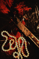
Contactby zxaarComment: This is potentially brilliant, but doesn't seem to have quite enough contrast on my monitor to truly pull it off - the colours are just too subtle. But then - and I'm rambling here just looking at it - those subtle colours do work and it's growing on me a lot. I've definitely revised my score upward since my first viewing. |
| Photographer found comment helpful. |
| 11/24/2005 09:31:55 AM |
Two Pigeonsby tanribilirComment: Two pigeons, 1 boat, 1 very famous mosque. Sadly I think you had a rather foggy day on the Bosphorus which didn't help this image at all. |
| Photographer found comment helpful. |
| 11/24/2005 09:29:29 AM |
|
| Photographer found comment helpful. |
| 11/24/2005 09:28:41 AM |
Four Blueby fsemarineComment: Well seen. This could have done with slightly sharper focus I think. |
| 11/24/2005 09:27:33 AM |
2 dozenby bobgaitherComment: I want to this to work with that lovely Old Master paint feel - but sadly, it just does not. It may be that patch of light to top right that keeps drawing my eye and spoiling the finish. A real shame because I think this could have been stunning. |
| Photographer found comment helpful. |
| 11/24/2005 09:24:58 AM |
Consider us even...by KarendtComment: Great concept but I don't like the execution I'm afraid. The finish of this is just too confusing for me - too fuzzy. |
| Photographer found comment helpful. |
| 11/24/2005 09:23:18 AM |
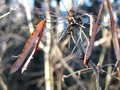
Seed Podsby tedwardComment: A good attempt but a shame that the second seed pod is not all in the frame - it rather loses the point. You've tried well to bring out the dof with the focus on the LHS pod but it hasn't quite worked out sharply enough and blends into the background a bit too much. |
| Photographer found comment helpful. |
| 11/24/2005 09:21:48 AM |
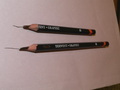
Which one do you prefer for drawing 4B or 6B ?by erainmanComment: A good idea, but you're let down in your execution and composition. The pencils are too central in the image and you needed to crop this tighter I think. Actually I think it would have looked better rotated rightward 90 degrees. Nonetheless, the focus was fair and and the clarity of the pencils is pretty good. |
| Photographer found comment helpful. |
Home -
Challenges -
Community -
League -
Photos -
Cameras -
Lenses -
Learn -
Help -
Terms of Use -
Privacy -
Top ^
DPChallenge, and website content and design, Copyright © 2001-2025 Challenging Technologies, LLC.
All digital photo copyrights belong to the photographers and may not be used without permission.
Current Server Time: 12/20/2025 06:29:16 AM EST.