| Image |
Comment |
| 08/31/2006 10:24:28 PM |
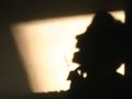
Mister Bassmanby iamfxtComment: Your subject occupies an uncomfortable space between a silhouette and a lit figure -- it makes him look simply underexposed, more than anything else. Also, his head and the bass get lost a bit in the window pattern behind him. |
| 08/31/2006 10:22:27 PM |
Sonrisaby polifiloComment: This looks more like a shadow than a silhouette. Also, nothing is in focus. Composition-wise, I'd eliminate the shadows surrounding your subject as they are distracting. I'd have the subject and the light area, but nothing else. |
| 08/31/2006 10:20:19 PM |
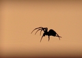
Waitingby astrogeekComment: You need a better focus on the spider -- I can just see hints of hairy legs, but nothing on him is sharp. Also, a bit more contrast and focus might bring out the web better as well. Having done that, I'd crop out some of the negative space above the spider. Its not doing anything for the image. Most of the image should be spider and web. |
 Photographer found comment helpful. Photographer found comment helpful. |
| 08/31/2006 10:15:11 PM |
|
| 08/31/2006 10:08:26 PM |
|
| 08/31/2006 10:07:34 PM |
Red Eye Flightby AppleFunkComment: Looks like you've got a bit of motion blur either on the bird or your camera or both. I like both the composition and colors. This could've been improved with a faster shutter speed, IMO. |
| Photographer found comment helpful. |
| 08/31/2006 10:03:42 PM |
|
| Photographer found comment helpful. |
| 08/31/2006 10:00:16 PM |
Without Youby nsharpComment: Your subject is well lit, but the background needs some work -- I can see the wrinkles in the sheet. You need to step away from it a few feet so it will be out of focus, and the imperfections in the sheet not as obvious. |
| Photographer found comment helpful. |
| 08/31/2006 09:38:05 PM |
Stevie Ray Vaughanby Army of nOneComment: I could barely tell there was a statue there. Maybe a longer exposure to light the sky just a bit? The composition is strong, with Stevie Ray looking out over the Austin skyline. |
| 08/31/2006 09:34:25 PM |
Three Gracesby ZoomdakComment: I really like the rock/tree combination on the left. I think you would have made a much stronger shot by eliminating the other rocks and including the single rock with the tree and the moon. |
| Photographer found comment helpful. |
Home -
Challenges -
Community -
League -
Photos -
Cameras -
Lenses -
Learn -
Help -
Terms of Use -
Privacy -
Top ^
DPChallenge, and website content and design, Copyright © 2001-2025 Challenging Technologies, LLC.
All digital photo copyrights belong to the photographers and may not be used without permission.
Current Server Time: 08/19/2025 07:03:13 AM EDT.