| Image |
Comment |
| 09/02/2006 03:47:24 PM |
I'm Starvingby eggfoxComment: I'm going to be honest -- the subject matter doesn't do anything for me. I'm guessing its some type of toy eating an Oreo cookie? That being said, it looks in focus, the lighting is appropriate for the shot (though some might not like the fall off in the corners). Even the cookie crumbs work well for the composition, IMHO. Might be improved with just a touch of light on the cookie to make it more recognizable. |
 Photographer found comment helpful. Photographer found comment helpful. |
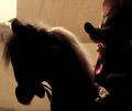
| 08/31/2006 11:30:53 PM |
Looking through the window: I wish I was real..by ho0jokerComment: The background and visible details of the mouse really distract from the image. It gives it a busy look. A simpler background with more of the horse visible (is it a "broomstick" horse or a rocker?) would really nail the look I think you're going for. |
| Photographer found comment helpful. |
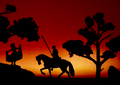
| 08/31/2006 11:29:14 PM |
A Knight-Errantby 3eyedcrowComment: The figures are so 2-dimensional looking that I can't really connect with this photo. The focus also seems a shade soft. |
| Photographer found comment helpful. |
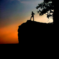
| 08/31/2006 11:28:26 PM |
Freedomby parrotheadComment: A more expressive pose on your model would really nail the theme your looking for. I like the overall composition -- particularly the rock and the angle you've chosen. |
| Photographer found comment helpful. |
| 08/31/2006 11:27:07 PM |
Untitledby zardozComment: A dramatic pose, with nice touches of highlights here and there. The carpet and sheet visible at the bottom and right of the photo are real distractions. |
| Photographer found comment helpful. |
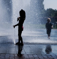
| 08/31/2006 11:25:42 PM |
Evening Splashby cislanderComment: I think a tighter crop on the girl would dramatically increase the strength of the composition. The girl has the emotion that drives this photo -- the boy on the right is a distraction. |
| Photographer found comment helpful. |
| 08/31/2006 11:24:06 PM |
Dark Assassinby MarkComment: The focus is a shade soft. A tighter crop on the subject would reduce the distraction of that big shadow on the right. |
| Photographer found comment helpful. |
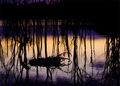
| 08/31/2006 11:23:13 PM |
Lakeside Duskby wavelengthComment: I think you've got too much silhouette in this -- its too dark and the overlapping lines are quite busy. |
| Photographer found comment helpful. |
| 08/31/2006 11:21:33 PM |
A Little Frenchby carpentsComment: Nice bokeh on the lights, but the dark background is hiding much of the lines of the silhouette. Hiding the table would help preserve the illusion that this is anything other than a model. |
| Photographer found comment helpful. |
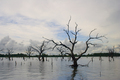
| 08/31/2006 11:20:33 PM |
A dash of Blueby BluebearComment: A strong composition with the drowned trees receding towards the horizon. Your lighting is your weak spot. Its really flat and grey. Adding some contrast or darkening the image may help that. |
| Photographer found comment helpful. |
Home -
Challenges -
Community -
League -
Photos -
Cameras -
Lenses -
Learn -
Help -
Terms of Use -
Privacy -
Top ^
DPChallenge, and website content and design, Copyright © 2001-2025 Challenging Technologies, LLC.
All digital photo copyrights belong to the photographers and may not be used without permission.
Current Server Time: 08/19/2025 01:40:56 PM EDT.