| Image |
Comment |
| 05/04/2006 06:51:18 AM |
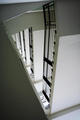
facadeby BlindBatComment: good composition but you lose marks for not using the full 640 pixel allowance |
| 05/04/2006 06:27:18 AM |
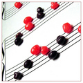
levelsby dockieComment: I really like the photo but its quite hard to give it a good score when its smaller than all the other photos |
 Photographer found comment helpful. Photographer found comment helpful. |
| 05/04/2006 05:37:46 AM |
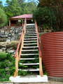
STEPSby harleyComment: I like your idea but the result isn't particularly appealing - none of the lines in he photo are straight, and there is no real point of interest for the photo - it should be the stairs but all the other distracting elements take away from it - less is more! |
| 05/03/2006 03:45:02 AM |
|
| Photographer found comment helpful. |
| 05/03/2006 03:44:12 AM |
Does Not Meet Challengeby amandaloreComment: thats great on so manny levels. number one so far but I'm only at 15%
I'm back - been through the lot and this is my fav by a long way. I would give you 11 if I could. |
| Photographer found comment helpful. |
| 05/03/2006 03:38:03 AM |
|
| Photographer found comment helpful. |
| 05/03/2006 01:50:48 AM |
|
| Photographer found comment helpful. |
| 05/03/2006 01:44:01 AM |
|
| 05/03/2006 01:40:48 AM |
|
| Photographer found comment helpful. |
| 05/03/2006 01:36:11 AM |
|
| Photographer found comment helpful. |
Home -
Challenges -
Community -
League -
Photos -
Cameras -
Lenses -
Learn -
Help -
Terms of Use -
Privacy -
Top ^
DPChallenge, and website content and design, Copyright © 2001-2025 Challenging Technologies, LLC.
All digital photo copyrights belong to the photographers and may not be used without permission.
Current Server Time: 06/18/2025 08:41:15 AM EDT.