| Image |
Comment |
| 08/20/2003 07:05:46 PM |
Foggy Morningby GolferDDSComment: Personally I woiuld have moved the plant to the low point of the tree line which would have provided leading lines down to the subject, and moved the subject away from the center of the frame.
Otherwise this is very well done. I like silhouttes anyway, and the fog obscured trees add interest to the background. |
 Photographer found comment helpful. Photographer found comment helpful. |
| 08/20/2003 07:00:22 PM |
|
| Photographer found comment helpful. |
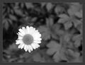
| 08/20/2003 06:58:44 PM |
Daisyby bdshortComment: Oh yes. Great use of DoF to create the negative space. Focus on the daisy is spot on.
Would love to see the colour version after the challenge, I have a feeling that I would like it even more, but that's down to personal taste.
I think a white border would suit the shot better than the grey, but pffft what does that matter.
'Only' a 9 because it leaves me wanting to see colour. |
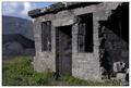
| 08/13/2003 05:46:58 PM |
A House Forgottenby heidaComment: Not sure exactly why I like this. Must be something to do with the contrasts - the greyness of the landscape and the building surrounded by green, the angular building against the curves of the landscape. Whatever it is it works for me. |
| Photographer found comment helpful. |
| 08/13/2003 05:39:17 PM |
Cross and Skyby JackoComment: Goddam 10D owners, just look at the state of that background will ya ... absolutely beautiful!
Shocked that this isn't up in the 6's where it belongs. Love the composition, love the silhouette, and I can't bear to look at that b/g any more : ) |
| 08/13/2003 05:32:47 PM |
Crossby craigantComment: If I had to find a fault in this it would be that the face of the cross should be darker! I'm a big fan of silhouttes and this is a good one - the harsh lines of the cross contrast very well against the random chaos of the shrubs. Great shot. |
| Photographer found comment helpful. |
| 08/13/2003 05:29:13 PM |
Three Boltsby CraigDComment: Do I like this shot or what?!
Great colours & textures on the metal. The rust really adds to the shot. As David said, the closest bolt could have done to have been in focus, otherwise this is superb.
Ignore the narrow minded voters - it's their loss ; ) |
| Photographer found comment helpful. |
| 08/07/2003 05:58:20 PM |
1by dsidwellComment: Simple *and* shiny : )
The only thing I don't like about this photo is the dark space on the left, it just seems to unbalance the shot a bit. |
| 08/07/2003 05:56:07 PM |
Magicby dsidwellComment: This is great. I love blue shots to begin with and having the word slapped in the middle makes this shot feel, um, magic! The moire type patterns on the wall are good too, gives the shot a little extra something to look at. |
| 07/30/2003 08:15:10 AM |
bell bottoms by grigrigirlComment: I blame it on Mars ... oh, and the fact that this is a cracking photo : ) Well done. |
| Photographer found comment helpful. |
Home -
Challenges -
Community -
League -
Photos -
Cameras -
Lenses -
Learn -
Help -
Terms of Use -
Privacy -
Top ^
DPChallenge, and website content and design, Copyright © 2001-2025 Challenging Technologies, LLC.
All digital photo copyrights belong to the photographers and may not be used without permission.
Current Server Time: 08/08/2025 05:11:09 AM EDT.