| Image |
Comment |
| 03/03/2007 05:15:26 PM |
|
 Photographer found comment helpful. Photographer found comment helpful. |
| 03/01/2007 12:44:57 AM |
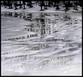
Fractured Ice Mirrorby dpcollinsComment by Blackbox: Very beautiful...to me, it's more silver then B&W. I never get to see anything like this...thanks for capturing it and for sharing. Hope it does well for you...10 |
| Photographer found comment helpful. |
| 02/28/2007 12:24:09 PM |
|
| Photographer found comment helpful. |
| 05/07/2006 05:46:16 AM |
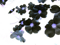
Inverted Dogwoodby dpcollinsComment by marcellieb: This is a comment from the Critique Club;
Very nice image, good sharpness - works well as a negative. I like the background - gives a "glowing effect"
I agree with the crop issue. You have loose flowers on the top left hand side that "pulls" the eye.
I see you ended with almost 5,5 -which is basically in the range of your latest entries. You are now in that difficlut stage on how to get from 5 to 6 and then 7. Like your work though. |
| Photographer found comment helpful. |
| 04/30/2006 08:44:34 AM |
Inverted Dogwoodby dpcollinsComment by LalliSig: This image works well as a negative, everything except the black backround wich of course turned completely white. If the white part had been slightly darker or with some texture in it I would have liked this much better but still nice, I gave this a 6. |
| Photographer found comment helpful. |
| 01/11/2006 10:27:53 AM |
|
| Photographer found comment helpful. |
| 11/07/2005 09:32:32 PM |
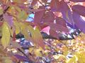
Fall Colorsby dpcollinsComment by mycelium: looks like this picture has a cool cast from being taken in the shade. if you adjust the blue levels you can fix this and bring out the warm tones of the leaves. |
| Photographer found comment helpful. |
| 11/07/2005 09:04:17 AM |
|
| Photographer found comment helpful. |
| 11/04/2005 10:57:07 PM |
|
| Photographer found comment helpful. |
| 11/03/2005 07:49:41 PM |
|
| Photographer found comment helpful. |
Home -
Challenges -
Community -
League -
Photos -
Cameras -
Lenses -
Learn -
Help -
Terms of Use -
Privacy -
Top ^
DPChallenge, and website content and design, Copyright © 2001-2024 Challenging Technologies, LLC.
All digital photo copyrights belong to the photographers and may not be used without permission.
Current Server Time: 07/27/2024 07:02:05 AM EDT.