| Image |
Comment |
| 09/30/2013 09:55:40 AM |
It wasn't Buenos Aires where I found Art Roflmao (and it turns out he's the devil after all)by Bear_MusicComment: Voted earlier coming back to comment.
Took a little doing in the key words but I found the original being 'Art went to Buenos Aires' by Hauxon. If this is the match then that woodie must have been from a redesign:-) While the costume head may be made of wood and is worn in dances it is very far remote from being readily recognized for the typical Woodie's the are dancing in the original. I can see some connections because that is I am trying to see it from the artist's shoes. I have to be honest, but I think it still is too far a stretch to be a good pairing between the original and the redux. The photo itself is an interesting shot showcasing this costume head...it just needed a little something more, something to make it pop more visually for greater visual impact. Perhaps not having it slightly off center and someone in the backdrop or off to the side showing interaction with the main subject. |
 Photographer found comment helpful. Photographer found comment helpful. |
| 09/30/2013 09:38:57 AM |
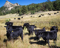
Bovine DQ, Georgette ID#894210, by stargazer05766by hahn23Comment: Voted earlier coming back to comment.
A nice capture of this very pastoral scene with rolling hills and mountains beyond. Very different from the original in that this composition has many cows for us to look at in this landscape rather than just a portrait of a single bovine. As a shot of these domestic animals in a scenic landscape it is good shot, but it is missing a clearly defined main subject when compared to the original. At least one cow should be the main focus where the eye rests before traveling off within the frame to look at the other cows and landscape. There is so much in the frame I don't know where I should look first. There are two cows in the forefront but they on on the opposite sides of the frame - I am caught bouncing between the two, 'which one should I look at'? I think it would be better if you waited or choose one of the cows in front and positioned yourself at an angle so that one bovine is the showcased star of the herd. The eye could then travel to the cows in back and then the landscape for a better balance/organization of all the subjects in the photo. My other suggestion on how to improve the shot is take if from a lower angle. It adds more visual interest than just the straight and level shot, would give more sense of depth & height to the bovines & the mountain beyond, and possibly eliminate/minimilize/crop out the harsh shadows on the ground. |
| Photographer found comment helpful. |
| 09/30/2013 09:24:40 AM |
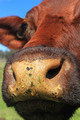
Georgette (Bovine Challenge 2010)by StagoleeComment: Voted earlier coming back to comment.
Talk about sticking your nose in the camera - wow, I can see tons of detail and texture from the individual hairs the the water droplets dotting the nostrils. The redux definitely gives one an up close and personal look at this cow - almost too close. I think it would be and even better shot if you pulled back a little bit so that the nose/muzzle dominates the lower half of the composition and have the right eye be visible in the top right corner of the frame. That way it is a more balance portrait of this bovine where we can follow the eye down to the nose or vice versa. As it is now there is no really defined element on the top half of the shot. Also, I like how in your redux captures the cow in a natural environment unlike the original where the head seems to be floating in space headless. |
| Photographer found comment helpful. |
| 09/29/2013 09:14:04 PM |
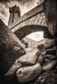
Sepia Challenge, Victoria Towerby MargaretNetComment: Voted earlier coming back to comment.
You have great sepia tones in this shot. Looking at the original it has the stairs that act as leading lines that draw the eye up to the tower that is clearly visible in it's entirety. A clear view of the tall tower and something that acts as a leading line to draw the eye to it is missing here. I do see something in this composition that had the potential to act as that leading line but it needed to be composed and framed in the shot better. The arch of the bridge would have been perfect but too much of the composition has the rocks which really don't do much for the photo as a whole. Getting at a higher angle and moving more the the right could have placed the arched bridge coming out from the right bottom corner half of the frame. It would then lead the eye to travel across the frame to where the tower would be on the left hand side. Orientation would have to be horizontal rather than vertical to get the whole of the tower in the frame with the angle I suggest. The photo has a good foundation to work from it just needed to be arranged better for greater visual impact. |
| Photographer found comment helpful. |
| 09/29/2013 08:17:20 PM |
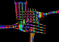
Kaleidoscope (DQed in Imagination Challenge)by illini75Comment: Voted earlier coming back to comment.
Love the bold and vibrant colors that just pop visually off of the black background. I see that you switched it up from spoons to forks in the redux - now if someone does knifes they can all be a nice matched set:-) I think the biggest drawback is that the forks overlapping upon each other don't work for this composition. The colors become a jumble and the criss cross of striped colors almost hurts the eyes to stare at it too long. I think it would be easier and more pleasing on the eyes if each was laid out in a distinct and separate formation from each other - either in a row like the original or maybe each of the four fours can be extending out from the corners of the composition with the tines almost meeting and creating the outlined shape of a circle in the center. If done in this fashion the eye can then greater appreciate the colorwork on the forks as well as the shapes. |
| 09/29/2013 07:58:35 PM |
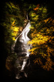
Quietudeby vawendyComment: Voted earlier coming back to comment.
Love the glow of autumn colors that frame the flow of the water cascading down. Very serene and beautiful. Love the silky flow of the water. There is one thing from the original that I feel is needed here in the redux. The original has a sense of grounding. Here there is dark, negative space surrounding the main subject that if feels like it is 'floating' in space. Most especially I get the feel of not being grounded when I look at the bottom of the composition where the water just 'ends' and there is nothing but blackness below it. |
| Photographer found comment helpful. |
| 09/29/2013 09:45:50 AM |
Lost in transition - "The Voice Of An Artist"by pgirish007Comment: Voted earlier coming back to comment.
The original is moody and creepy while the redux is surreal and fun. The original has the hand screaming. This redux has the mouth looking like it is in the action of ready to laugh/giggle. I just look at the girl holding her mouth and I am thinking she is trying to hold her laughter in. There are similarities between the two but the mood/feel of each is vastly different - not a bad thing mind you just different. I do have one suggestion on how to improve on the image (man, she is picky, right?;-) ). The mouth resting on the hand doesn't quite mesh with the angle of the hand. The angle of the shot of the mouth is turned a bit more to the right while the hand is turned a bit more the opposite direction. I think it would have been best to take a dozen angled shots and then see what better melds with the surface angle of the hand. It is tough sometimes to match the angle of a composite but when it all matches it then just looks more polished. |
| Photographer found comment helpful. |
| 09/29/2013 09:34:01 AM |
Pincers (DQ Abstract Macro IV ID=1003157)by IreneMComment: Voted earlier coming back to comment.
Great mood lighting to illuminate the two wine glasses! Love the colors here too. Angle is different from the original - I like how the main subjects lie on the diagonal of the frame. My only critique is that I wish that there was a little more light on the bottom glass so the edges are more defined like in the top glass. The bottom blends too much into the dark tones that it gets lost such that the shape is less defined. |
| Photographer found comment helpful. |
| 09/29/2013 09:27:27 AM |
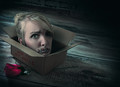
As Quiet as the Dead: Redux by Samantha_TComment: Voted earlier coming back to comment.
This brings new and creepy meaning to 'thinking inside the box'. Editing, lighting and composition are all in the top notch category. A bit different than the original but still many elements that are similar in the redux that point back to the origin point. |
| Photographer found comment helpful. |
| 09/28/2013 10:32:08 PM |
when the water is gone, the plastic is still here..by jmritzComment: Voted earlier coming back to comment and after pondering upon it a bump up.
Whoa! This has the water bottle from the original and a whole lot more. Reading the MSmidt23 photographer's comments I took what the original artist intended to show in the shot but didn't. "Water bottles are the most common plastic object used today and if we keep this rate up our earth will lose all its beauty and no amazing photos will be taken anymore." You set out to show that plastic is indeed everywhere from the water bottles on the left to the eyeglass frames, possibly the dress, the bike helmet with the crazy headdress adornments, etc. etc. etc. The plastic of the bottles and elsewhere clutters up the frame and maybe that is what you were aiming to show your audience. Natural beauty overrun and spoiled by non biodegradable plastics/litter. |
| Photographer found comment helpful. |
Home -
Challenges -
Community -
League -
Photos -
Cameras -
Lenses -
Learn -
Help -
Terms of Use -
Privacy -
Top ^
DPChallenge, and website content and design, Copyright © 2001-2025 Challenging Technologies, LLC.
All digital photo copyrights belong to the photographers and may not be used without permission.
Current Server Time: 08/24/2025 04:58:28 AM EDT.